Horsefeather – Brand & Creative
Four years of ongoing menu design, seasonal production, and marketing for a warm, contemporary San Francisco restaurant and bar — now expanded to Palo Alto.
Overview
Horsefeather’s visual identity was already established when I came on. The job was sustaining it, extending it, and adapting it across every new format, season, and location the brand required. The register is warm, refined, and approachable: good materials, clean typography, nothing overworked. It runs on a completely different frequency than Last Rites, and keeping both distinct while producing them from the same role was the ongoing reality of the work.
Four years in, the scope covers two locations, a full menu suite for each, annual holiday programming under its own sub-brand identity, three years of NYE campaigns, and the full creative and photography package for the Palo Alto opening.
My Roles
Brand Designer and ongoing creative production lead for Horsefeather across both San Francisco and Palo Alto, running concurrently with Last Rites. Two brands, one person, zero crossover — Last Rites is pulp adventure and vintage horror; Horsefeather is warm, contemporary, and refined. Keeping them visually distinct across the same format types (menus, social graphics, event marketing, photography, print collateral) for four years is the actual job.
Work spans menu production (seasonal updates, holiday editions, new menu launches, all print-production-ready), cocktail and food photography, in-center signage, private events sales collateral, holiday campaign creative, drink tickets, and ongoing social media graphics. The Palo Alto opening also meant building out a new set of brand applications from scratch for a second location with its own audience and context.
Tools Used
Adobe Photoshop, Adobe Illustrator, Adobe InDesign, Adobe Lightroom
Artifacts
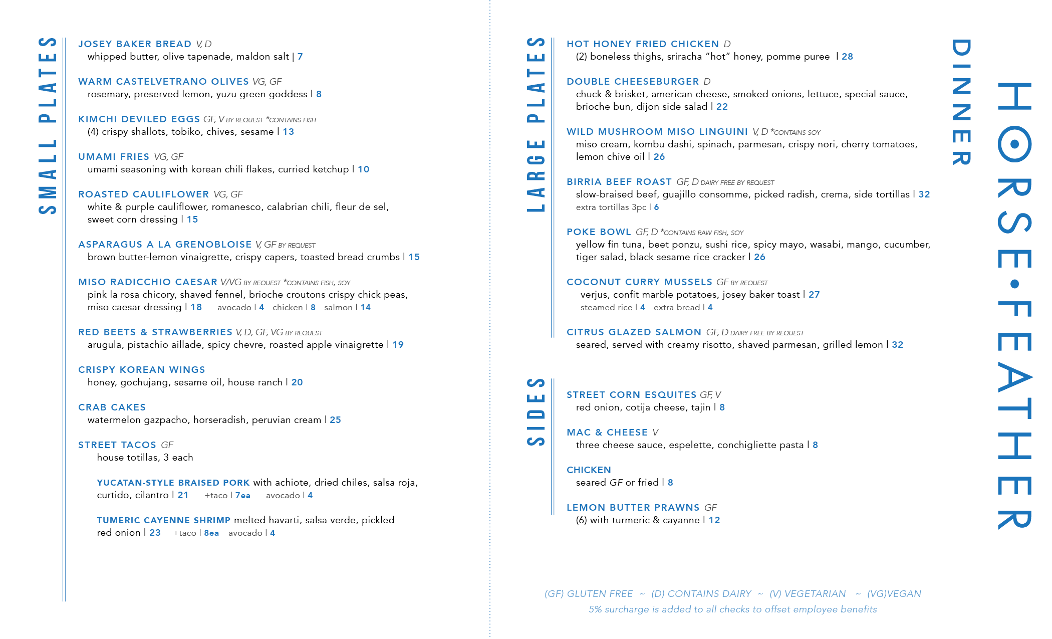
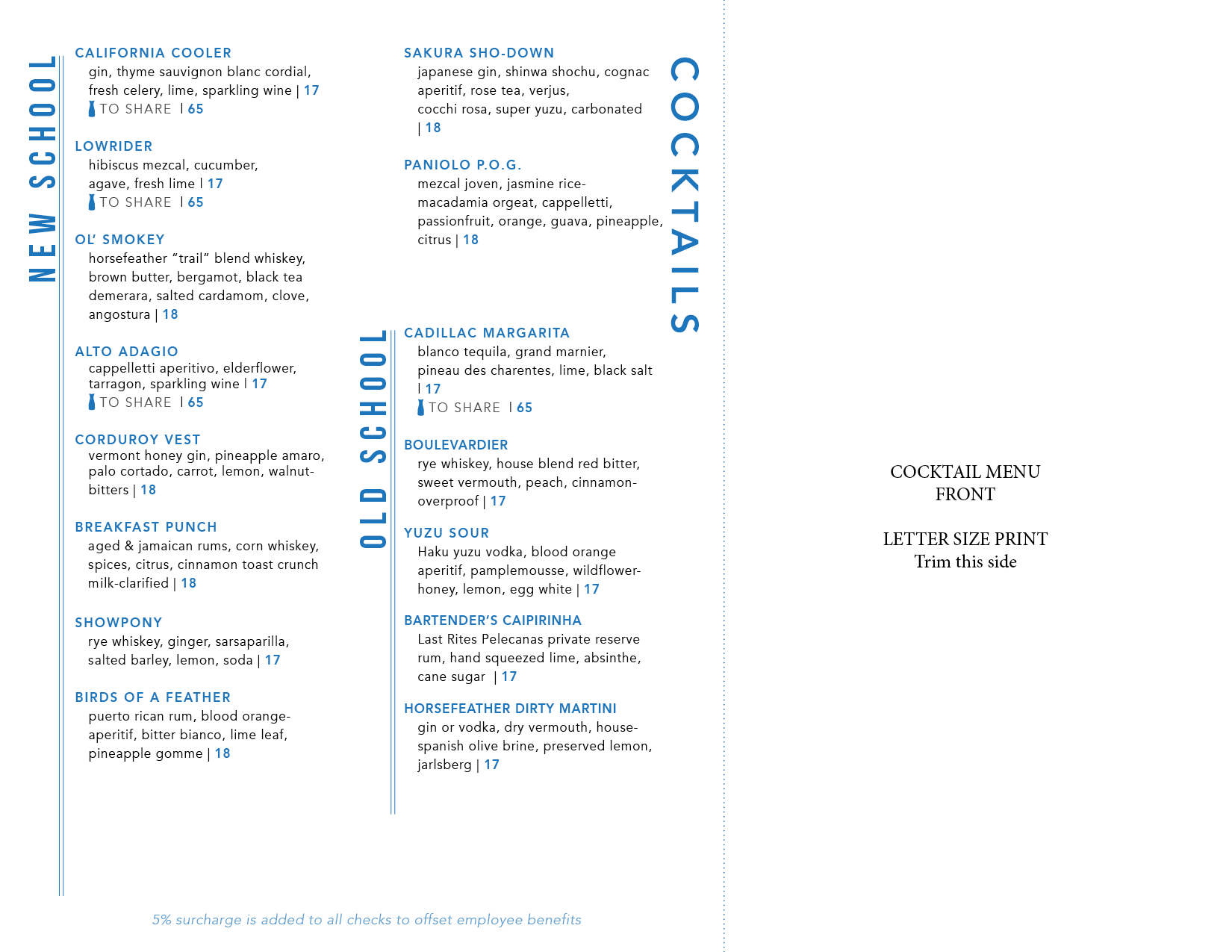
MENU SYSTEM
The most consistent body of work is menu production. Both locations run full programs across dinner, brunch, lunch and happy hour, dessert, spirits, seasonal, and private events — each built in InDesign, each updated on a rolling cycle, each print-production-ready.
The Palo Alto location added a complete second suite when it opened in 2025. Adapting the design language to the new space meant preserving the warmth of the original while letting the cleaner, more contemporary interior inform the execution.
This menu is printed on cream colored legal 8.5×11 paper, and folds off-center to leave the HORSEFEATHER type peaking out from under the front flap with the logo. The cocktail menu is printed onto 8.5×11 and trimmed down so that it nests perfectly inside of the main dinner menu as an insert.
PALO ALTO OPENING
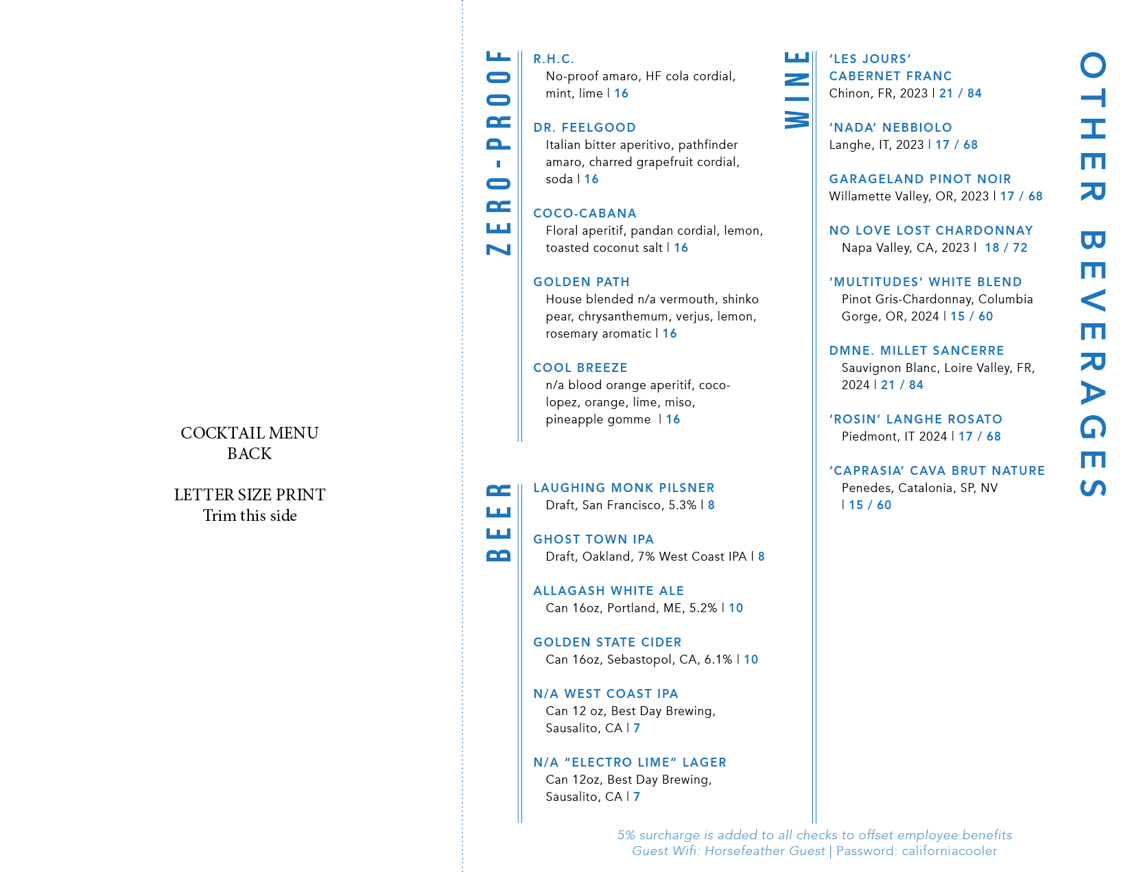
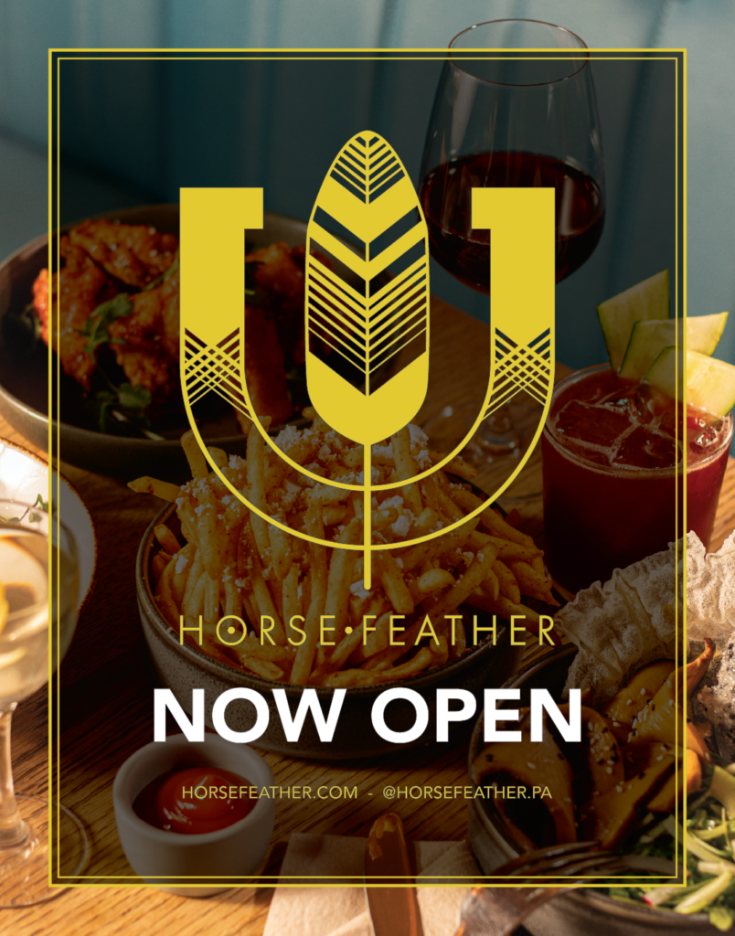
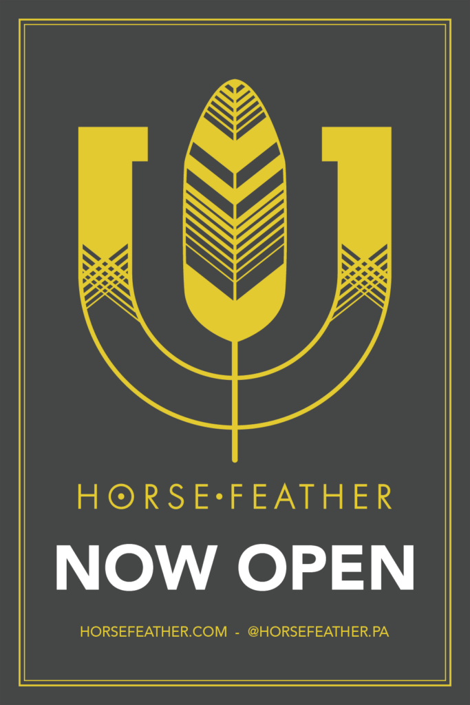
The 2025 Palo Alto opening was the largest single production push. Two sets of press invites — Friends & Family and Media — a Now Open launch poster, brunch and lunch service posters, opening photography, and a full new menu suite, all hitting against a hard launch date.
The photography shoot covered the full food and beverage program. The brief was to reflect the Palo Alto space’s cleaner aesthetic while keeping the warmth the brand is known for. Those images now live across the website, menus, and all opening promotional materials.
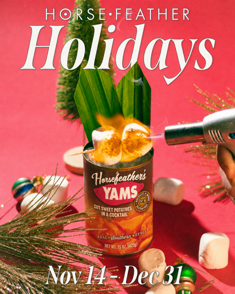
Horsefeather Holidays
The annual holiday programming runs under its own identity: Holiday at the Horse, with a full collateral system built each year. The campaign covers four content categories, seasonal menu updates, print assets, and social graphics across both locations. I have a separate page for this work.
In-Center Signage
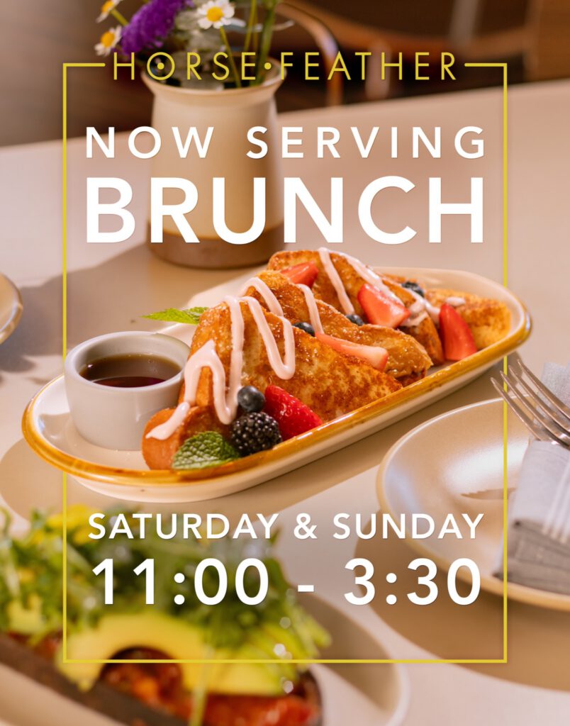
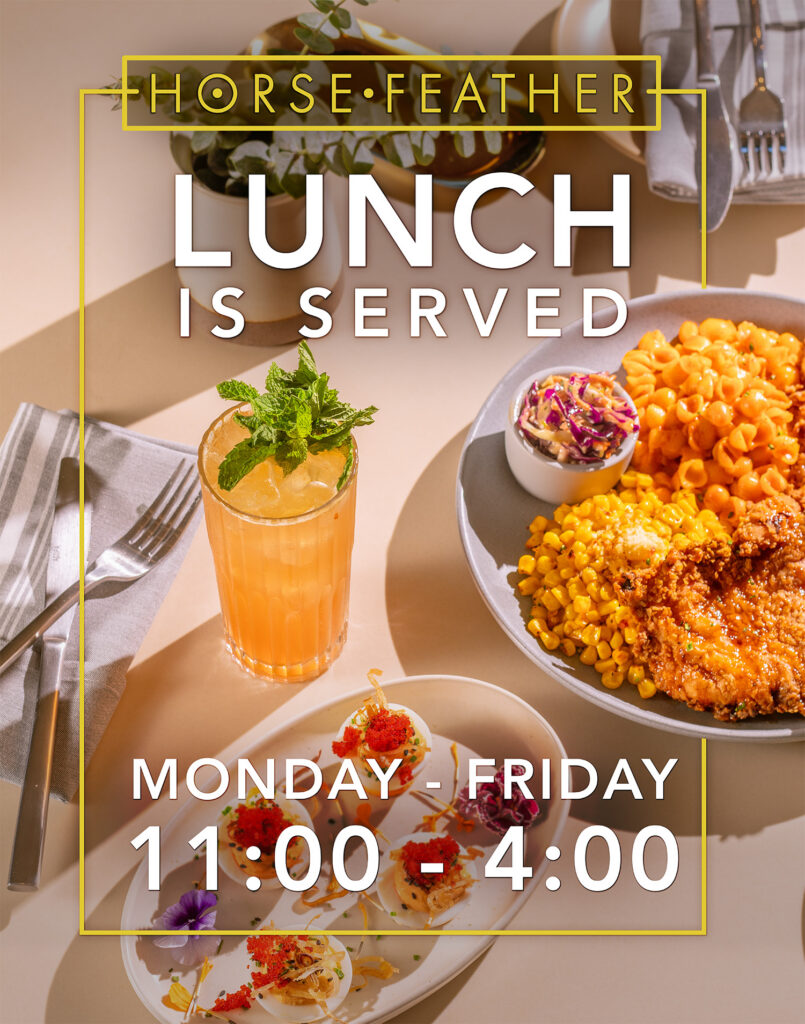
When Horsefeather opened its Palo Alto location, the surrounding shopping center became a marketing channel. These large-format posters went up around the property to announce the opening and new service offerings — brunch, lunch, hours.
Each poster leads with food photography shot specifically for the campaign. The styling is warm and editorial: natural light, loose compositions, dishes that look like you interrupted someone mid-meal. The design keeps the Horsefeather brand system intact — gold border frames, the wordmark anchoring the top, bold white display type for the key information. Two versions of the opening poster gave us options depending on context: a photography-forward layout for high-traffic areas, and a clean mark-on-charcoal version where the logo needed to carry more weight.
Utilizing my photography. Designed in Adobe Illustrator, Adobe Photoshop.
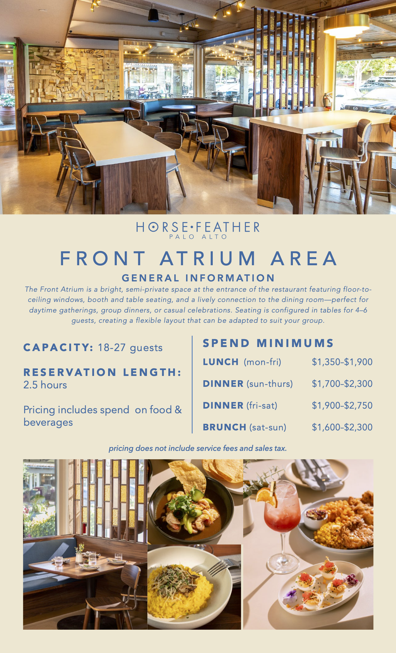
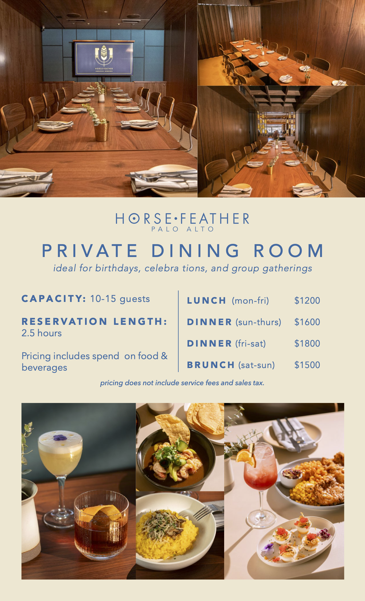
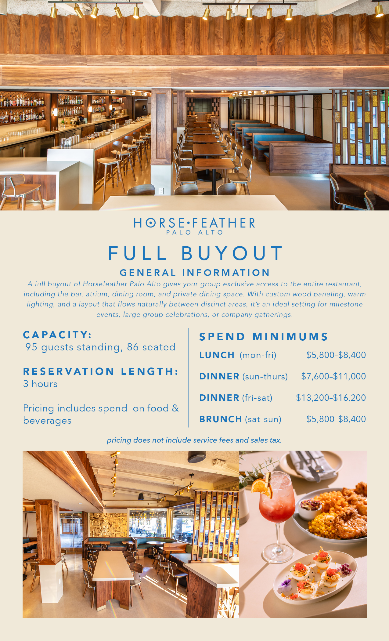
Private Events Collateral
When Horsefeather Palo Alto launched its private dining program, the sales materials needed to do real work — communicate the space clearly, justify the spend minimums, and feel consistent with a brand that has a distinct visual identity.
The photography throughout — the space shots and food — was mine, shot specifically for these documents. The design stays within the Palo Alto brand system: cream field, slate blue headers, spaced tracking on the section titles, the wordmark centered above each document name.
Photography & Design: Colton Redwine
Tools: Adobe Illustrator, InDesign
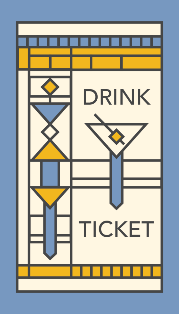
Drink Tickets
The Horsefeather brand draws from Frank Lloyd Wright’s design vocabulary — geometric ornament, strong grid structure, stained glass color fields. These drink tickets extend that language to a physical takeaway.
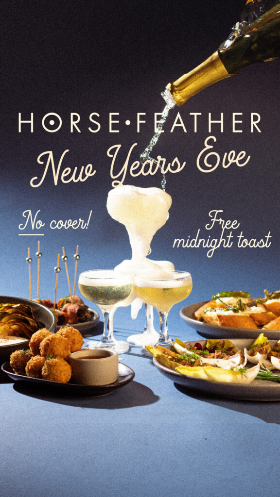
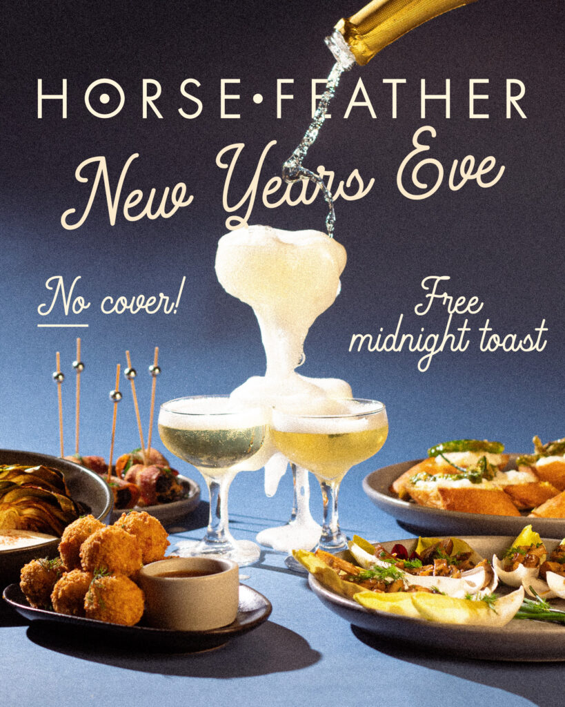
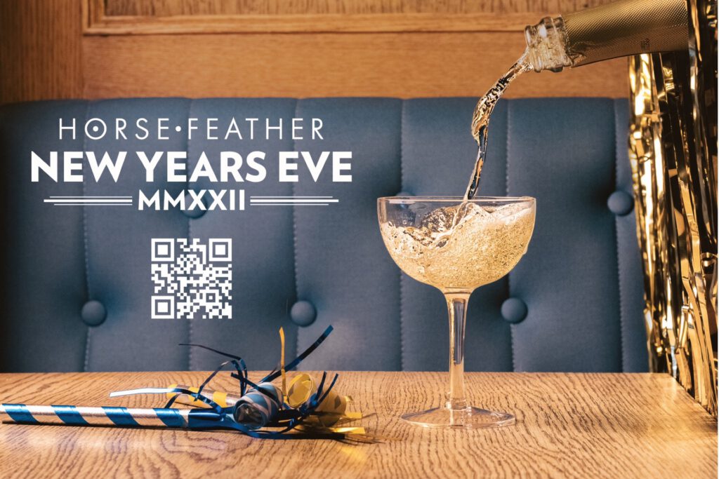
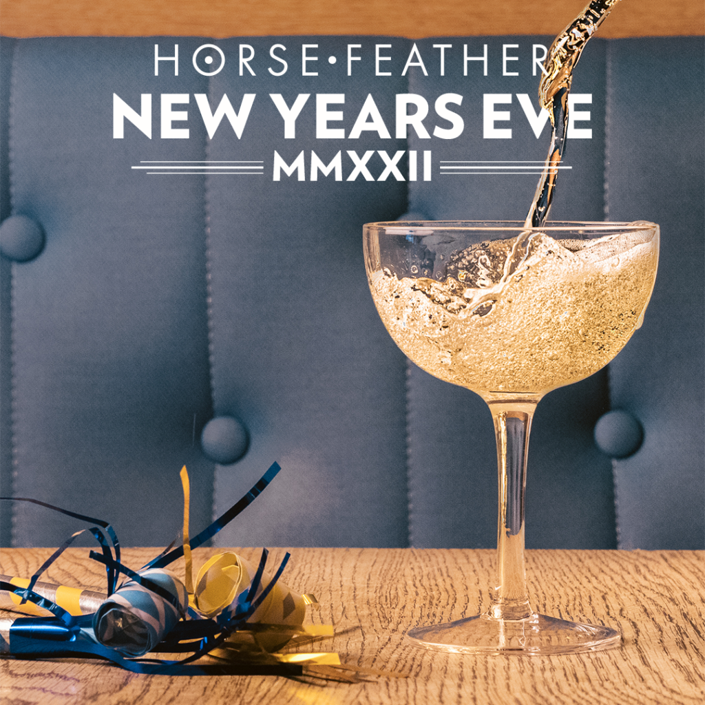
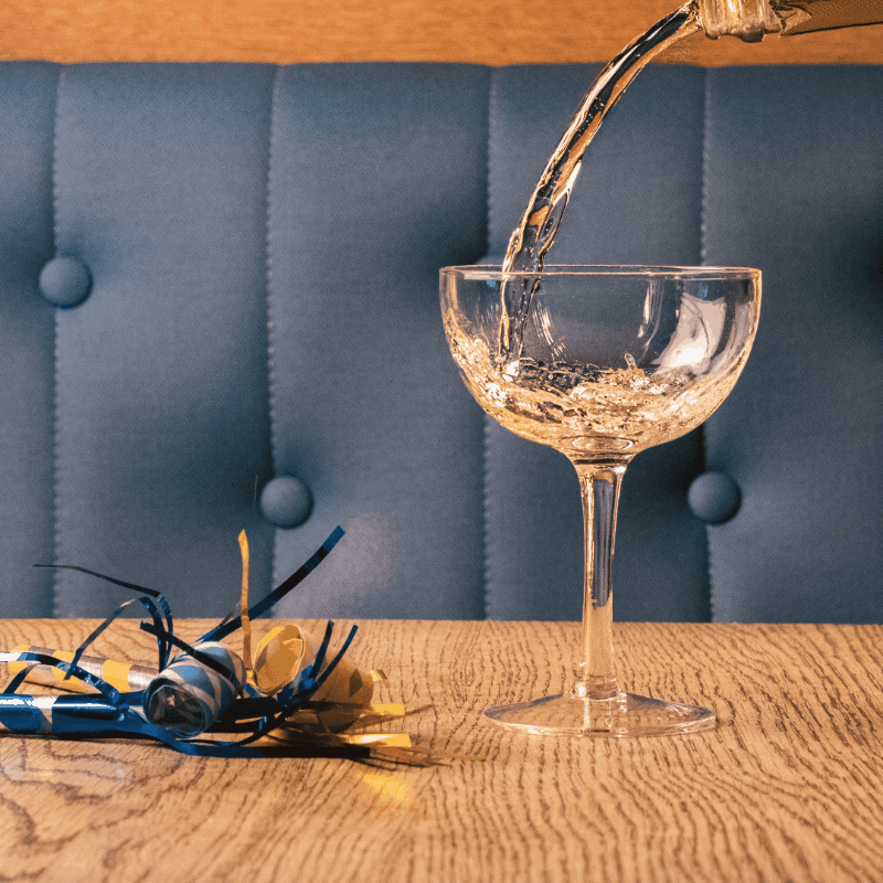
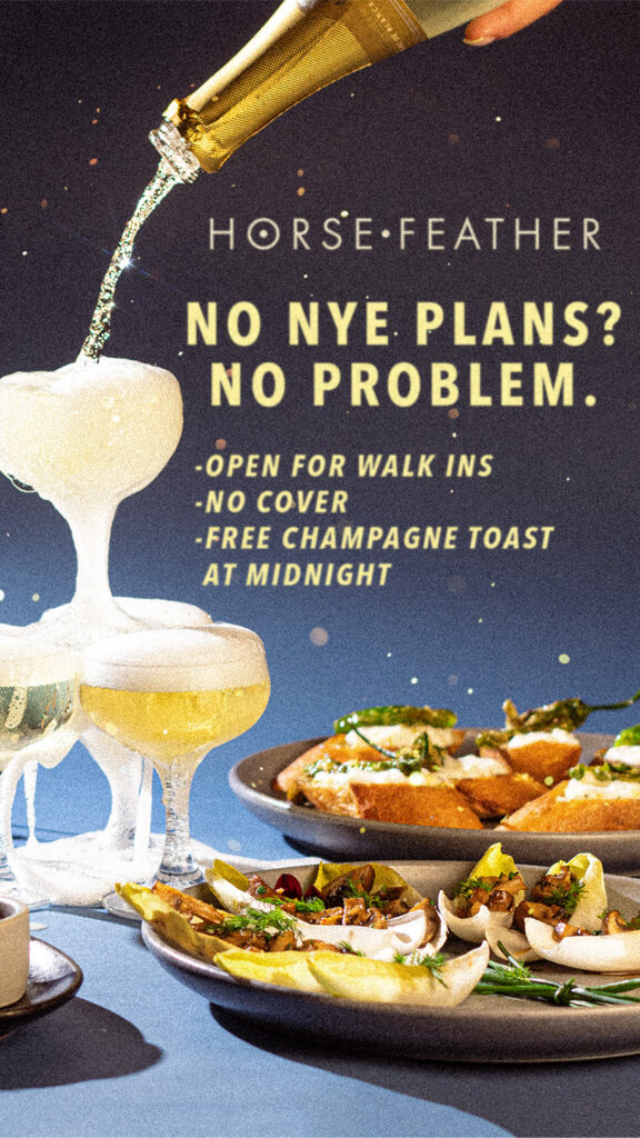
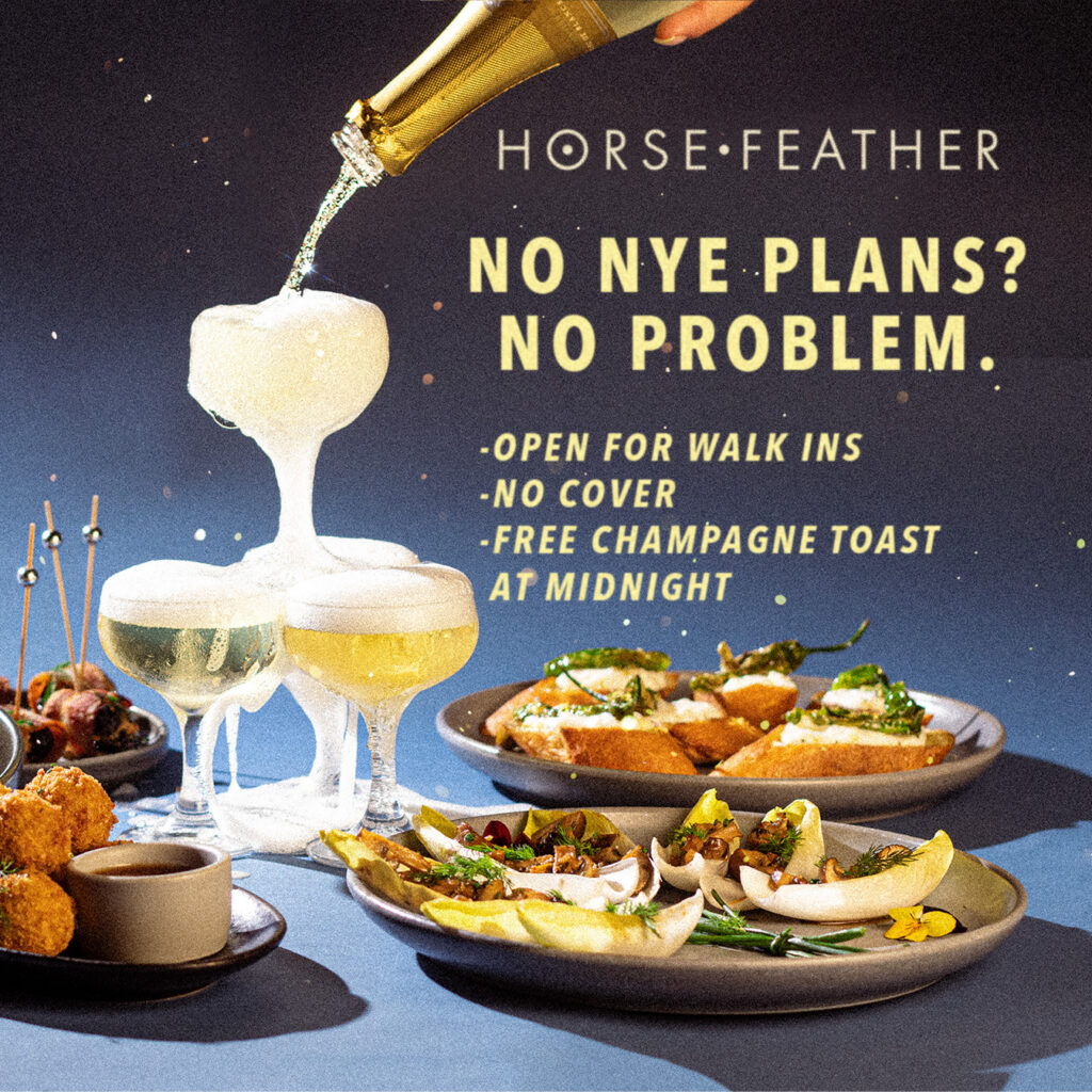
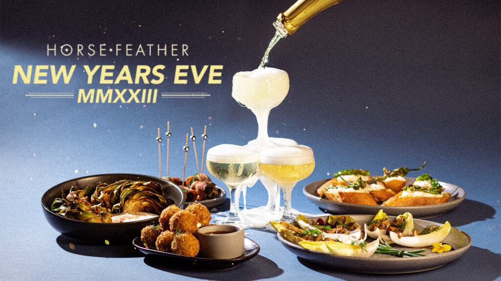
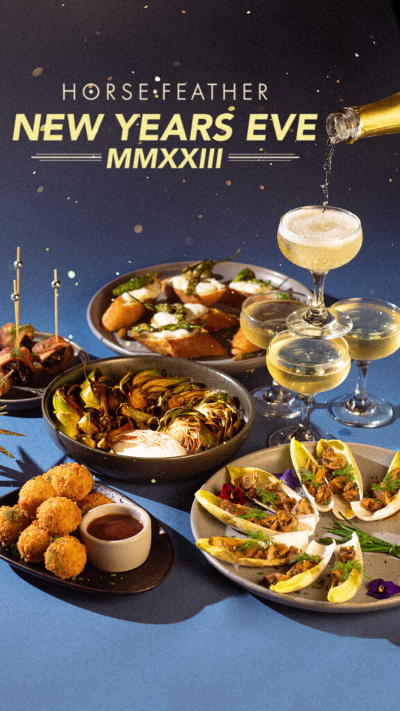
NYE
Three years of New Year’s Eve campaigns: print flyers in multiple sizes, Instagram story and grid posts, Eventbrite banners in standard and “Book Now” variants, and website banners. The 2022 campaign included an animated story post.
2022
2023
2024