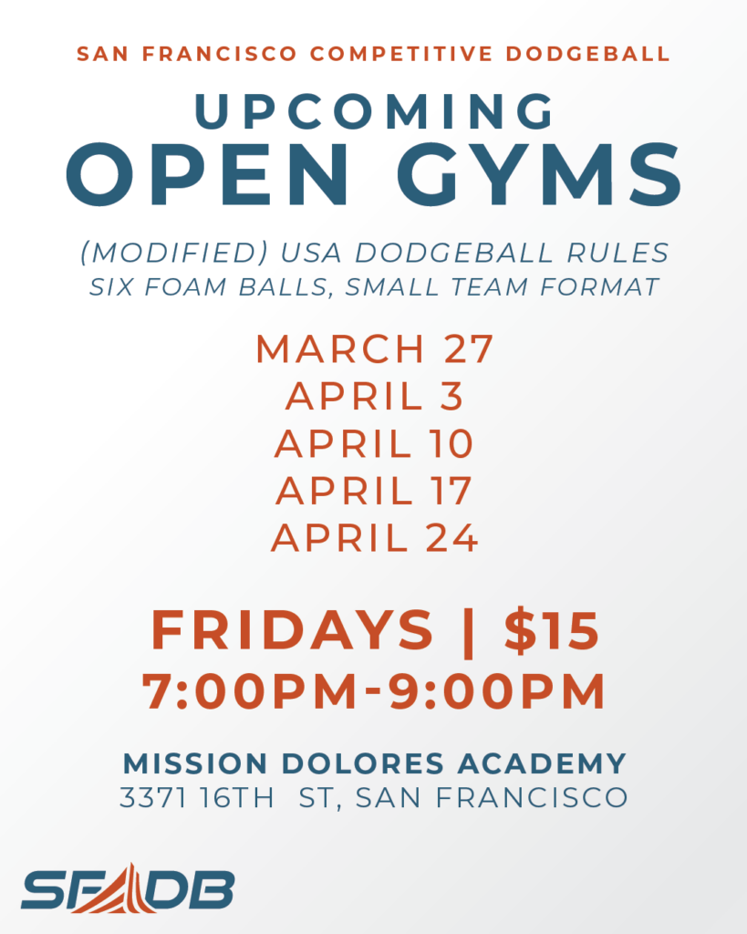
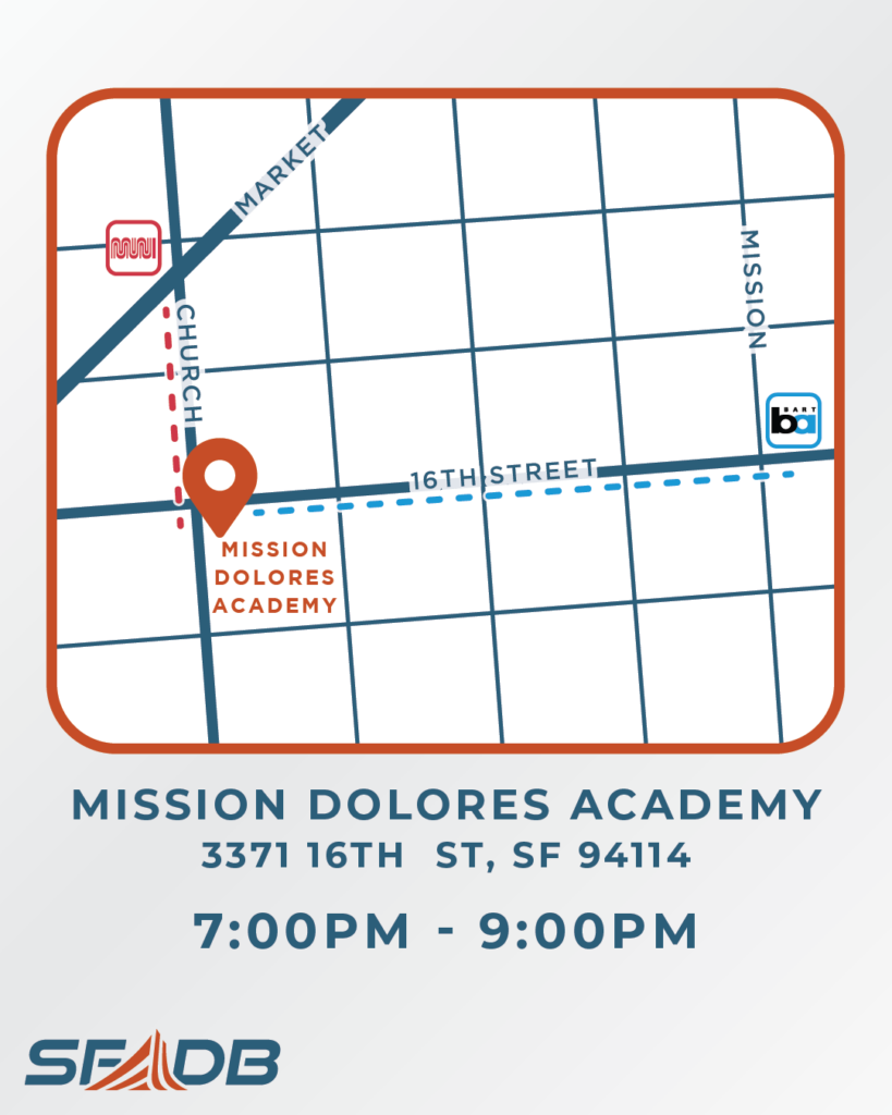
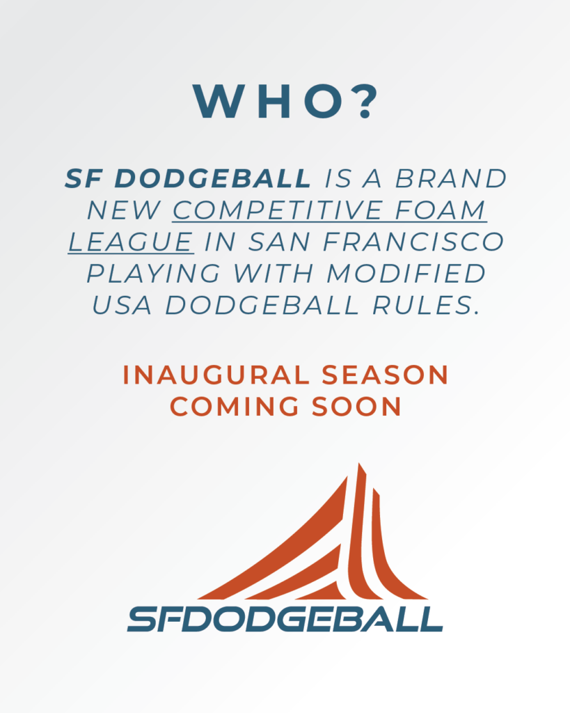
A friend was launching SF’s first competitive foam dodgeball league and needed a visual identity that could do a few things at once: look legitimate enough to attract serious players, be approachable enough for people who hadn’t played since middle school, and be simple enough that he could run it himself without a design background.
Working from an existing logo mark, I built out the full visual system around it. The palette is navy and rust — athletic without being generic, warm enough to not feel corporate. Typography is condensed all-caps throughout, which keeps the hierarchy clean and gives everything a light retro-sports feel without committing to the bit.
I built the initial asset set in Illustrator — logo, lockups, and a suite of Instagram templates covering league announcements, venue info, and open gym schedules. Once the system was settled, I rebuilt the templates in Canva so he could update dates, add sessions, and post without touching a design file.
Tools
Adobe Illustrator • Canva
Artifacts
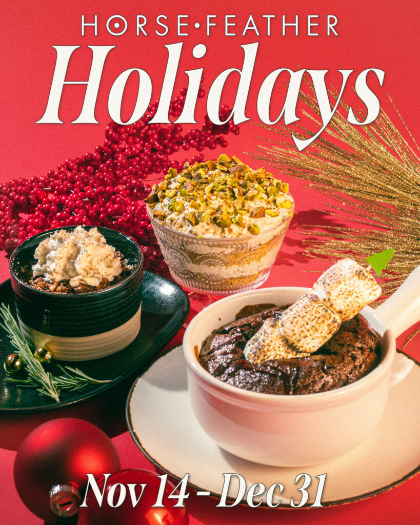
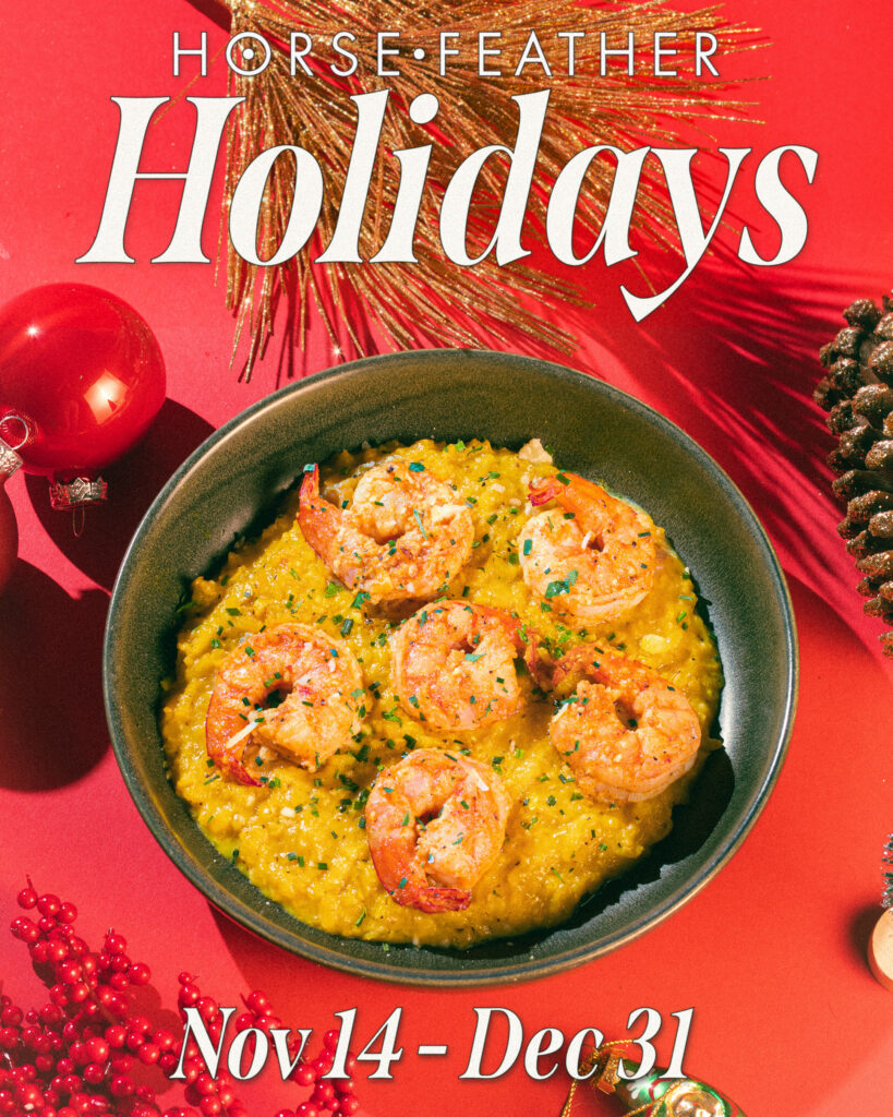
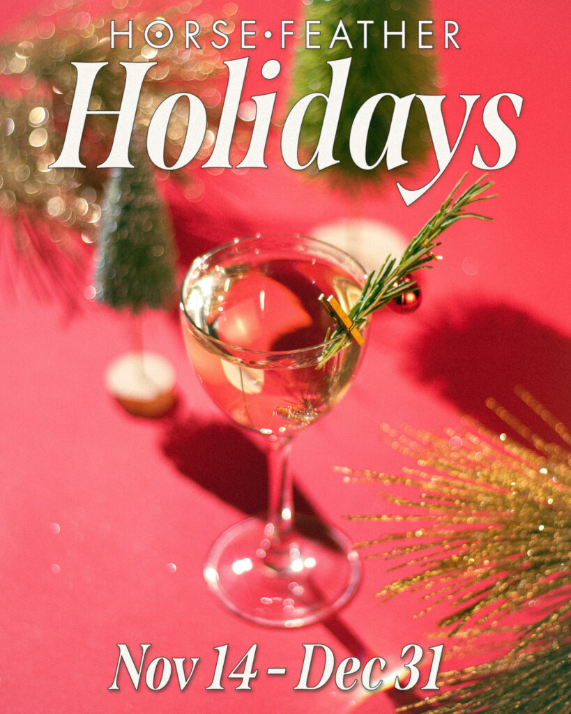
Horsefeather Holidays
Overview
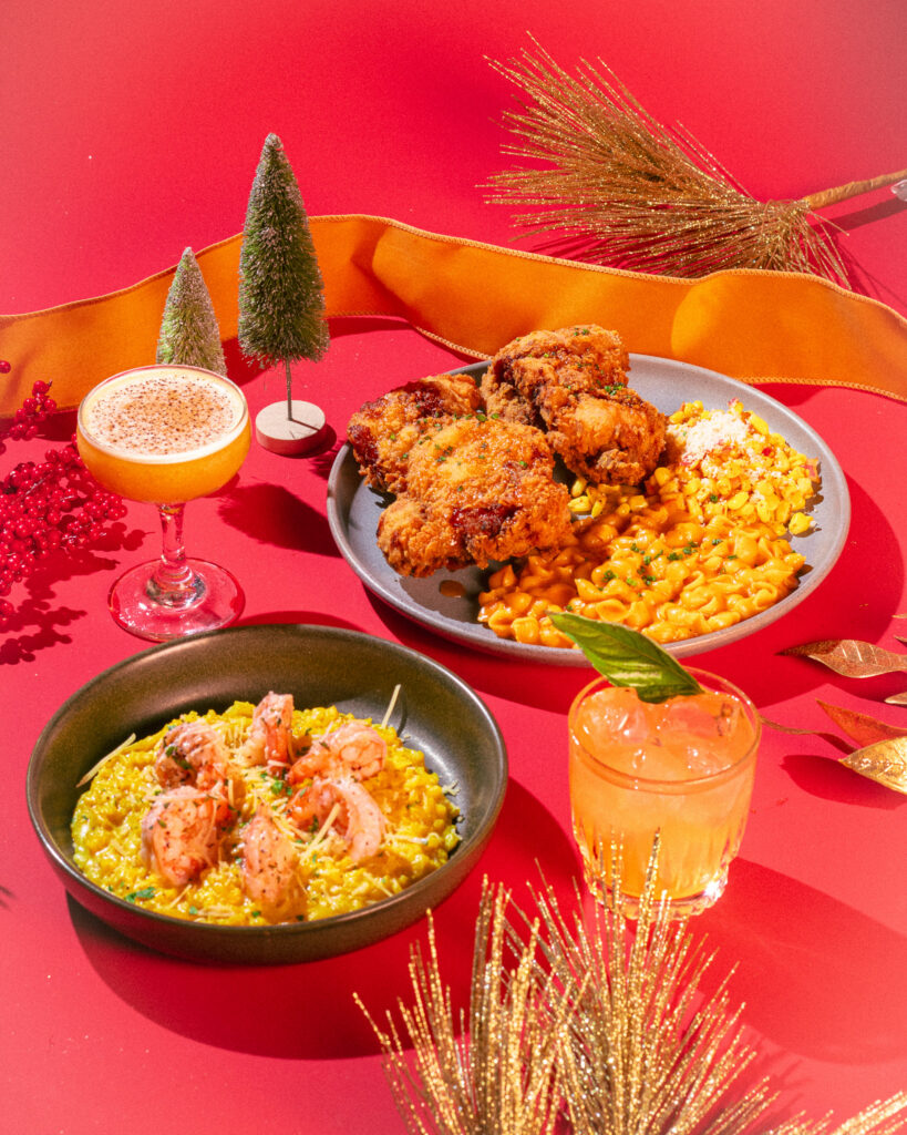
Most bars do Christmas pop-ups the same way: maximum coverage, minimum restraint. Lights everywhere, nonspecific festivity, the holiday as spectacle. It works for some brands. It wasn’t right for Horsefeather.
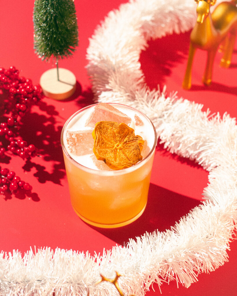
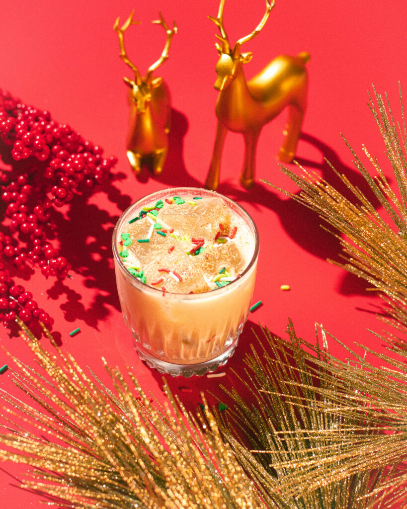
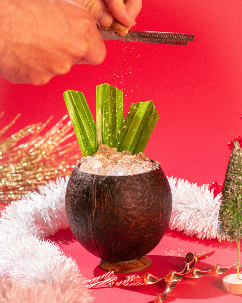
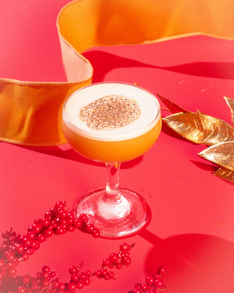
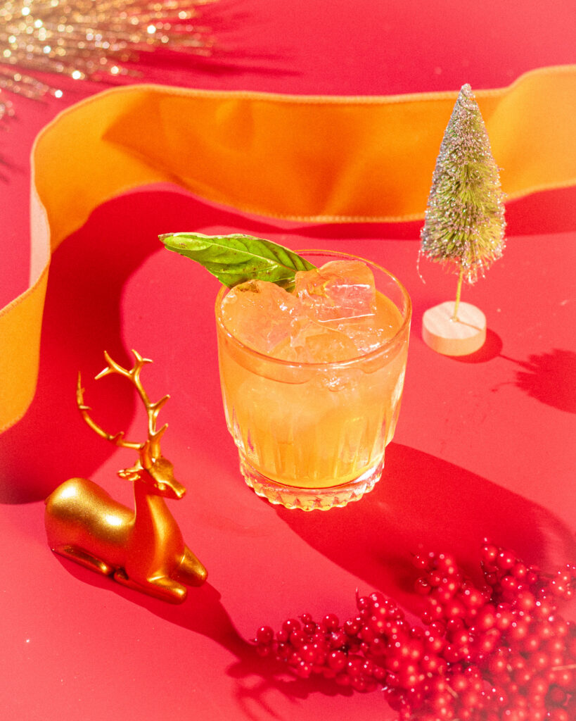
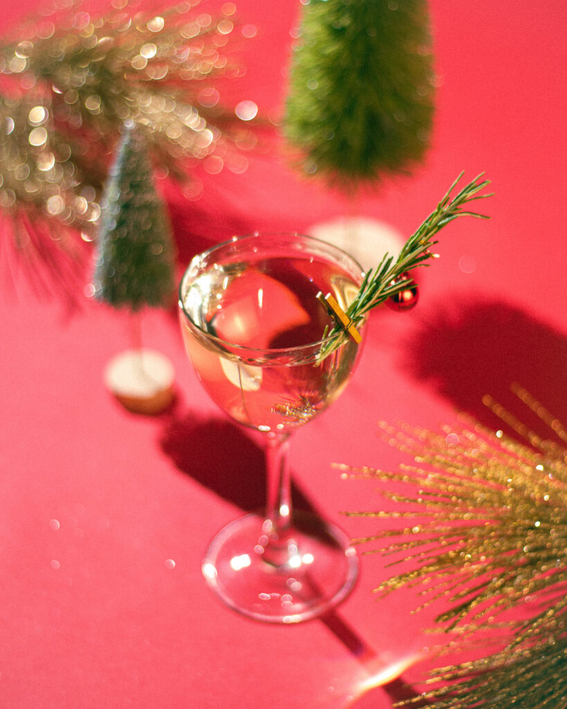
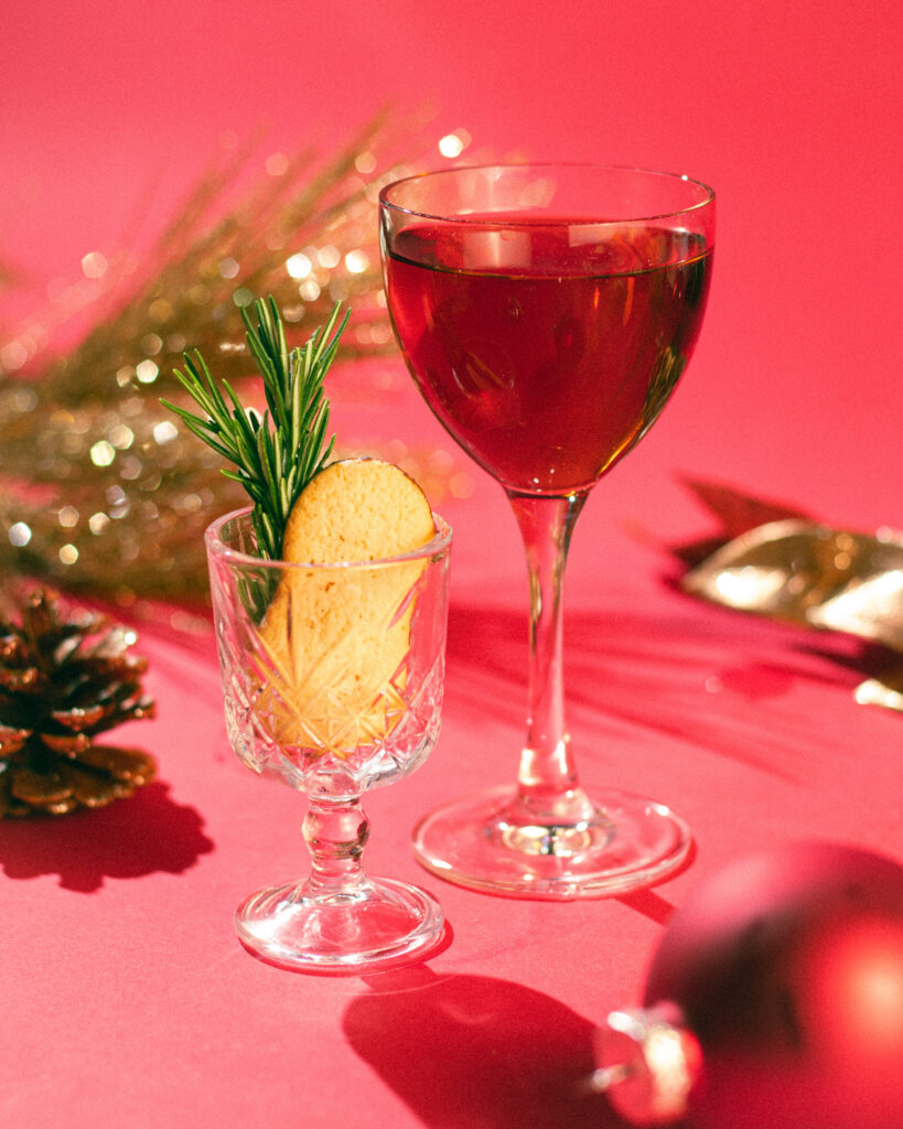
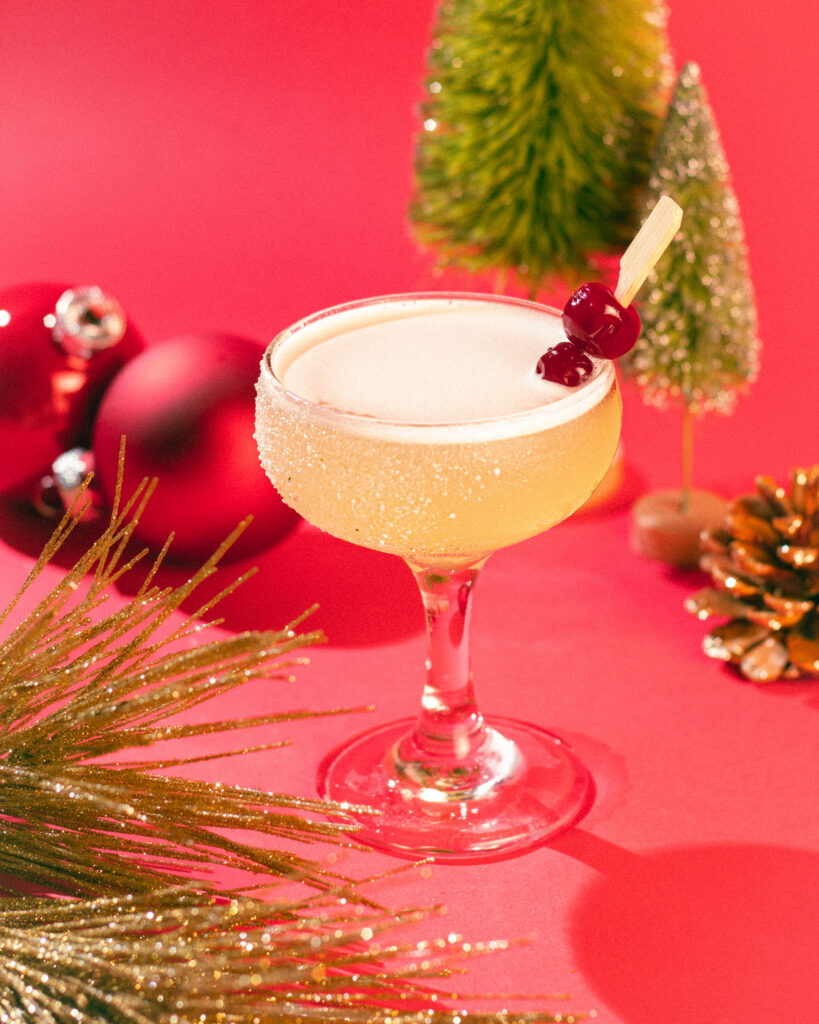
Horsefeather’s identity draws from American Arts and Crafts — warm materials, considered design, nothing gratuitous. Doing the holidays meant finding a version of Christmas that fit that register rather than overriding it. The answer was to go back further: vintage Americana, mid-century catalogs, mid-century music, the kind of Christmas that felt classic before it became kitsch. Nostalgic enough to be festive, restrained enough to stay on-brand.
The goal was a holiday that felt like it belonged to Horsefeather rather than temporarily displacing it.
MY ROLE
Creative Direction · Brand Strategy · Graphic Design · Menu Design · Food & Beverage Photography · Art Direction
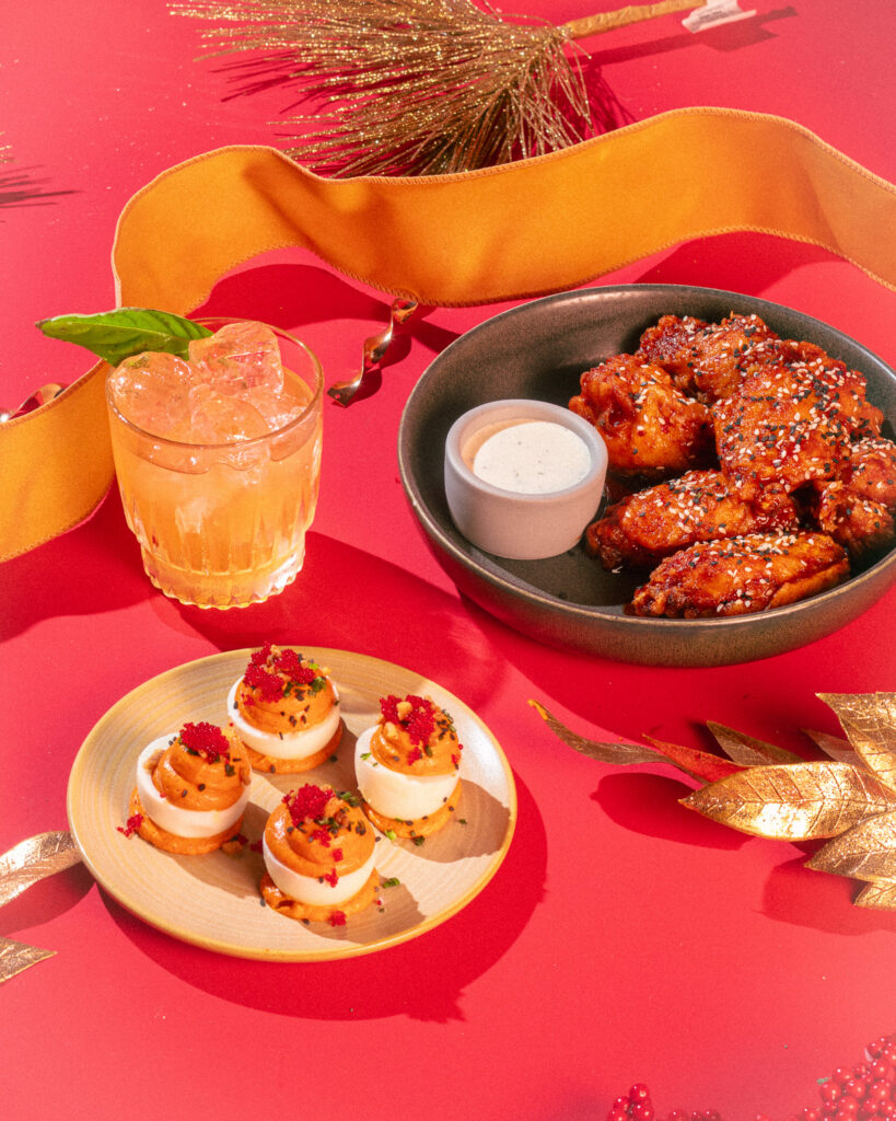
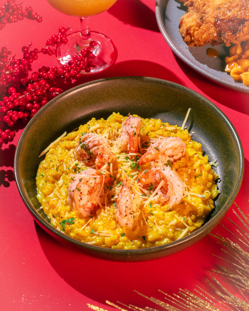
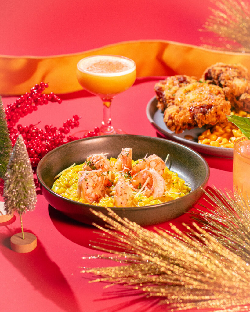
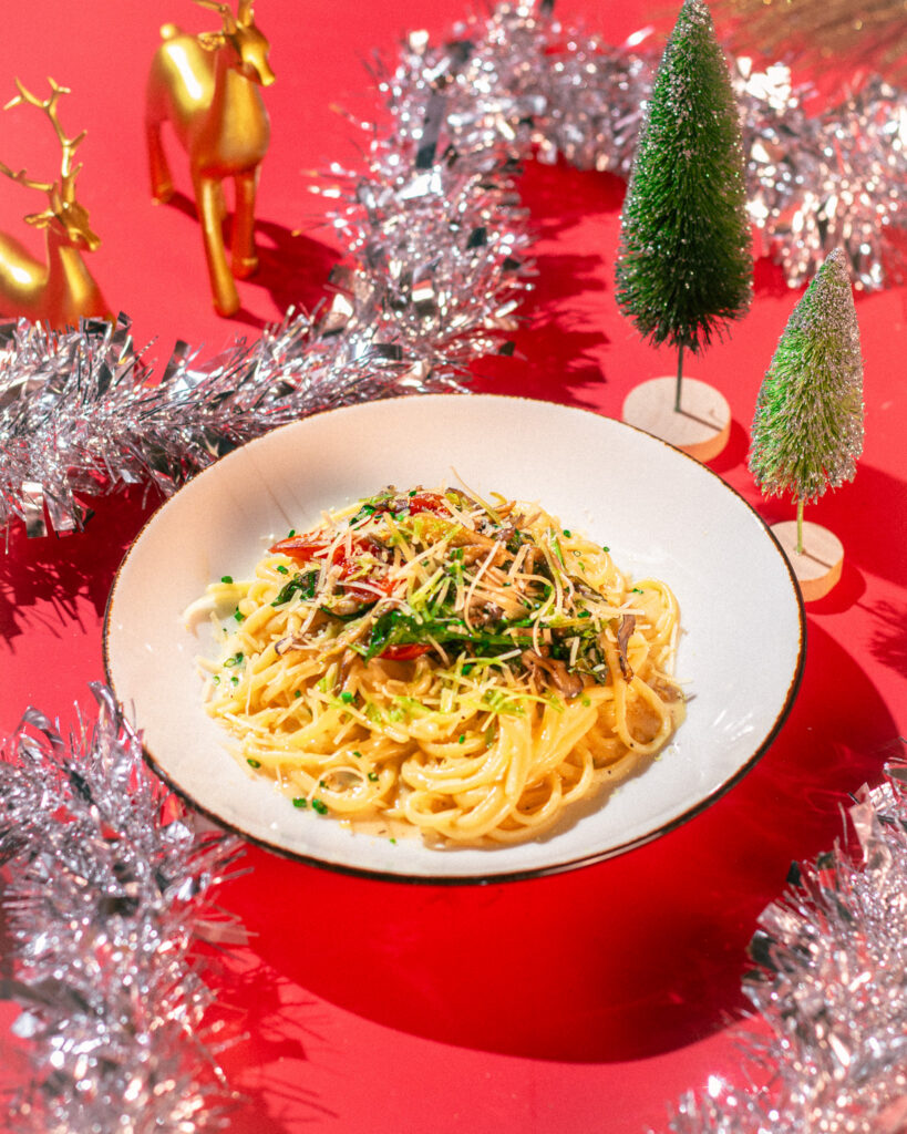
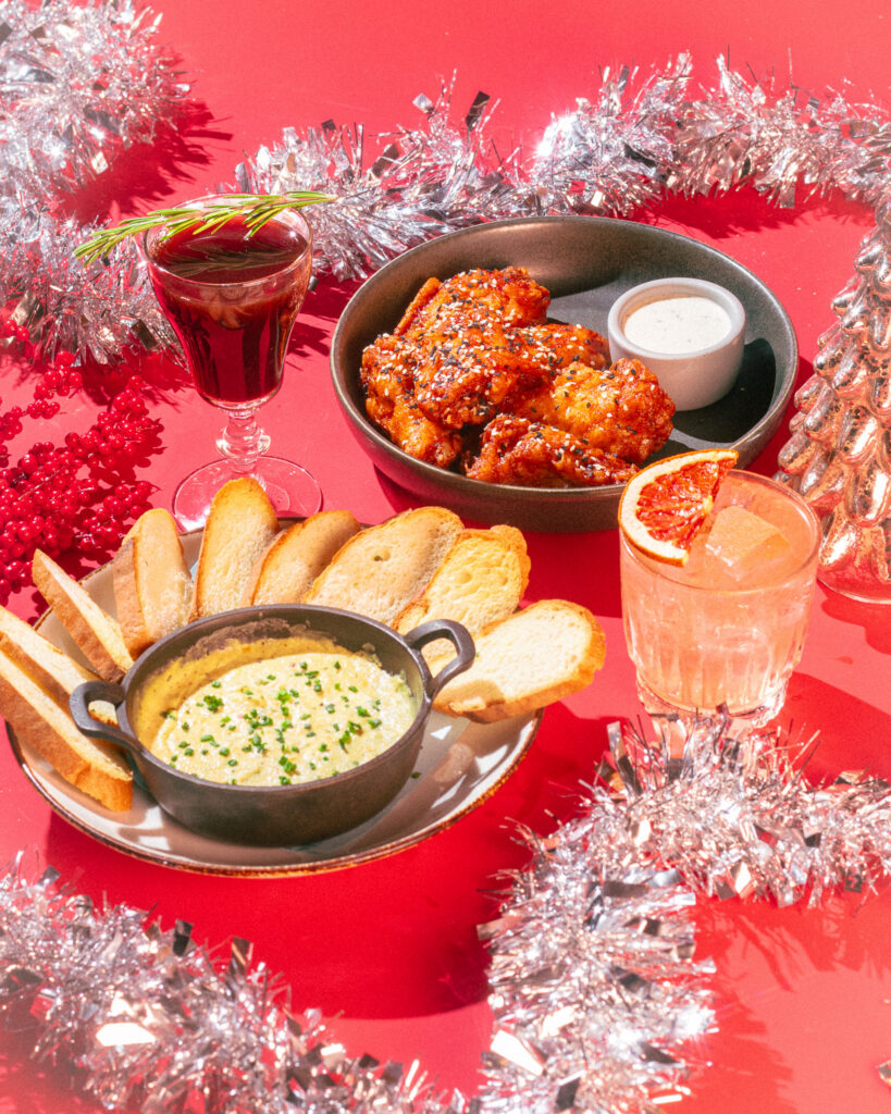
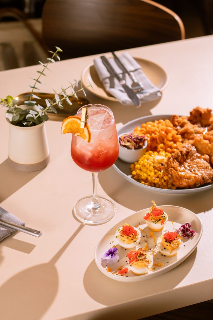
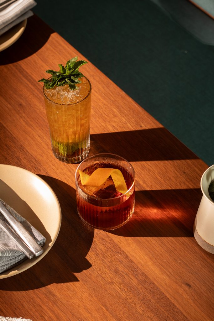
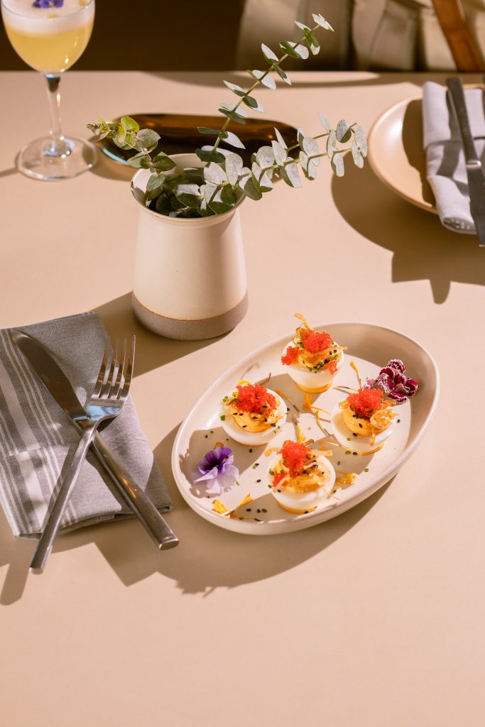
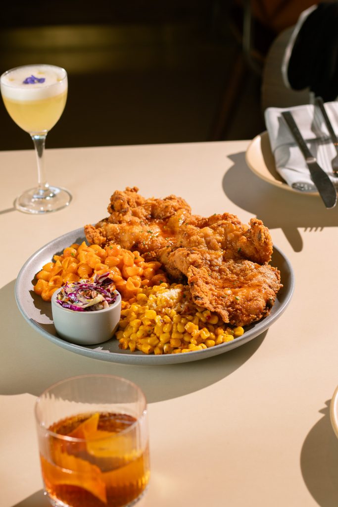
The photography brief followed the same logic. Warm, practical light. Rich textures. Nothing that read as generic holiday stock. The food and beverage program was shot to feel like it could have come from a well-designed catalog from another era — specific, unhurried, a little romantic.
MARKETING ASSETS
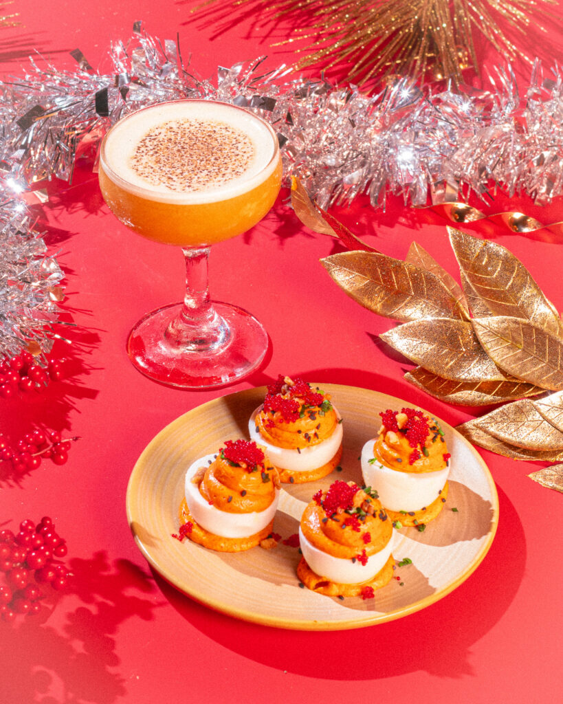
The collateral system extended the same vocabulary across print and digital: the Holiday at the Horse sub-brand identity, seasonal menu updates, Instagram Story Highlights, and social graphics across both locations. Festive without being loud. Recognizably Horsefeather throughout.
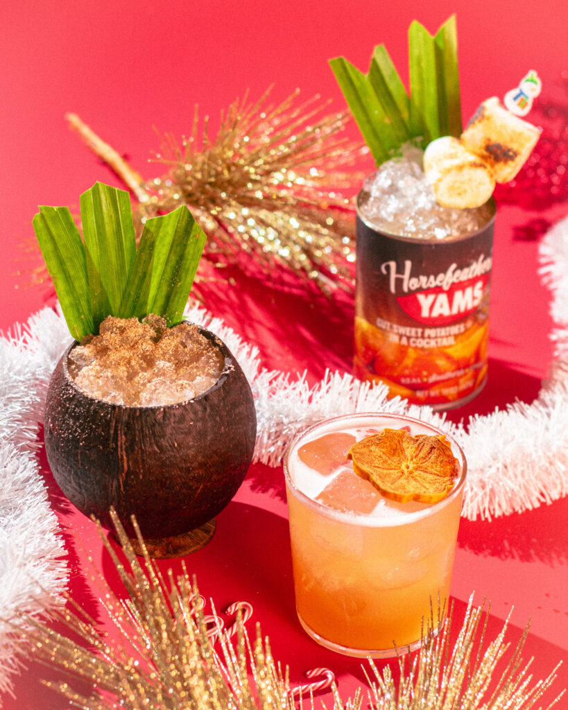
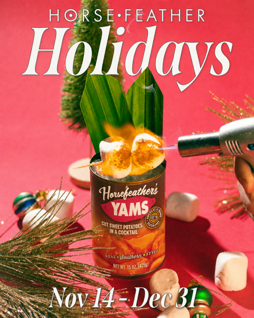
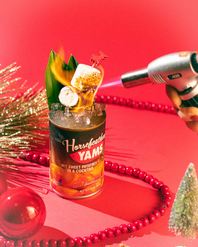
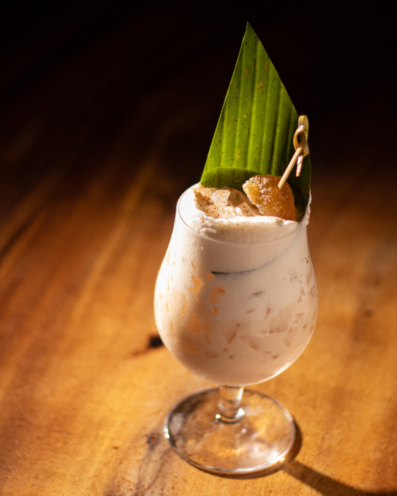
CAN-O-YAMS
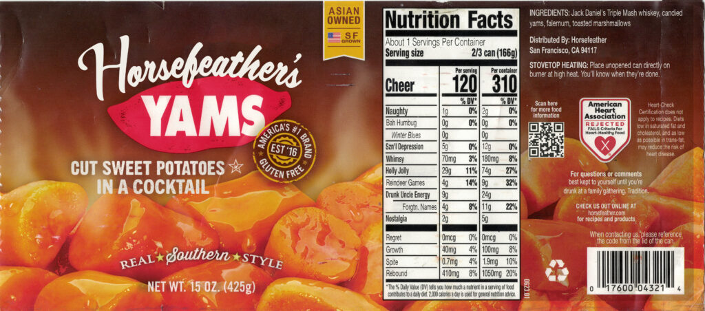
The Horsefeather bar manager had a cocktail concept: Can-O-Yams, served directly from a Bruce’s Yams can. The only problem was practical — the cans couldn’t be washed and reused with the paper label intact. He asked me if I could come up with a solution.
I scanned the original Bruce’s Yams packaging, rebuilt it as a spoof at exact dimensions, and had it printed as a waterproof bumper sticker. Bare cans got the new label. “Horsefeather’s Yams.” Distributed by Horsefeather, San Francisco, CA 94117. Ingredients: Jack Daniel’s Triple Mash whiskey, candied yams, falernum, toasted marshmallows. The nutrition facts track Cheer, Naughty, Bah Humbug, Drunk Uncle Energy, Spite, Rebound, and Nostalgia. The Heart-Check Certification is prominently rejected. Stovetop heating instructions advise placing the unopened can directly on a burner at high heat — “You’ll know when they’re done.”
The cocktail has come back every holiday season since. So has the can.
Horsefeather – Brand & Creative
Overview
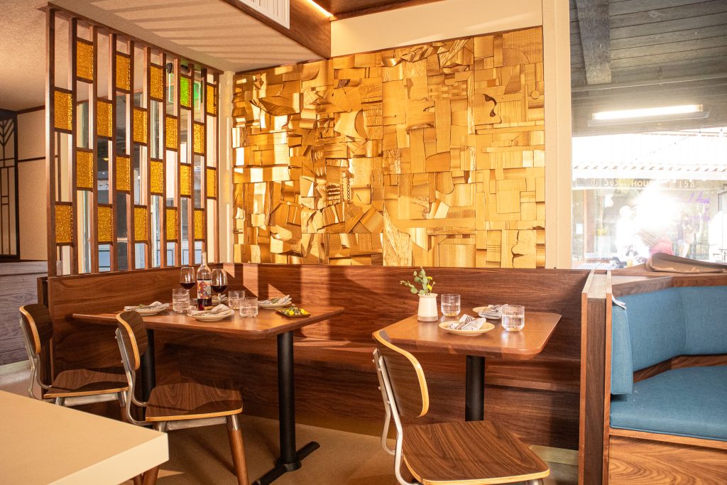
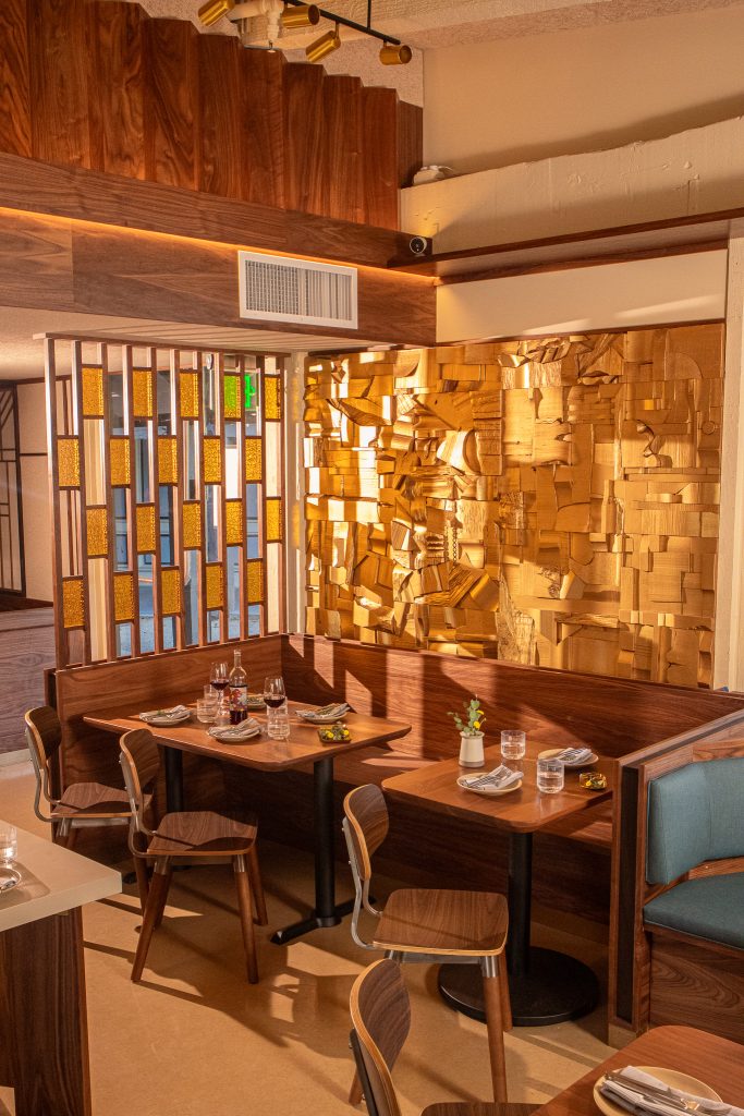
Horsefeather’s visual identity was already established when I came on. The job was sustaining it, extending it, and adapting it across every new format, season, and location the brand required. The register is warm, refined, and approachable: good materials, clean typography, nothing overworked. It runs on a completely different frequency than Last Rites, and keeping both distinct while producing them from the same role was the ongoing reality of the work.
Four years in, the scope covers two locations, a full menu suite for each, annual holiday programming under its own sub-brand identity, three years of NYE campaigns, and the full creative and photography package for the Palo Alto opening.
My Roles
Brand Designer and ongoing creative production lead for Horsefeather across both San Francisco and Palo Alto, running concurrently with Last Rites. Two brands, one person, zero crossover — Last Rites is pulp adventure and vintage horror; Horsefeather is warm, contemporary, and refined. Keeping them visually distinct across the same format types (menus, social graphics, event marketing, photography, print collateral) for four years is the actual job.
Work spans menu production (seasonal updates, holiday editions, new menu launches, all print-production-ready), cocktail and food photography, in-center signage, private events sales collateral, holiday campaign creative, drink tickets, and ongoing social media graphics. The Palo Alto opening also meant building out a new set of brand applications from scratch for a second location with its own audience and context.
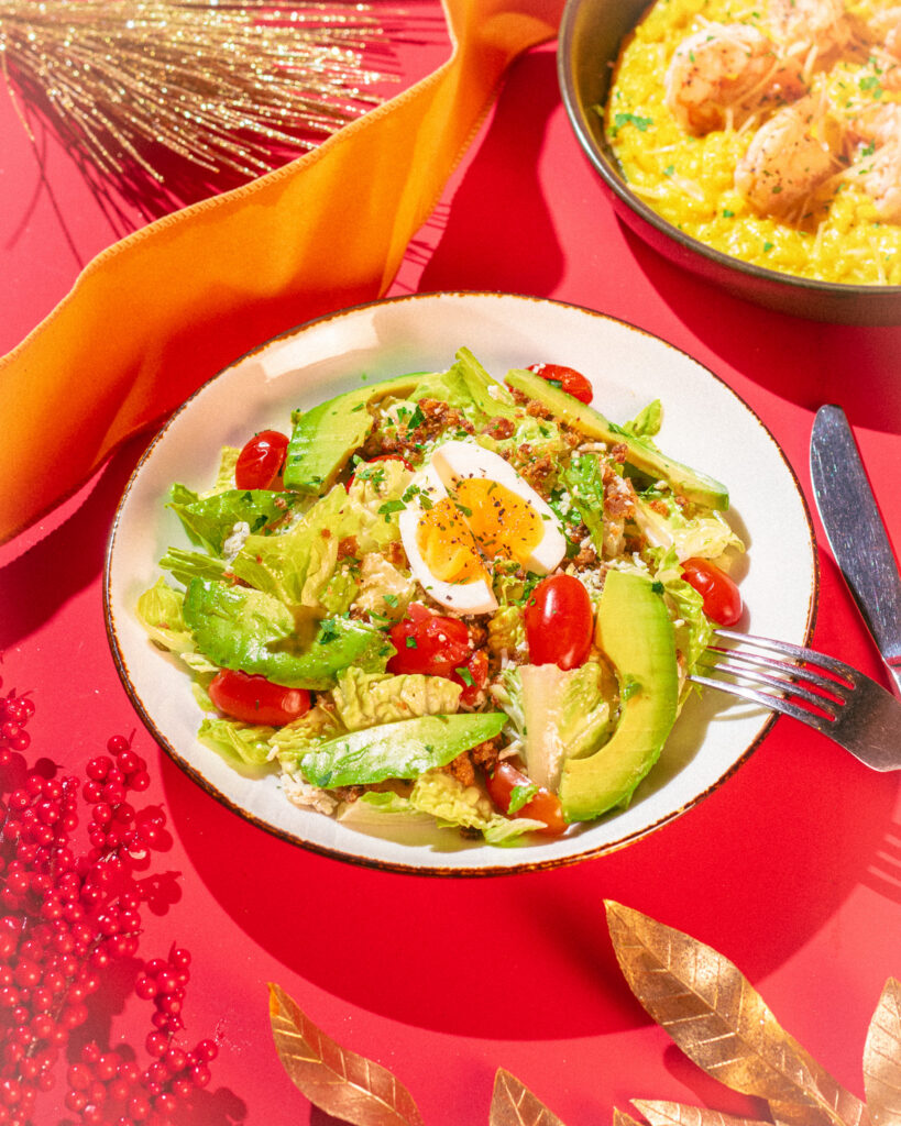
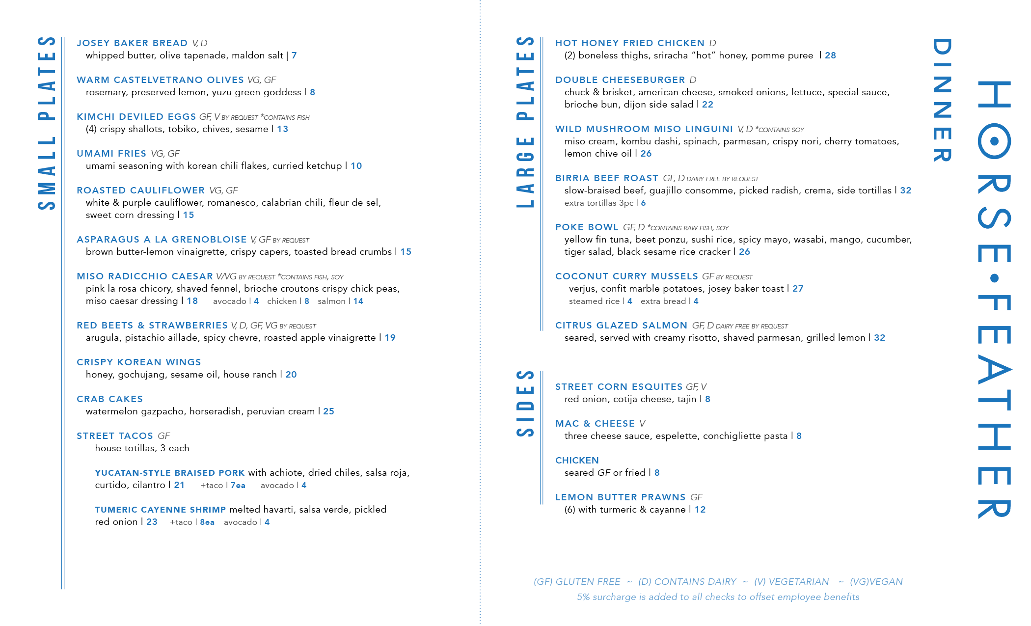
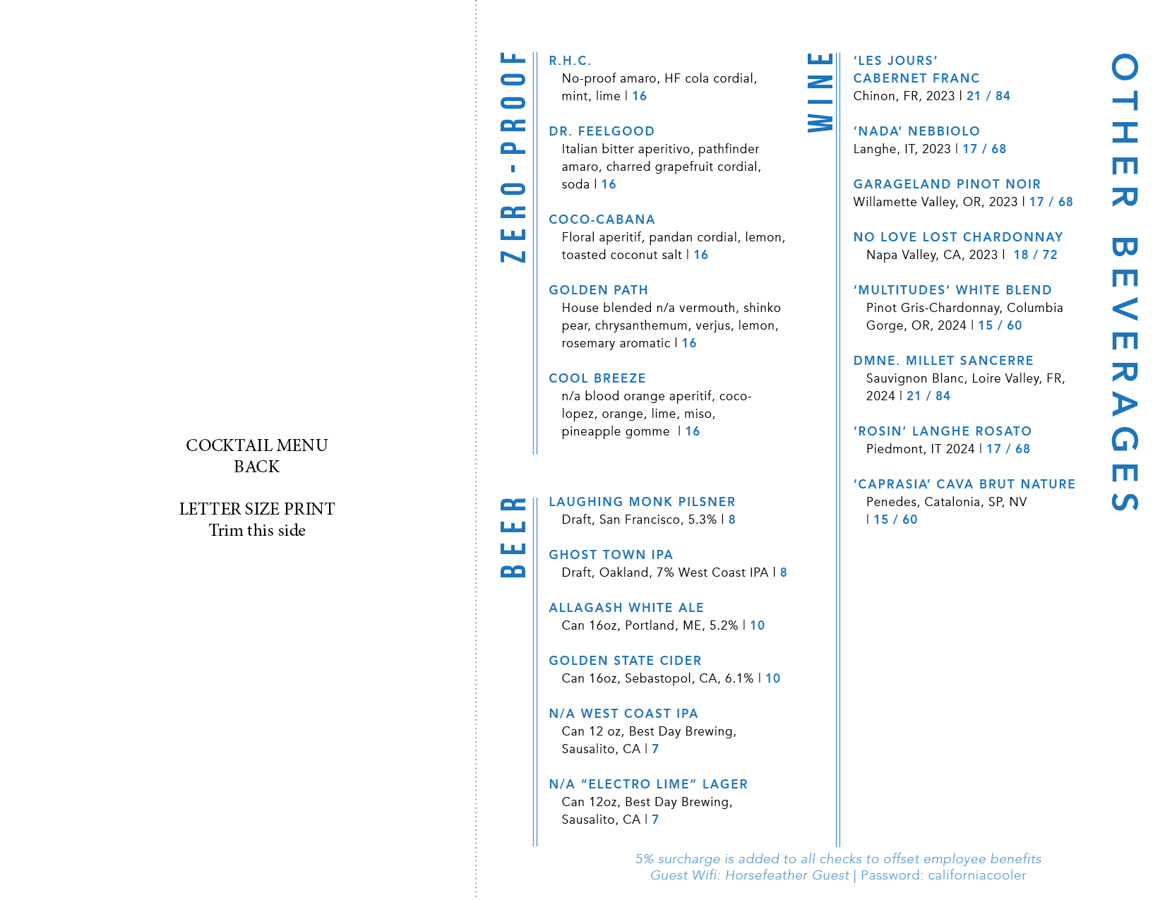
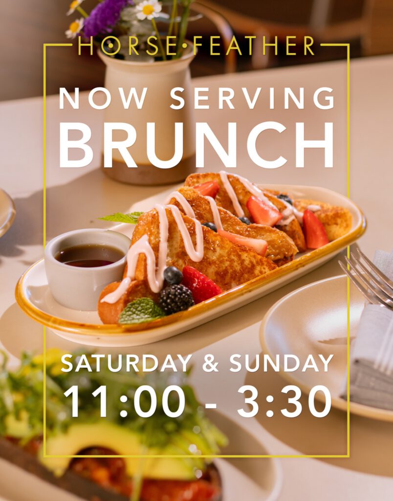
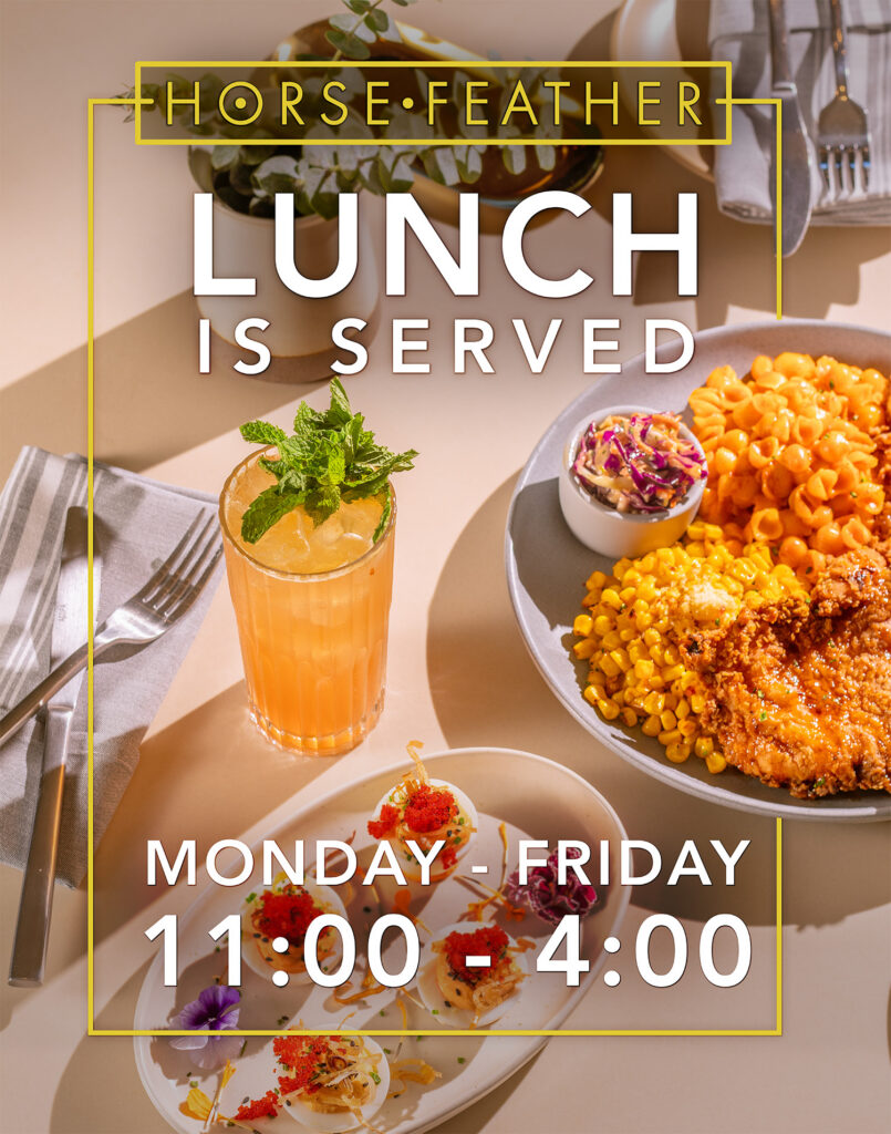
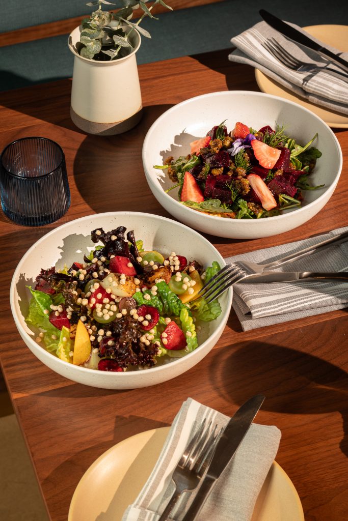
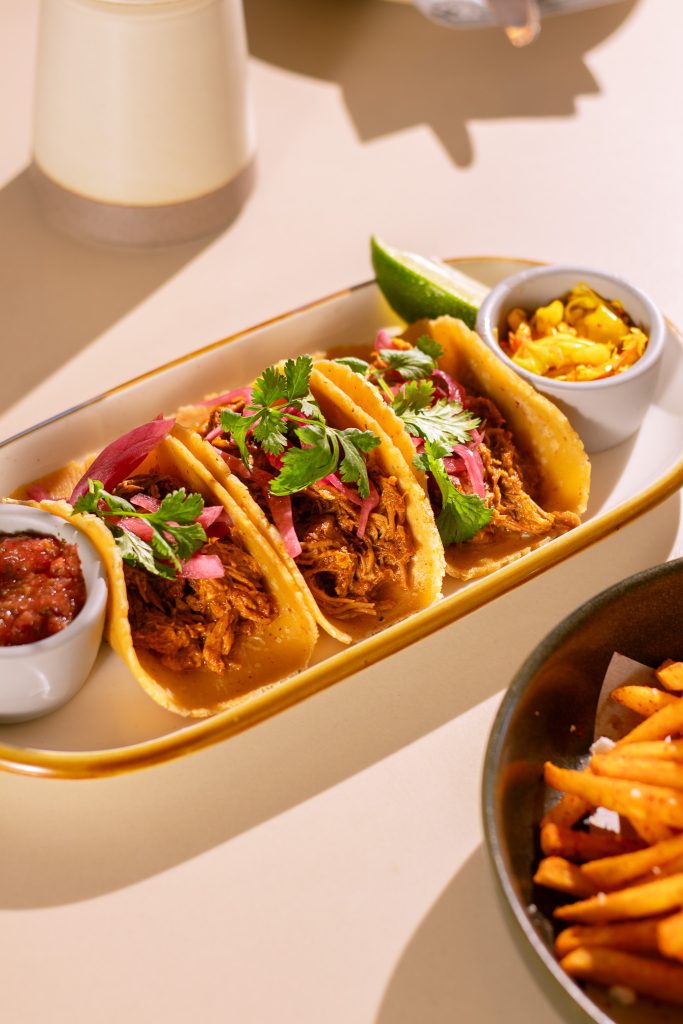
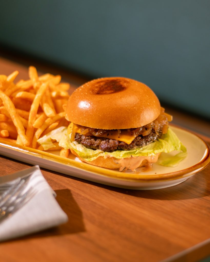
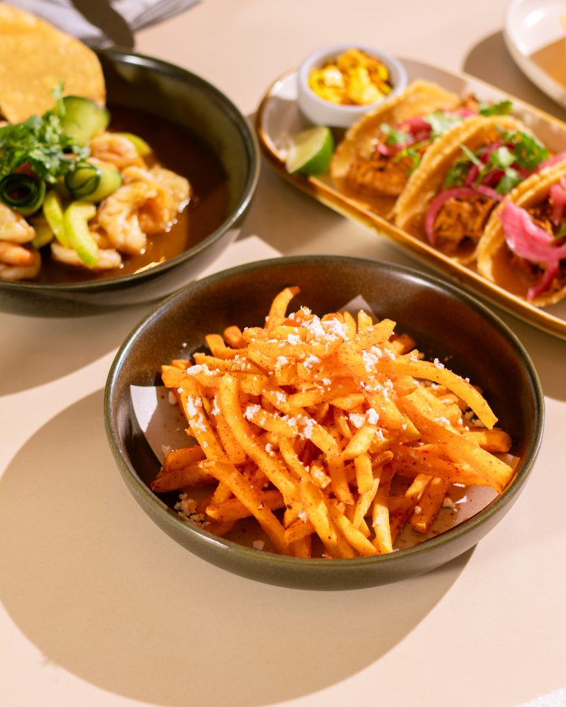
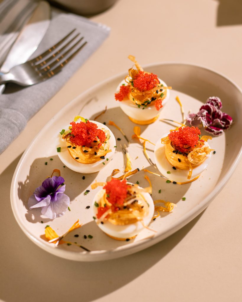
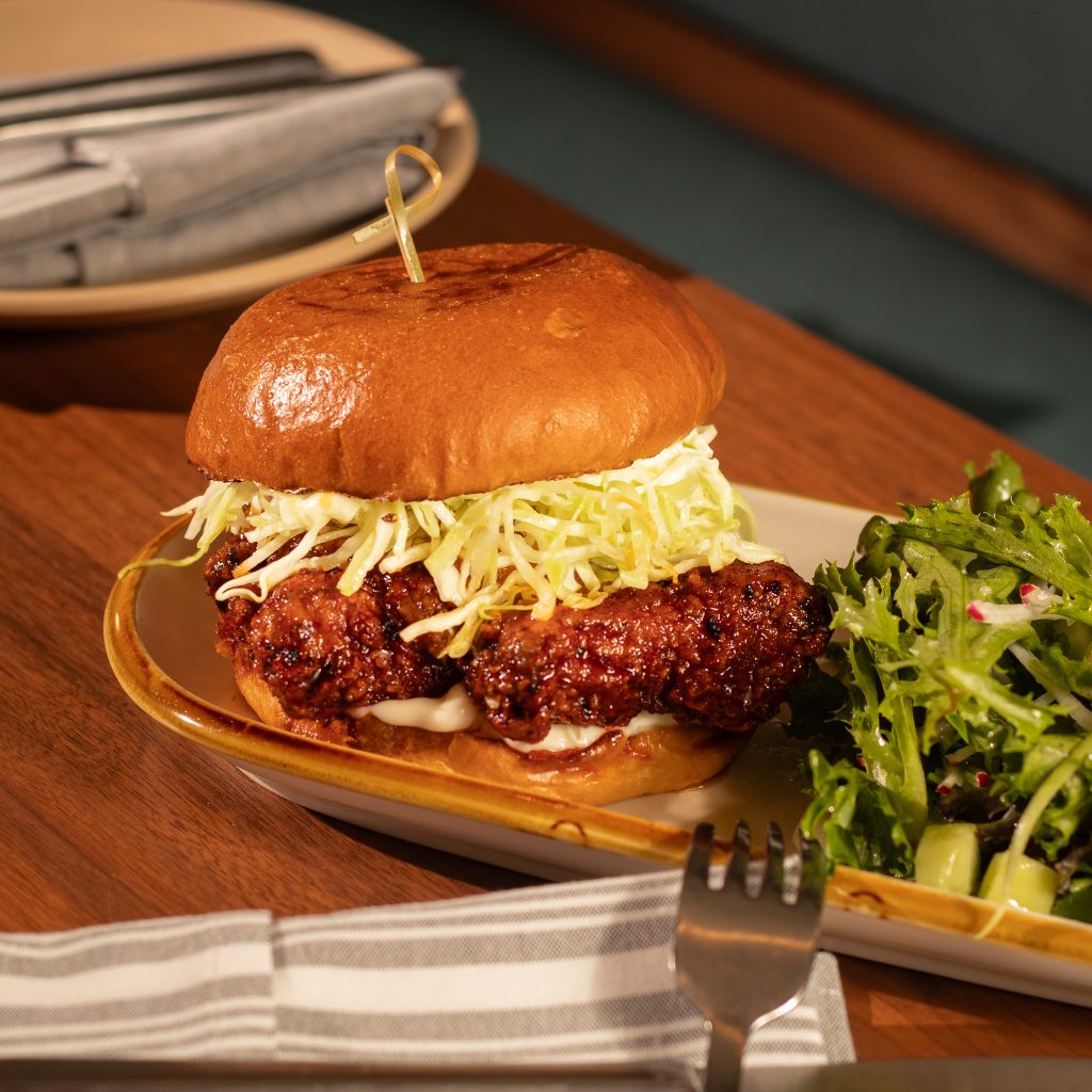
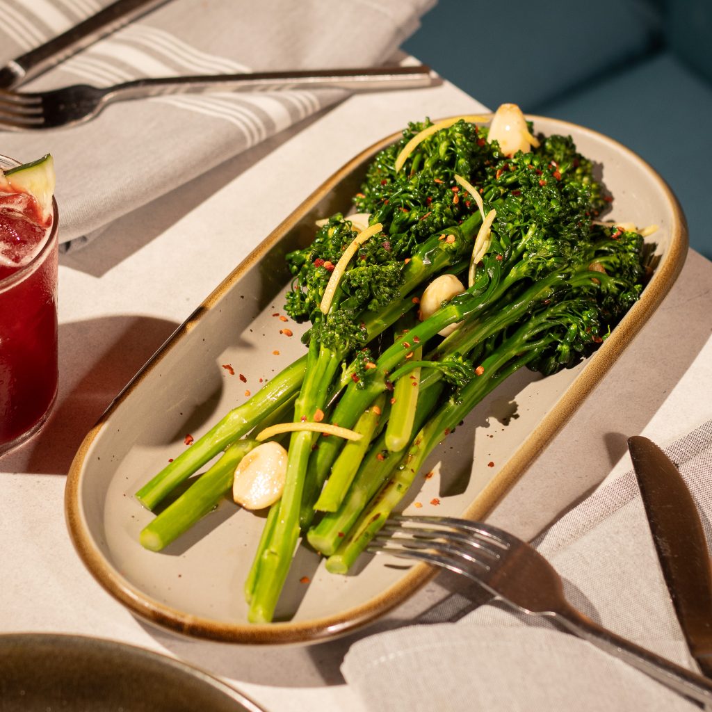
The most consistent body of work is menu production. Both locations run full programs across dinner, brunch, lunch and happy hour, dessert, spirits, seasonal, and private events — each built in InDesign, each updated on a rolling cycle, each print-production-ready.
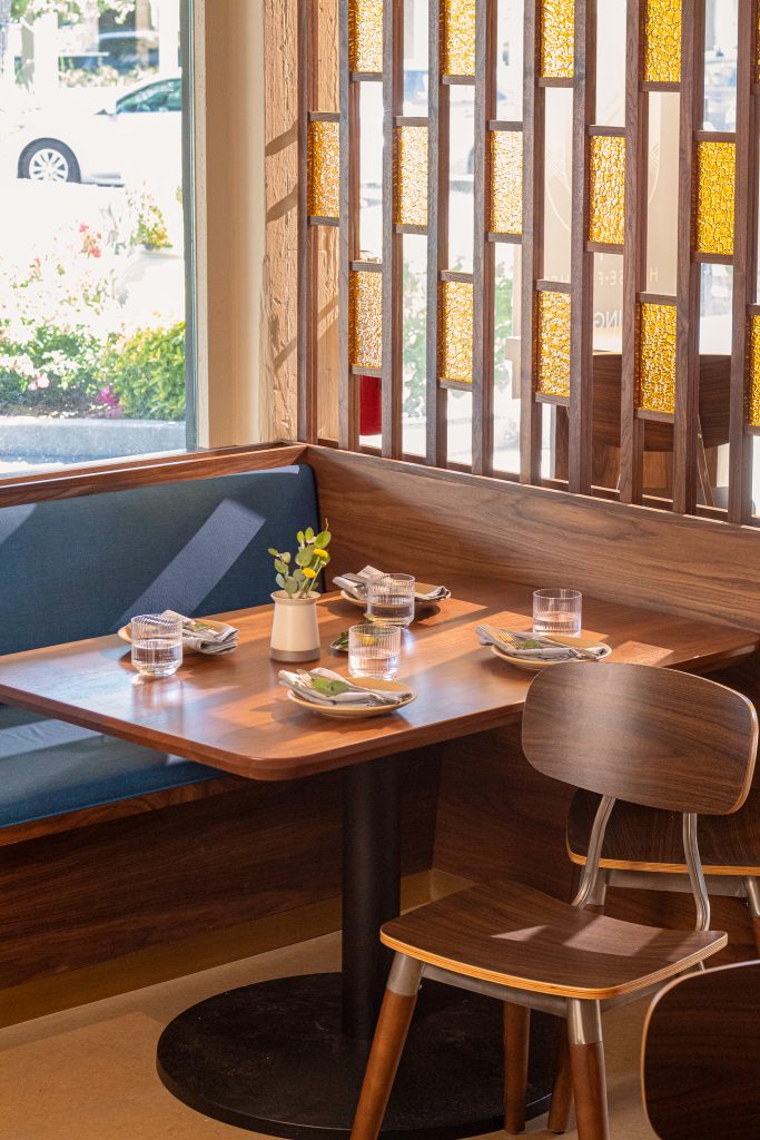
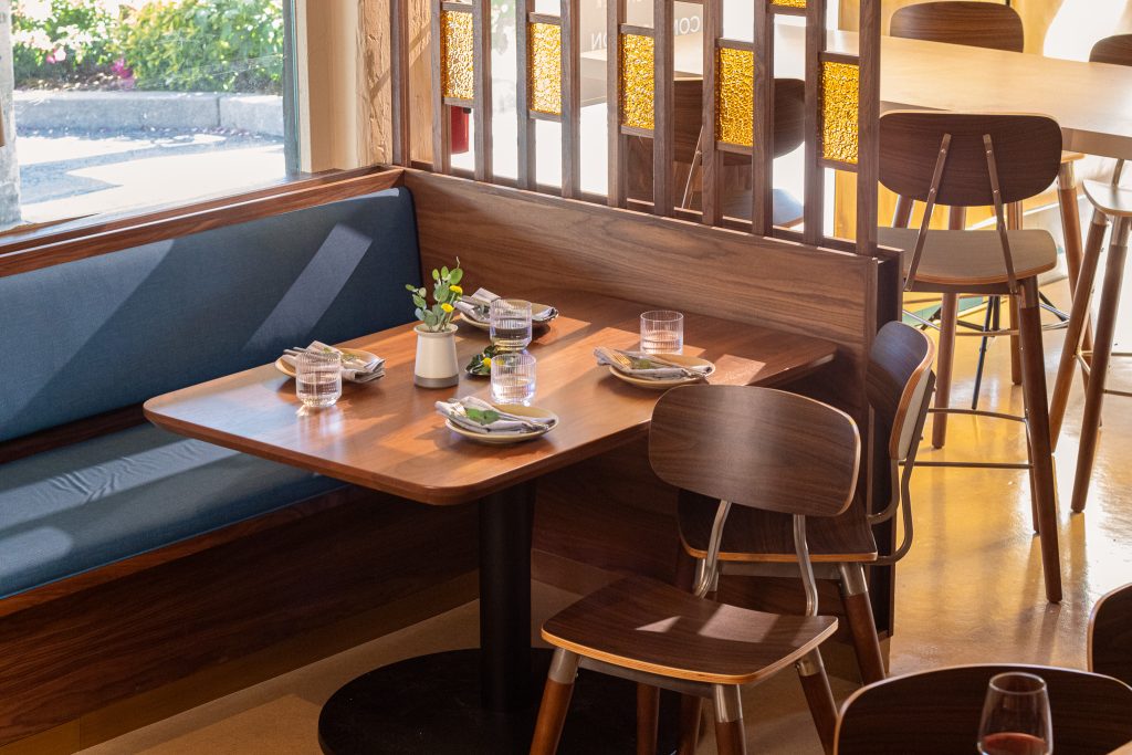
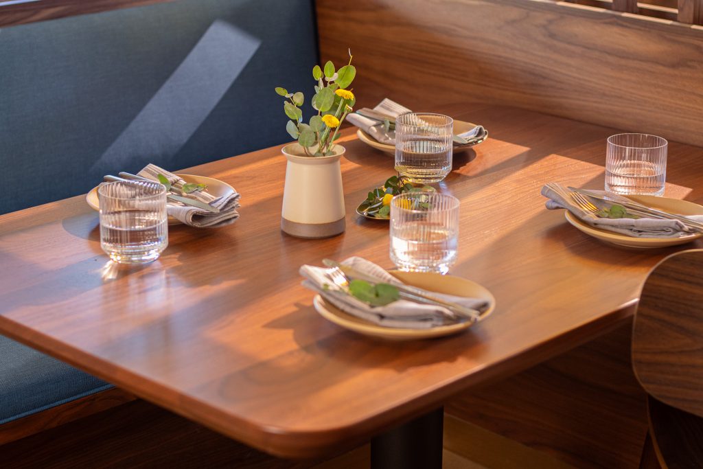
The Palo Alto location added a complete second suite when it opened in 2025. Adapting the design language to the new space meant preserving the warmth of the original while letting the cleaner, more contemporary interior inform the execution.
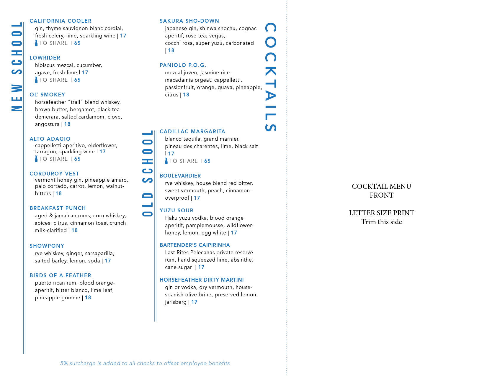
This menu is printed on cream colored legal 8.5×11 paper, and folds off-center to leave the HORSEFEATHER type peaking out from under the front flap with the logo. The cocktail menu is printed onto 8.5×11 and trimmed down so that it nests perfectly inside of the main dinner menu as an insert.
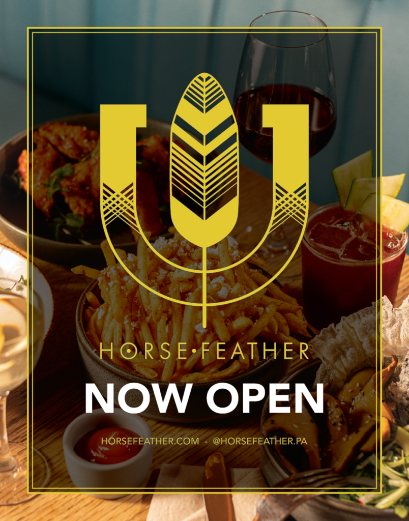
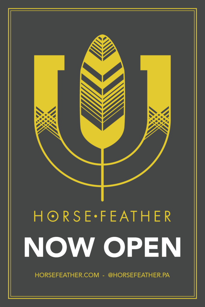
PALO ALTO OPENING
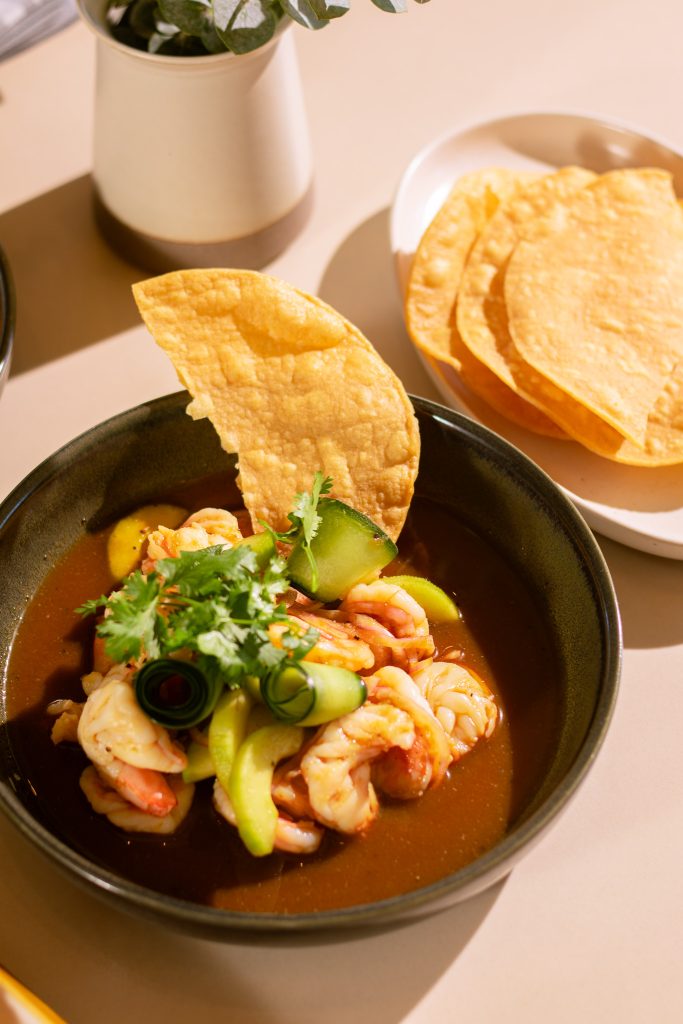
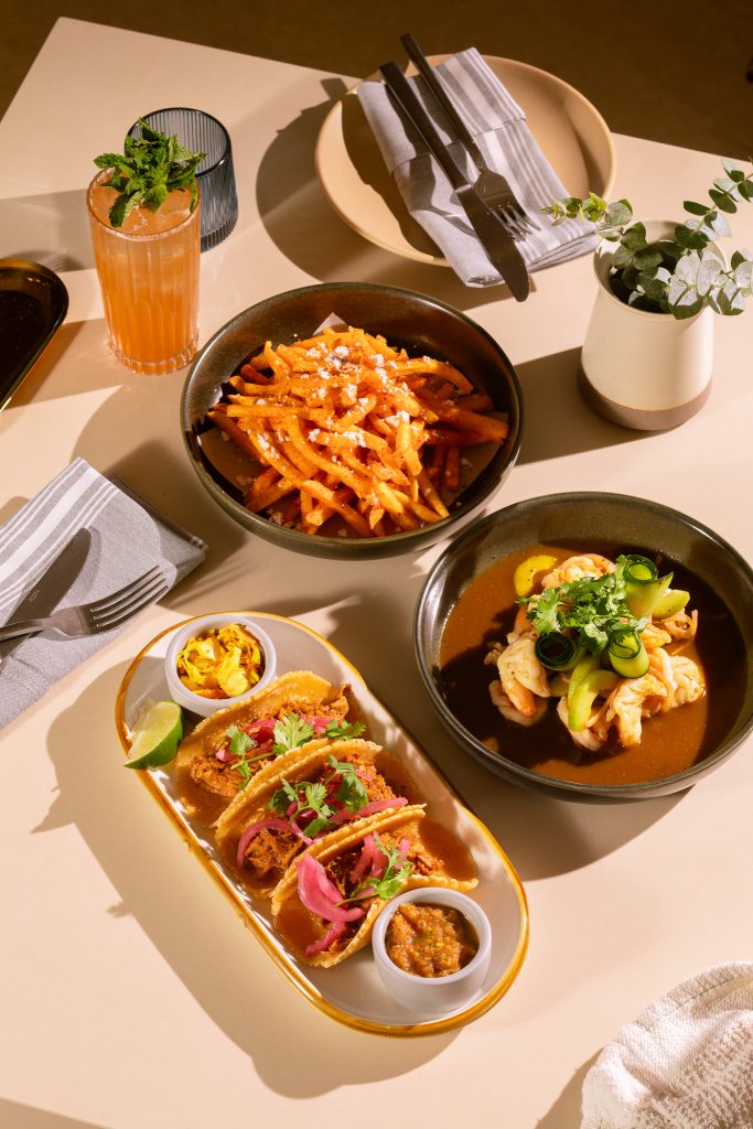
The 2025 Palo Alto opening was the largest single production push. Two sets of press invites — Friends & Family and Media — a Now Open launch poster, brunch and lunch service posters, opening photography, and a full new menu suite, all hitting against a hard launch date.
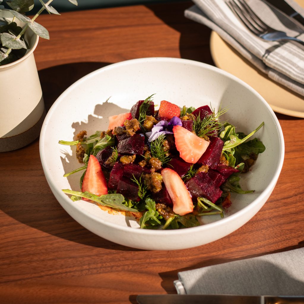
The photography shoot covered the full food and beverage program. The brief was to reflect the Palo Alto space’s cleaner aesthetic while keeping the warmth the brand is known for. Those images now live across the website, menus, and all opening promotional materials.
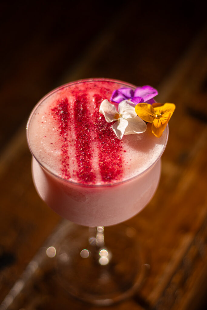
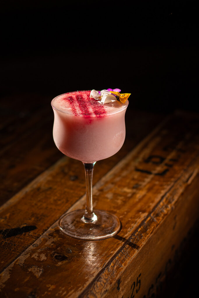
The annual holiday programming runs under its own identity: Holiday at the Horse, with a full collateral system built each year. The campaign covers four content categories, seasonal menu updates, print assets, and social graphics across both locations. I have a separate page for this work.
When Horsefeather opened its Palo Alto location, the surrounding shopping center became a marketing channel. These large-format posters went up around the property to announce the opening and new service offerings — brunch, lunch, hours.
Each poster leads with food photography shot specifically for the campaign. The styling is warm and editorial: natural light, loose compositions, dishes that look like you interrupted someone mid-meal. The design keeps the Horsefeather brand system intact — gold border frames, the wordmark anchoring the top, bold white display type for the key information. Two versions of the opening poster gave us options depending on context: a photography-forward layout for high-traffic areas, and a clean mark-on-charcoal version where the logo needed to carry more weight.
Utilizing my photography. Designed in Adobe Illustrator, Adobe Photoshop.
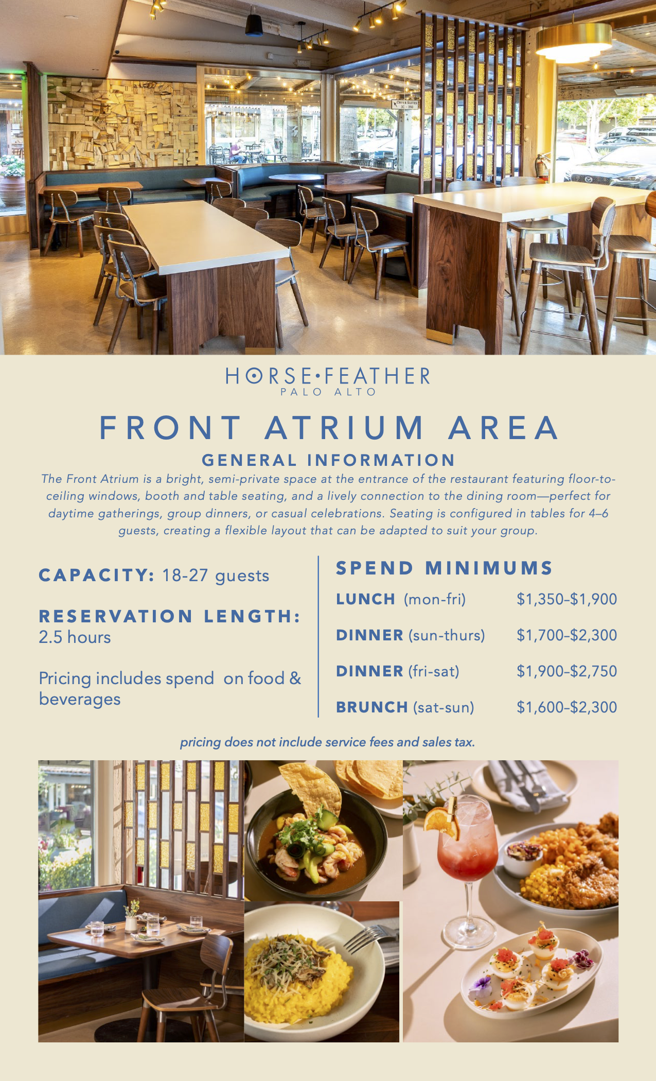
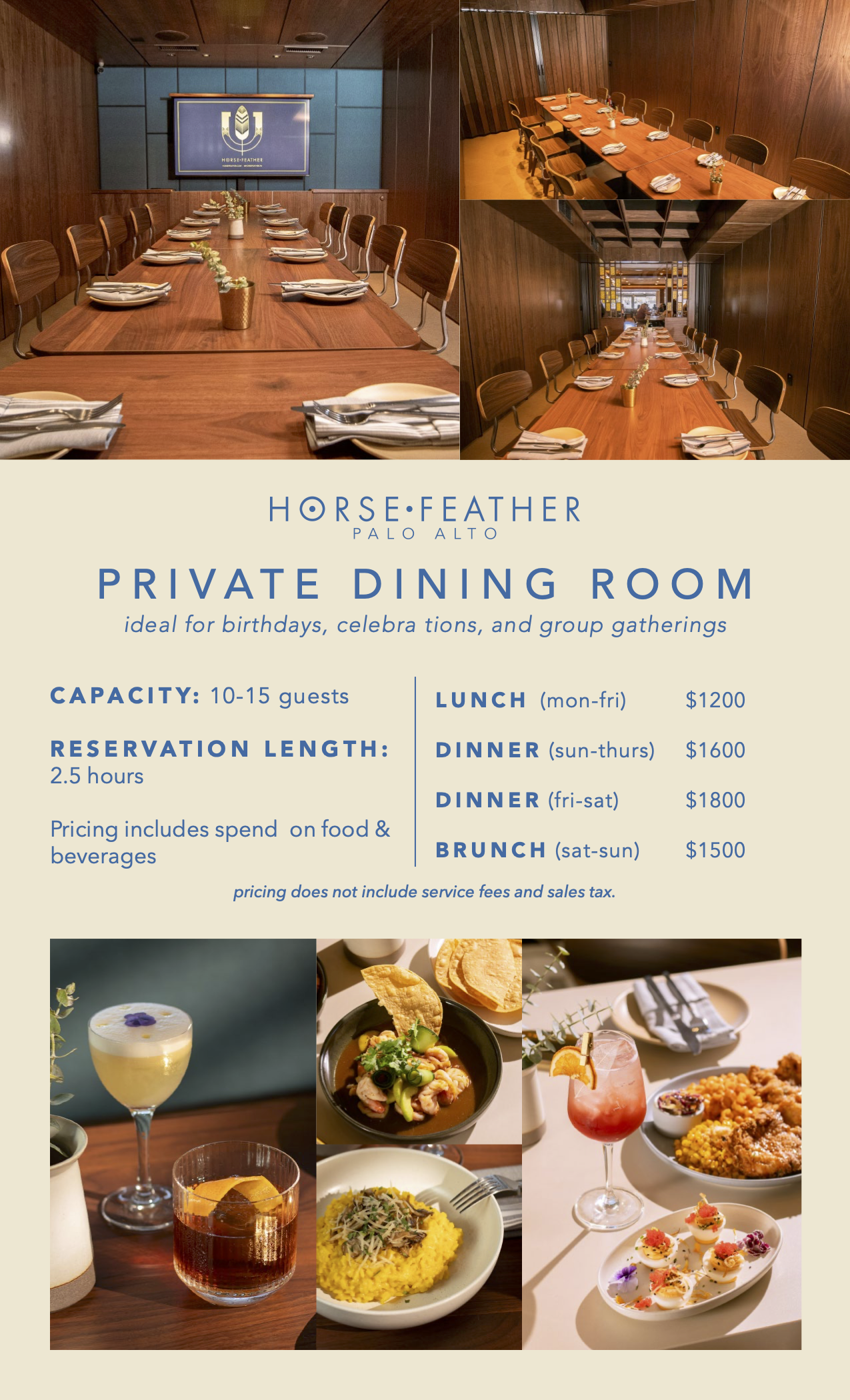
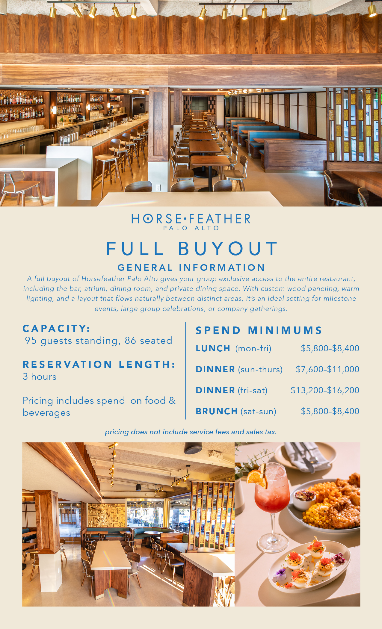
Private Events Collateral
When Horsefeather Palo Alto launched its private dining program, the sales materials needed to do real work — communicate the space clearly, justify the spend minimums, and feel consistent with a brand that has a distinct visual identity.
The photography throughout — the space shots and food — was mine, shot specifically for these documents. The design stays within the Palo Alto brand system: cream field, slate blue headers, spaced tracking on the section titles, the wordmark centered above each document name.
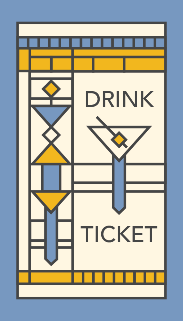
The Horsefeather brand draws from Frank Lloyd Wright’s design vocabulary — geometric ornament, strong grid structure, stained glass color fields. These drink tickets extend that language to a physical takeaway.
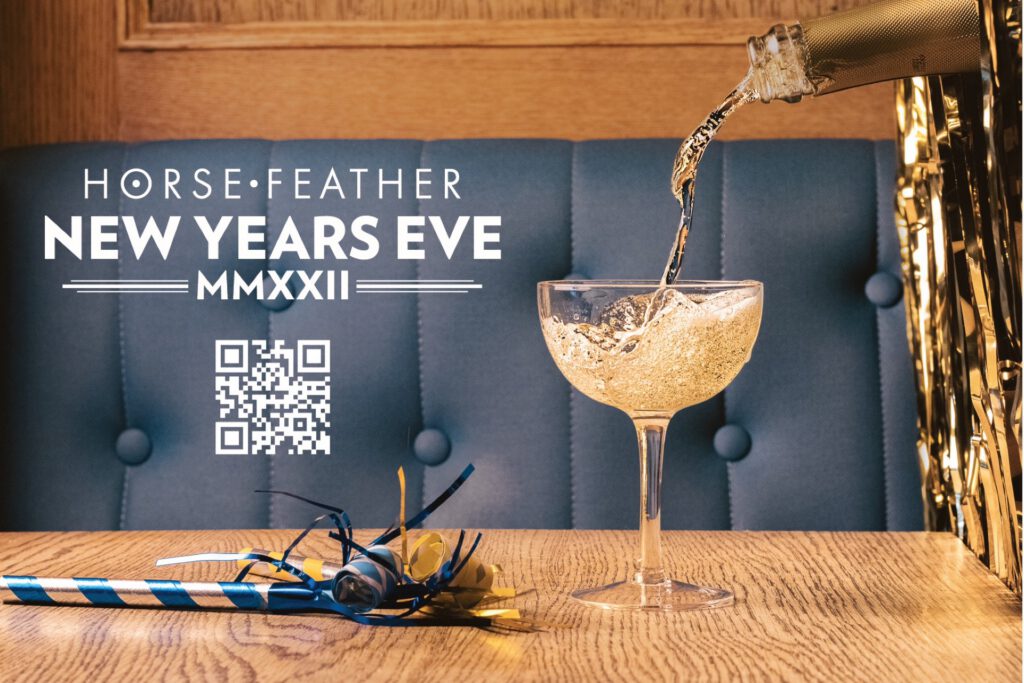
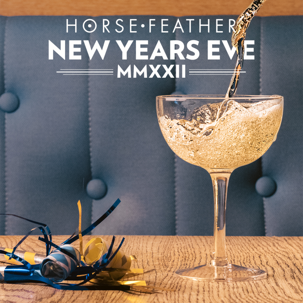
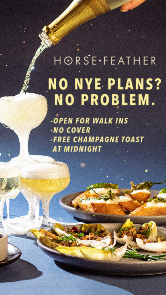
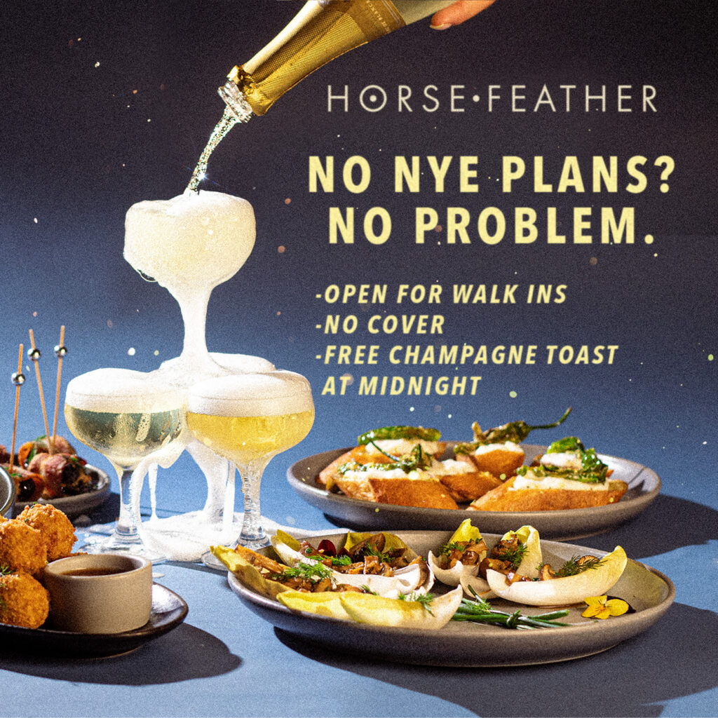
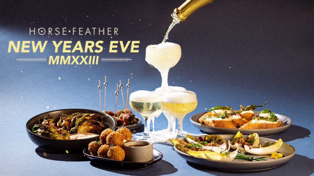
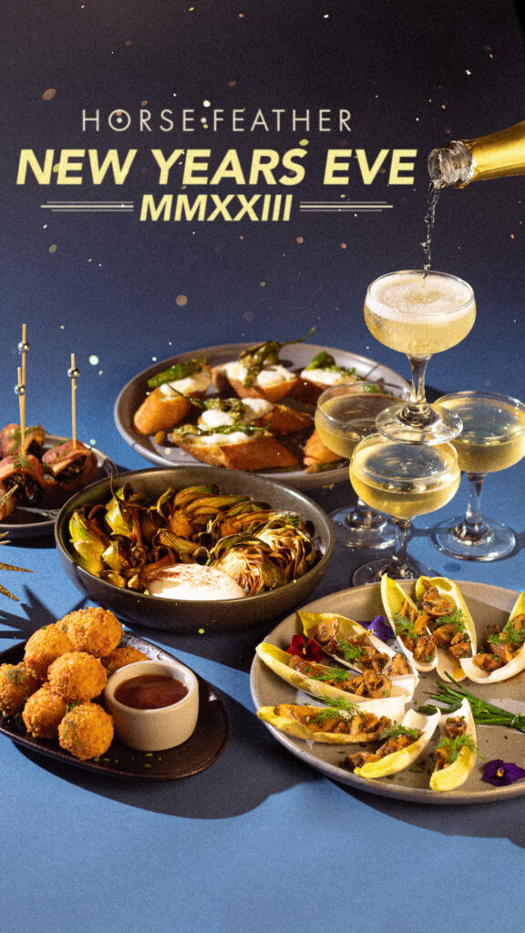
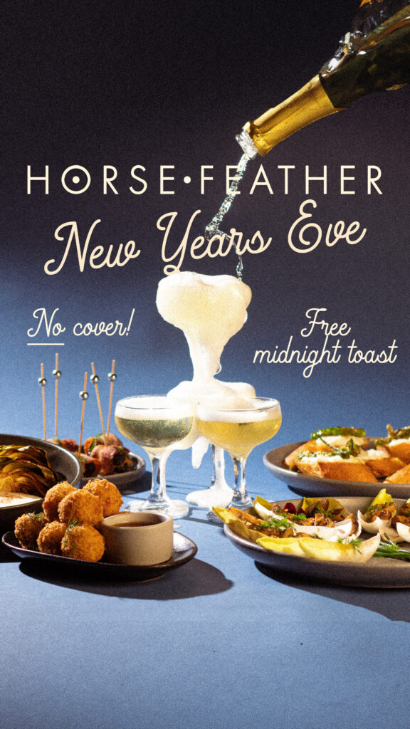
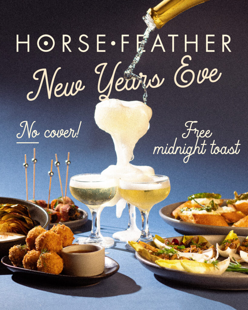
NYE
Three years of New Year’s Eve campaigns: print flyers in multiple sizes, Instagram story and grid posts, Eventbrite banners in standard and “Book Now” variants, and website banners. The 2022 campaign included an animated story post.
2022
2023
2024
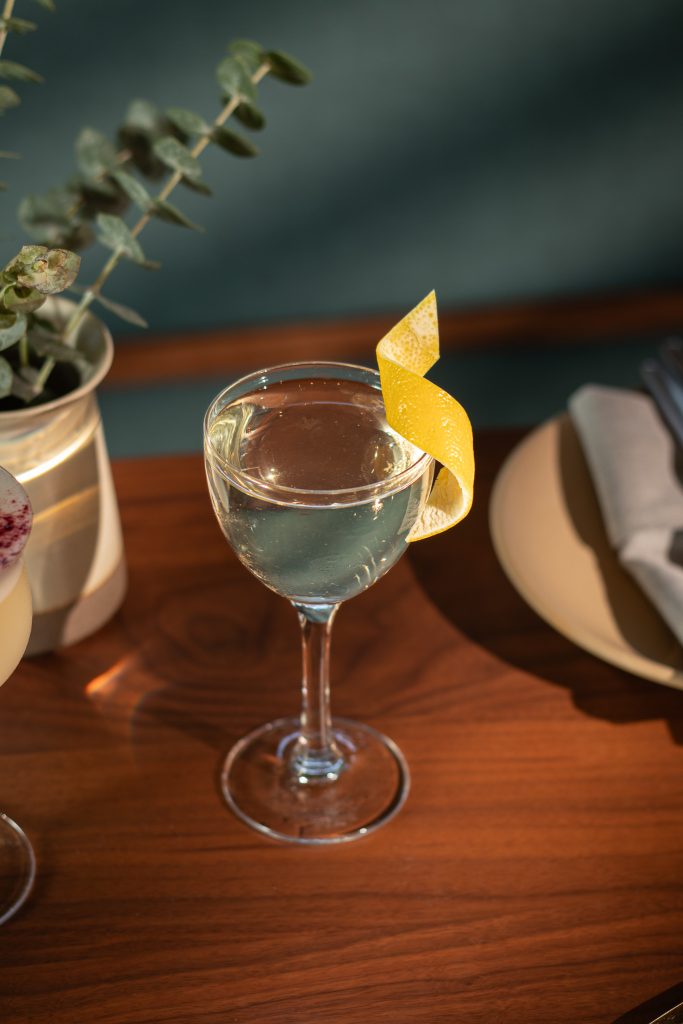
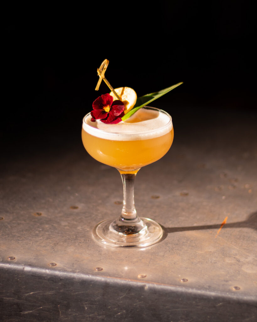
Horsefeather – Photography
As Horsefeather Palo Alto prepared to open, I led and photographed a menu shoot capturing the full food and beverage program. While the location builds on the visual identity established at the original San Francisco restaurant, the Palo Alto space was designed to feel more modern and contemporary. The shoot aimed to reflect that evolution—maintaining the warmth and distinct character of the brand while introducing a cleaner, more current aesthetic. The resulting images were used across the website, menus, and promotional materials for the opening.
Site photos
Last Rites – Photography
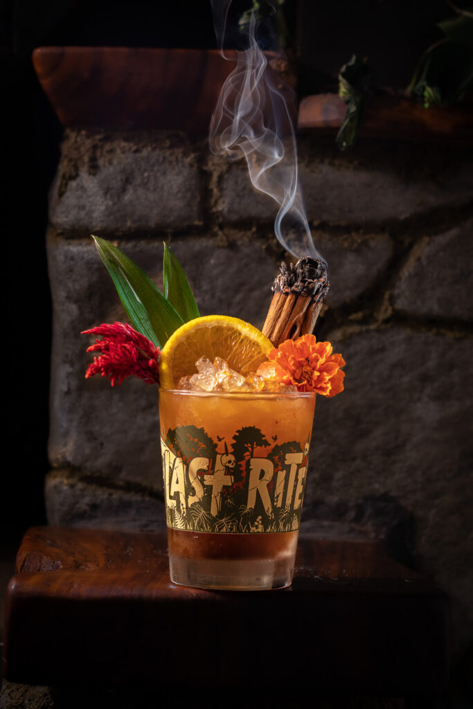
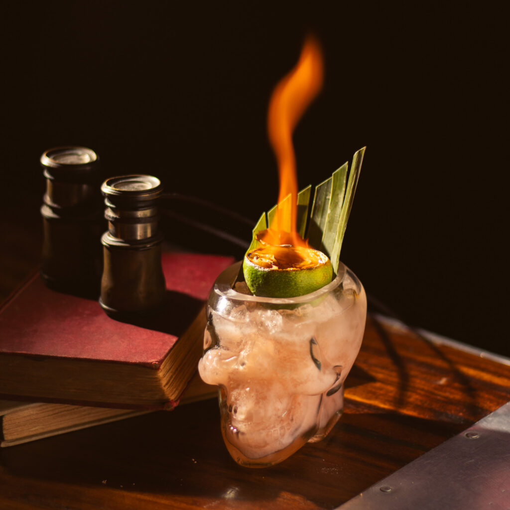
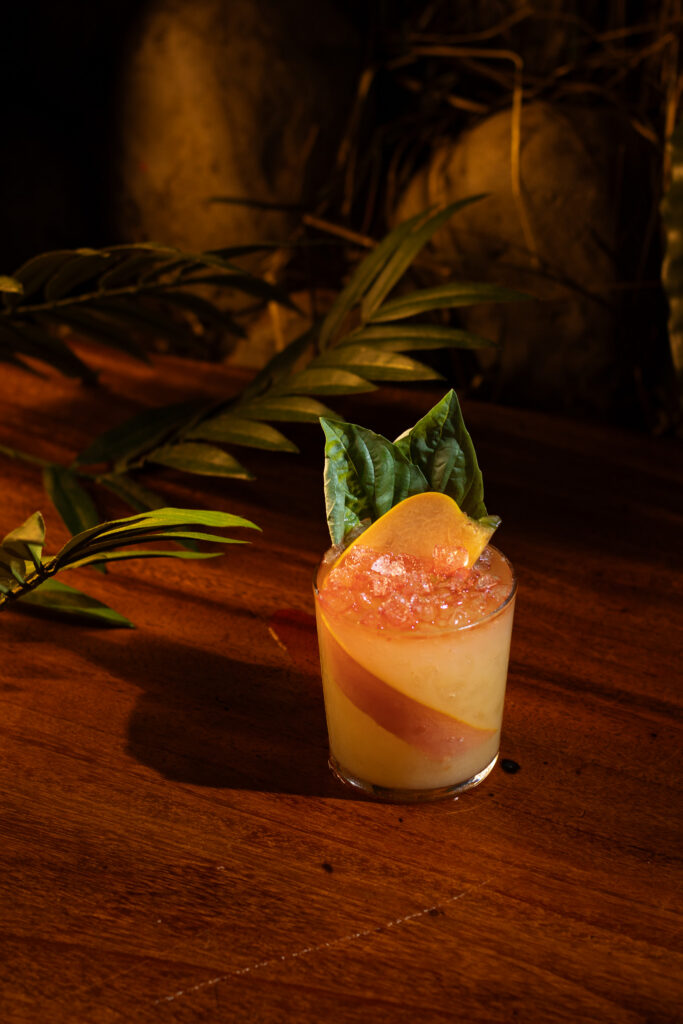
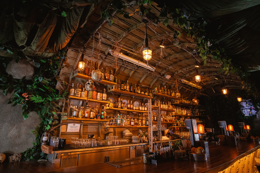
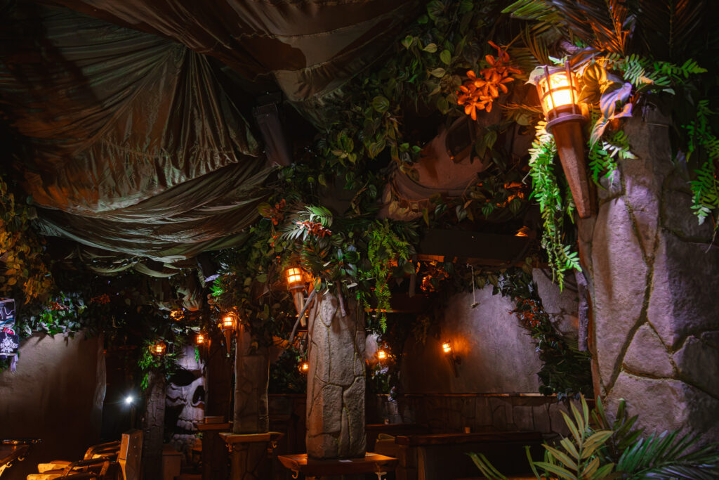
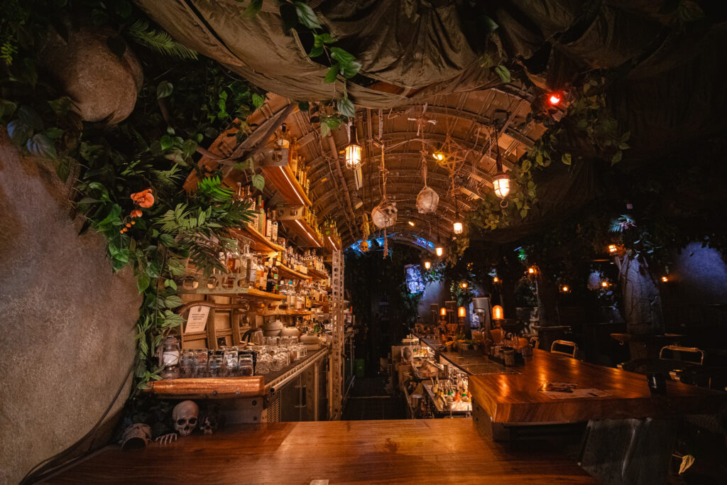
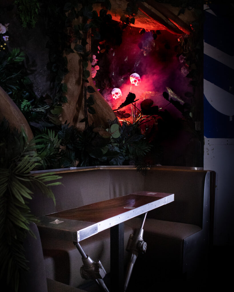
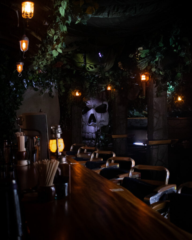
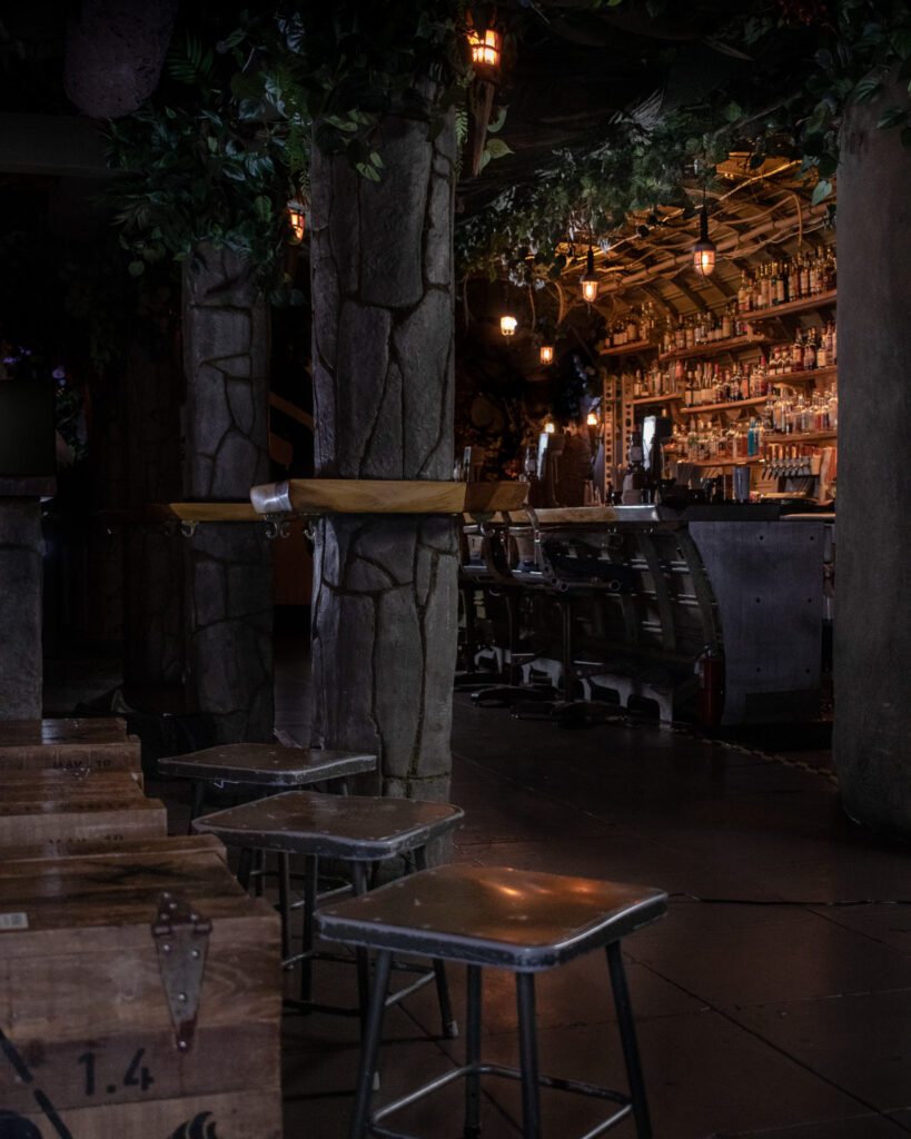
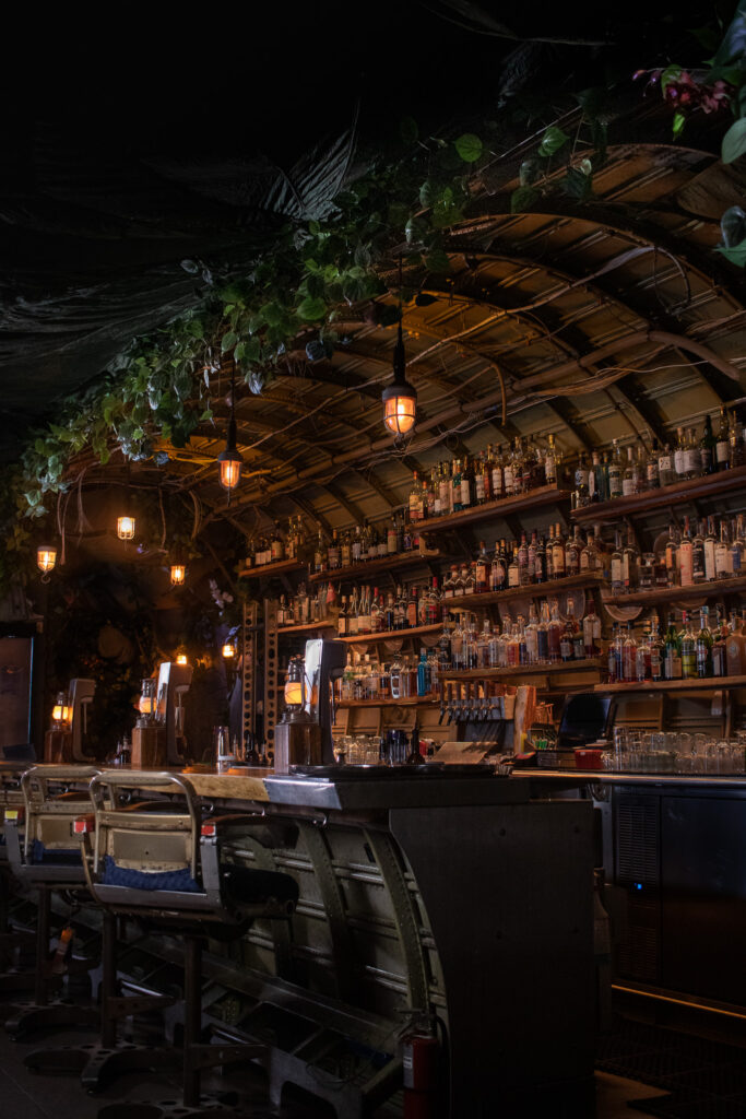
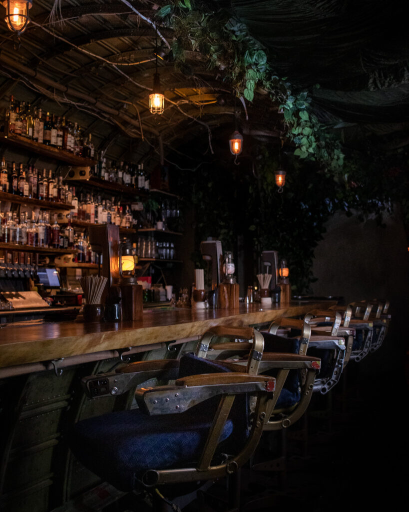
Last Rites is a rum bar in San Francisco built around a specific fiction: you’ve found your way into a tropical jungle outpost with a questionable past. The brand runs deep — vintage pulp adventure novels, crashed planes, dramatic lighting, a whole visual universe. I’ve handled the bar’s creative output for four years, from the cocktail menu system to event marketing. The photography is part of that same register.
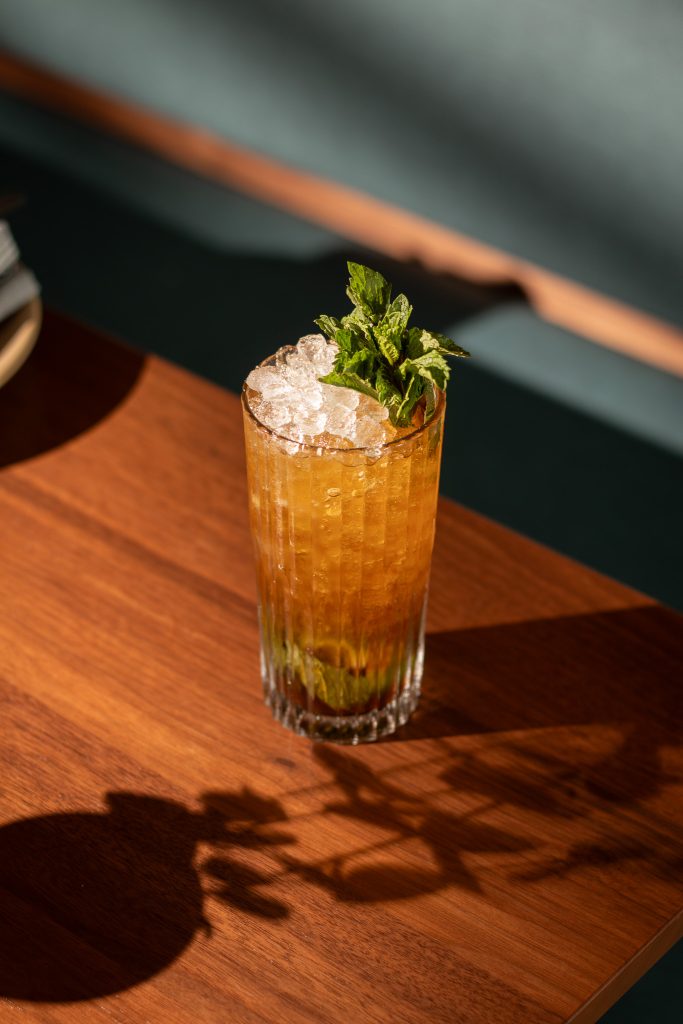
COCKTAIL PHOTOS
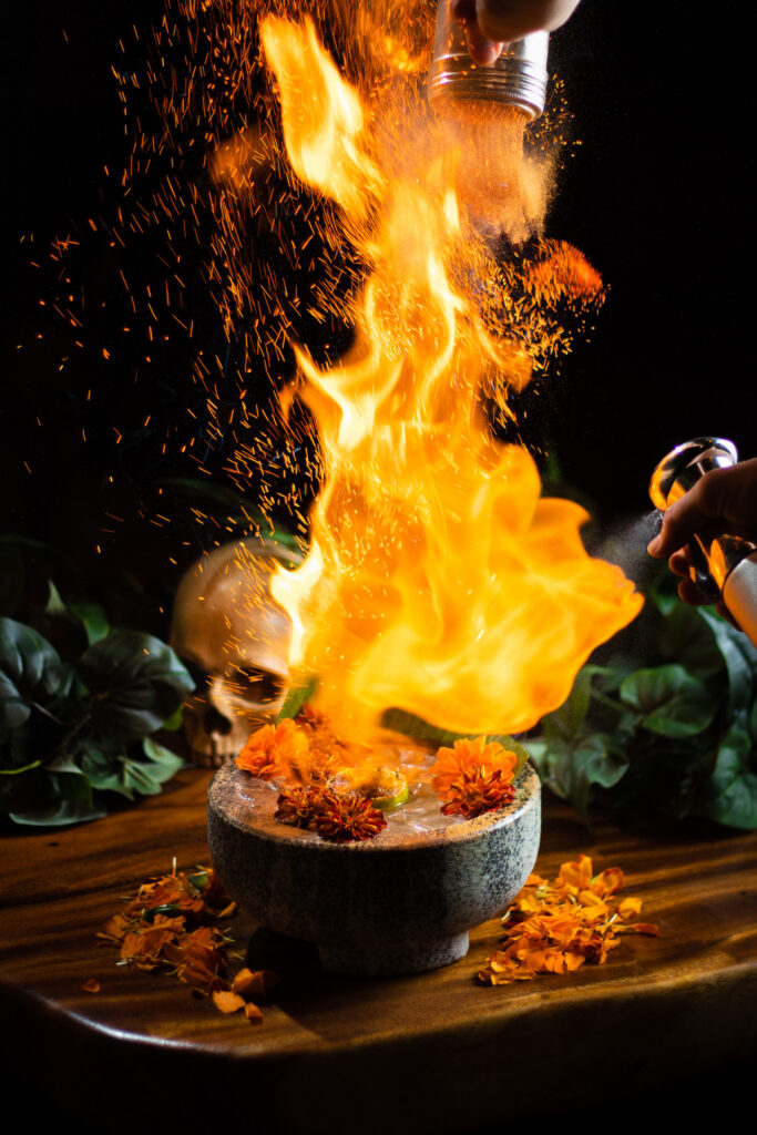
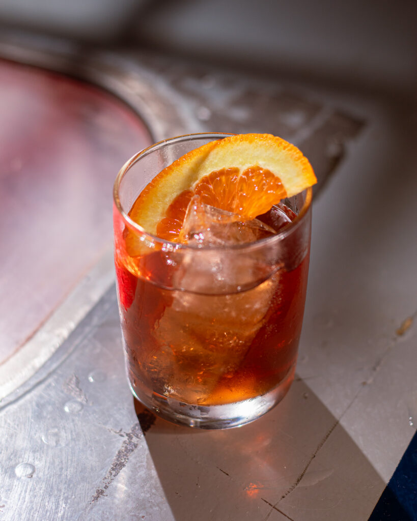
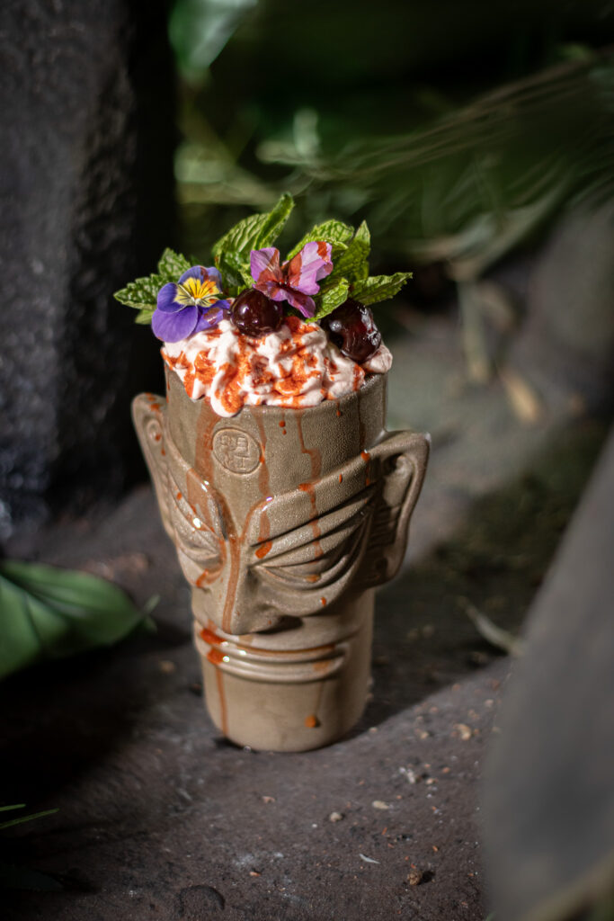
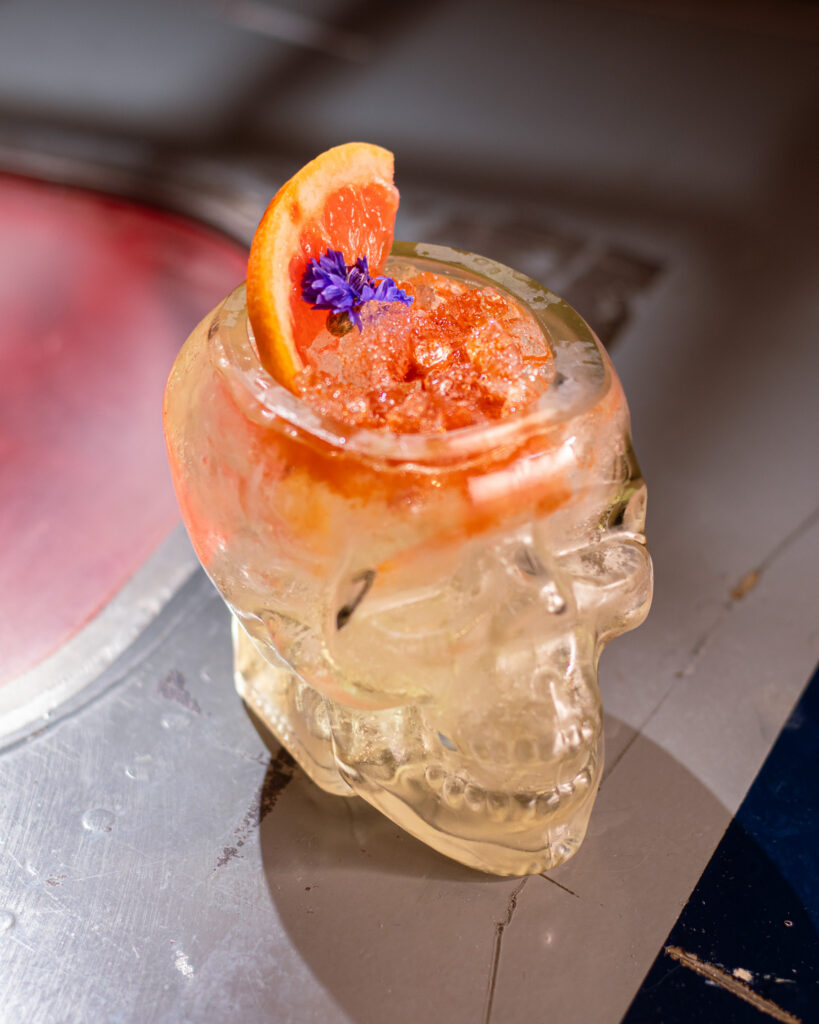
Every shot was done on location at the bar, leaning into what the space already gives you: low light, texture, shadow. The goal was photography that looked like it belonged in the world Last Rites had built — moody and specific, not studio-clean. This is a sample of my work capturing the cocktail program.
Site Photography
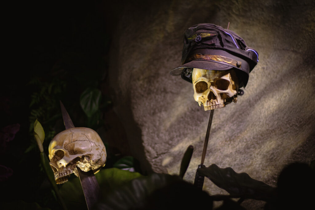
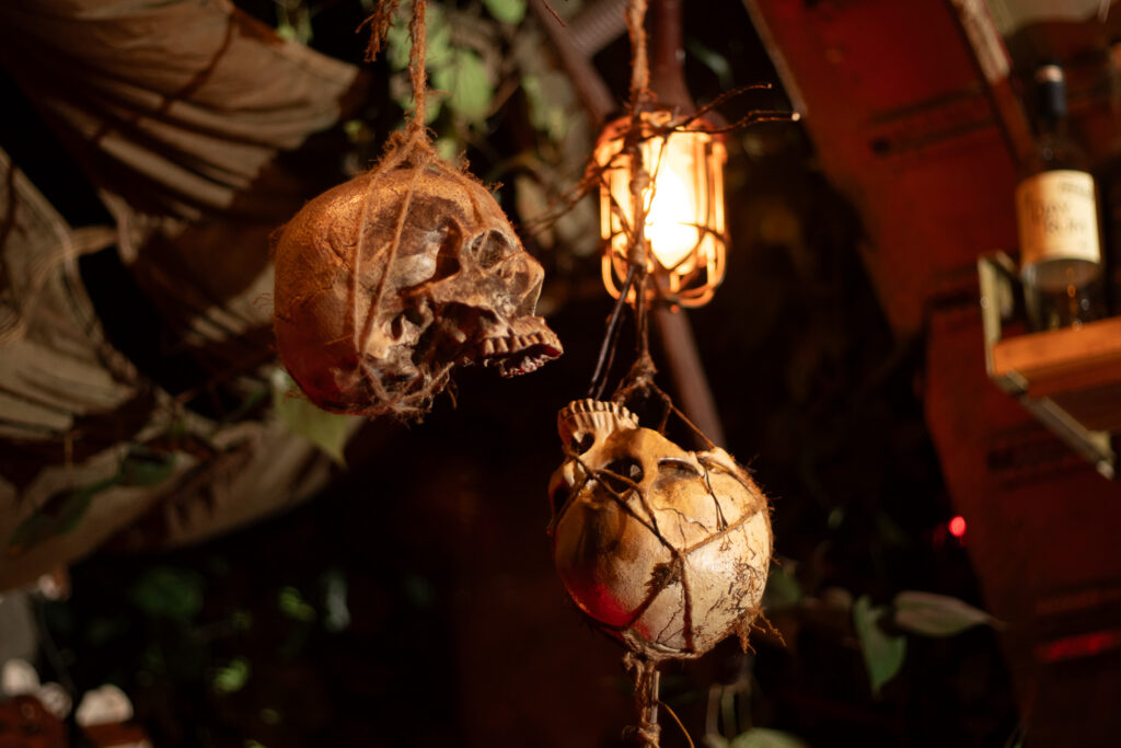
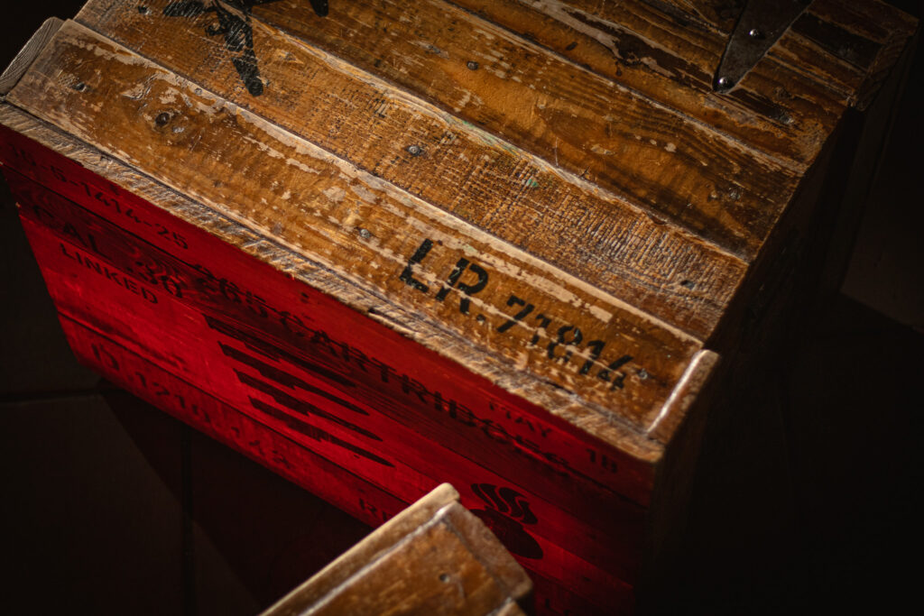
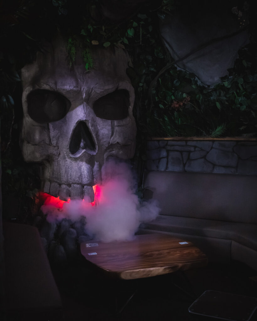
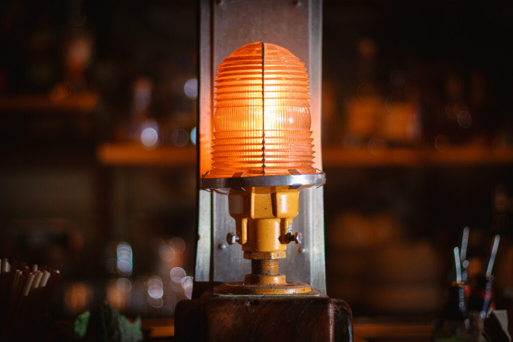
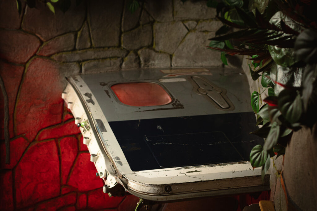
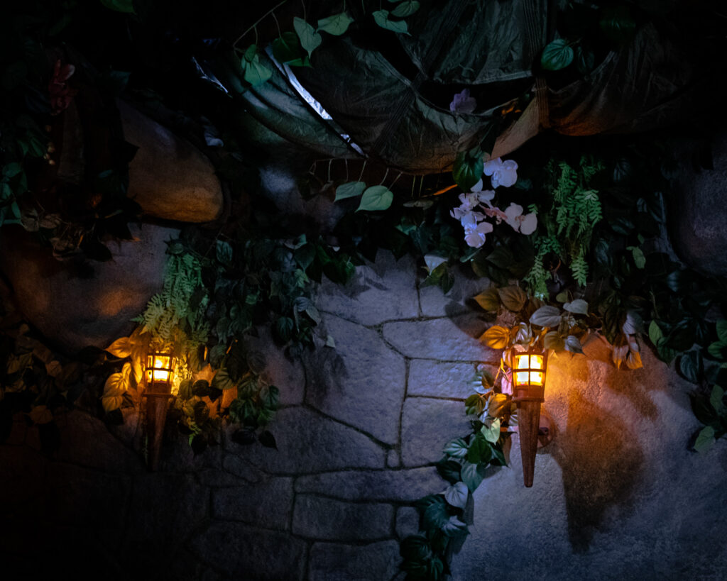
The bar interior is its own prop: metal airplane fuselage, hanging vines, cargo netting, trouble bulbs buried in foliage, 9ft stone idols. The site photography documents that environment using the same approach as the cocktail work — practical light sources, selective use of flash, and let the atmosphere do most of the work.
Last Ritual 2024
Overview
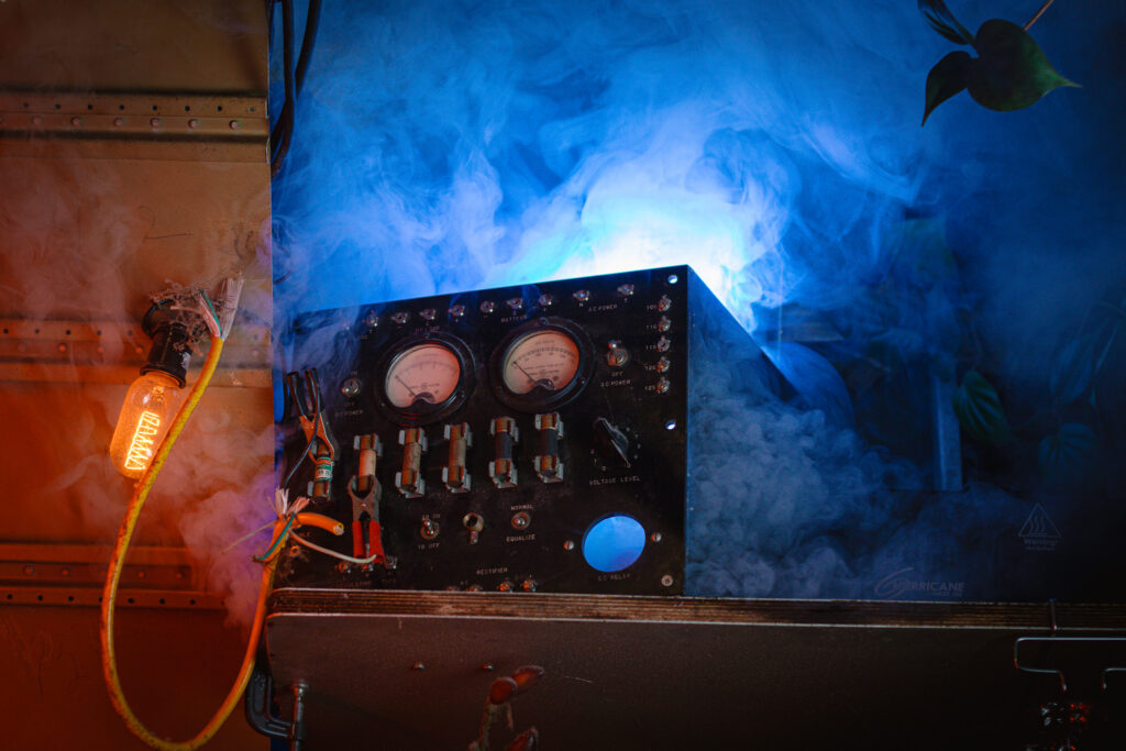
Last Ritual was a 34-day immersive Halloween activation I conceived, designed, and produced solo on a $2,500 budget. An original fictional universe built entirely in-house: a cult-linked missing persons investigation with a physical paper trail guests could actively follow. Props, a synchronized DMX and projection system, a working phone hotline with a passcode-locked final message, bilingual missing person posters, a fabricated FBI report, and an 8-minute NPR-style radio drama. Full install and de-install each completed in a single day.
Role
Creative Direction · Narrative Design · Production · Prop Fabrication · Technical Execution
Tools Used
VenueMagic · Lightform · Adobe After Effects · Adobe Premiere Pro · Pro Tools · ElevenLabs · DMX Lighting Systems · Google Sheets · Lark
Impact
29% revenue increase, year-over-year for October
21% guest count increase, year-over-year for October
Average drinks per guest: 2.0 to 2.5
Repeat visitation across multiple nights, with guests returning to follow the investigation
Advance demand for a 2025 activation established before the month ended
TECHNICAL DOCUMENTATION
Full technical breakdown of the execution, tools, and implementation:
Short-form videos were produced by Gourmand Group for the activation’s social rollout — shot and edited by their team, briefed and art-directed as part of the broader creative.
PRESS
Artifacts
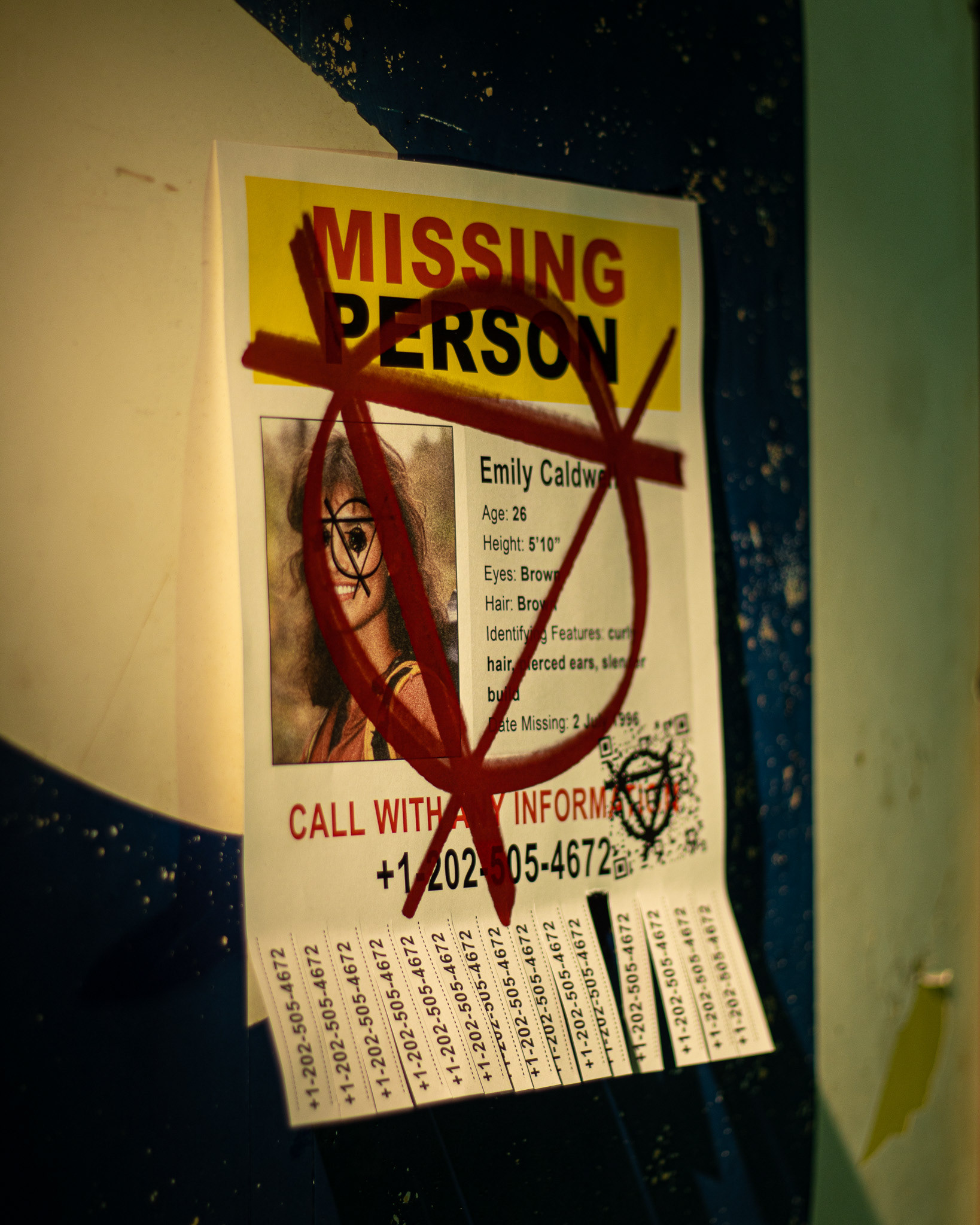
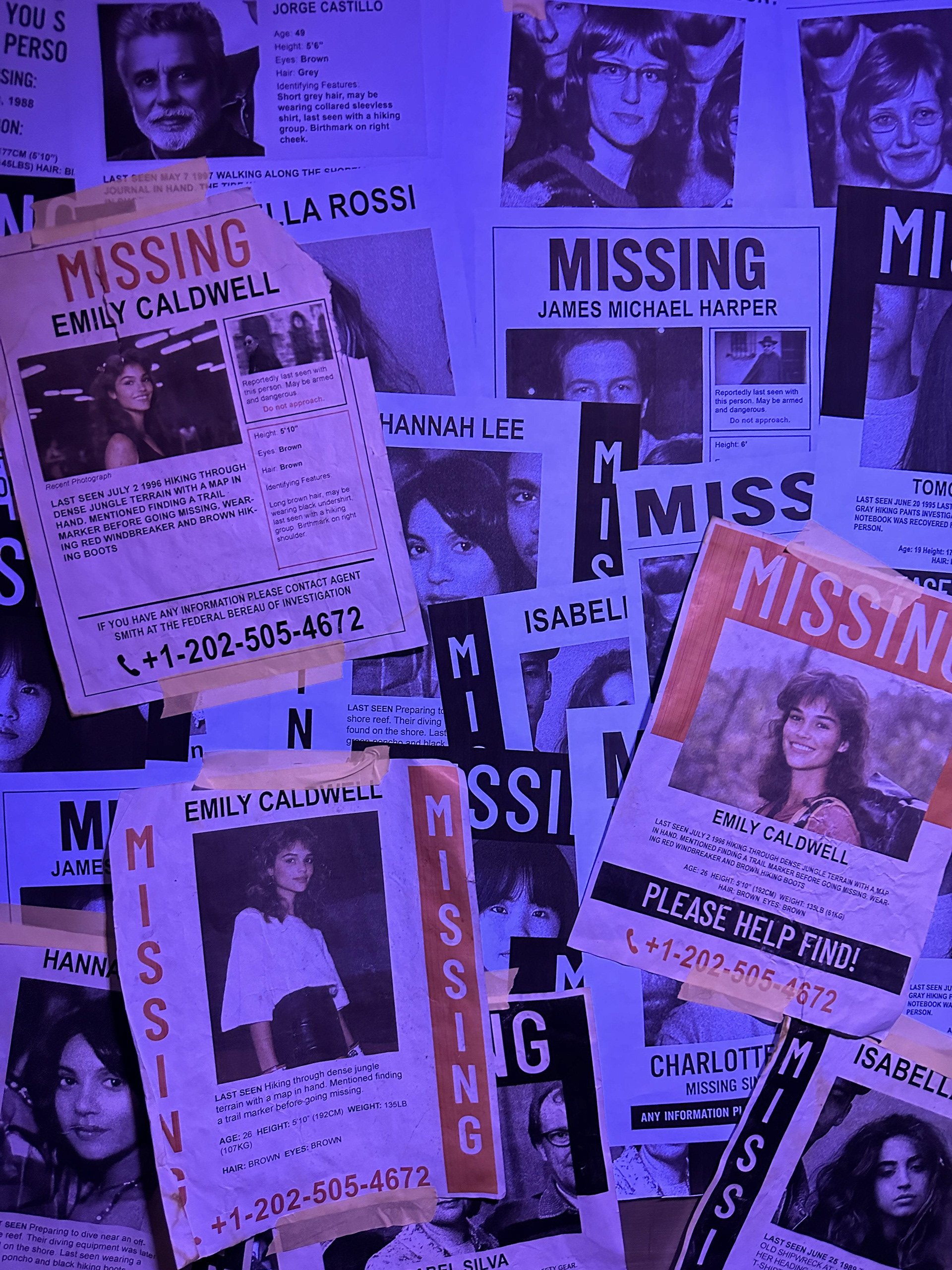
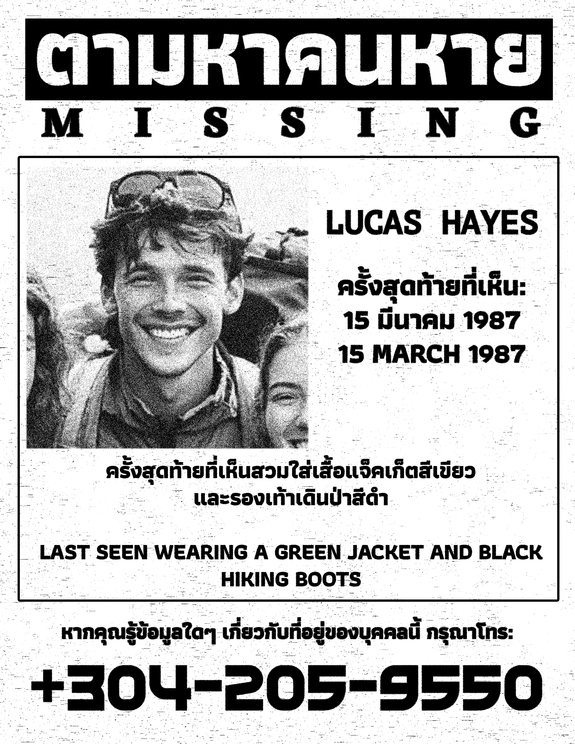
Missing Person Posters
Missing person posters for Emily Caldwell and over a dozen other fictional victims were designed, aged, and distributed throughout the bar. The series was produced in multiple languages, including bilingual Thai/English versions, to suggest an international pattern of disappearances. The number printed on every poster connected to a live voicemail system.
Voicemail Inbox
The number on every missing person poster connected to a live voicemail system: character-driven messages from people who knew Emily Caldwell, and a hidden, passcode-protected recording that unlocked a final chapter in the investigation. Guests could call from anywhere — from inside the bar with a drink in hand, or from home after the night ended.
Radio Broadcast
An 8-minute NPR-style radio program looped in a transitional space of the bar, presenting the investigation as live coverage guests could absorb in passing. Produced in Pro Tools with AI-assisted voice performance via ElevenLabs. Most guests didn’t realize it was original audio.
Conspiracy Board
The investigation wall was the physical center of the narrative: photographs, documents, red string, and handwritten notes building the case in plain sight. A news reel loop projected directly onto the board added motion and the feeling of live coverage happening in real time.
News Reel
A looped television news segment covering Emily Caldwell’s disappearance as a real missing persons case, projected directly onto the conspiracy board. Produced in After Effects and Premiere Pro, with fabricated lower thirds, chyrons, on-location footage, and news anchors.
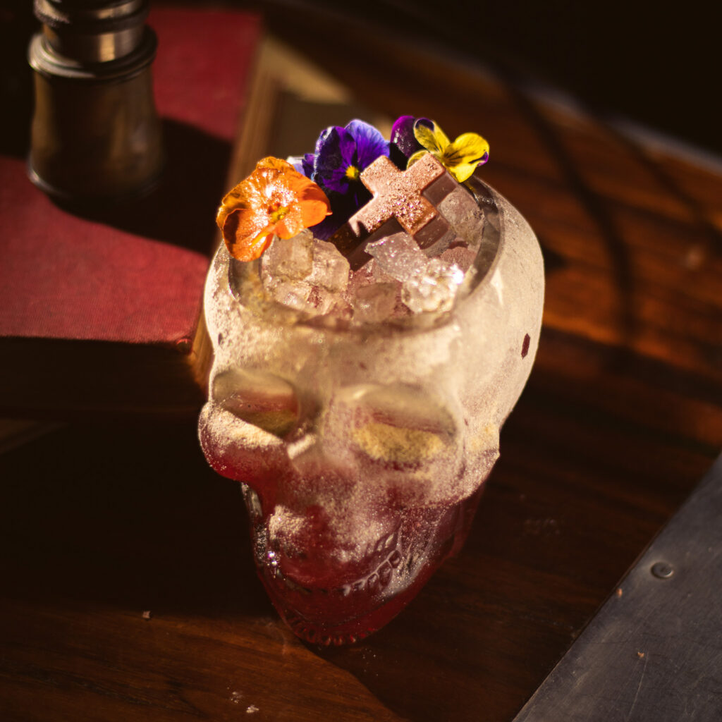
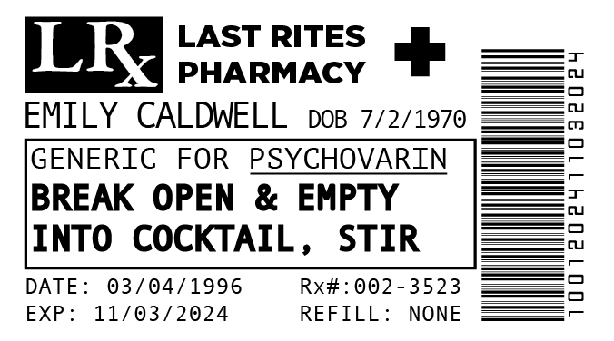
Prescription Garnish
The capsule garnish was a prescription from Last Rites Pharmacy, filled out in Emily Caldwell’s name. The dosage field told guests what to do with it: “Break open & empty into cocktail, stir.” Medication for psychosis and insomnia. No refills. The drink carried the story inside it.
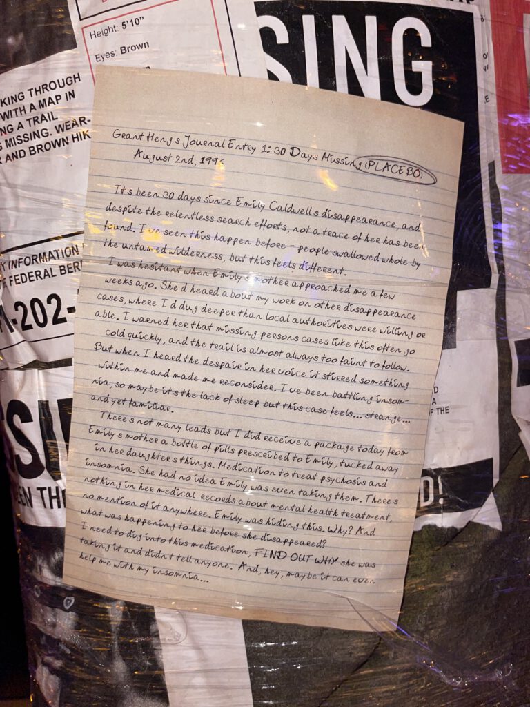
Grant Heng’s Case Notes (SET DRESSING)
One of several handwritten journal entries placed on the missing persons wall. This entry, 30 days into the search for Emily Caldwell, introduces the private investigator hired by her mother. It’s also where the pill bottle enters the story — Heng had just received a package of Emily’s medication and started questioning why she’d been hiding it. The circled “(PLACEBO)” in the header was a prop note for staff: the capsule contents were inert.
Classified Field Report (SET DRESSING)
A redacted FBI official report investigating ritualistic cult activity in rural Norway, 1984. The redactions were intentional — guests were meant to squint, speculate, and fill in the gaps themselves. What was visible was deliberate: the sequence 3-5-2-3, the cult emblem, the note that investigating agents had begun exhibiting erratic behavior. Printed, aged, and placed as background lore throughout the space.
Last Rites — Brand & Creative
Overview
Last Rites’ brand identity was built by Justin Lew: a themed experience that dropped guests into a tropical jungle with the wreckage of a crashed airplane, inspired by dimestore adventure novels. My job was to put it to work. Over four years I produced all of the bar’s ongoing creative output — event marketing systems, a private events sales book, merchandise, a brand collab, and the cocktail photography that feeds the menu system.
Each piece required working within a specific visual register: pulp adventure, vintage horror, high camp. The work shown here is a selection from a larger body covering hundreds of assets across print, digital, and physical collateral.
My Roles
Creative Director, ongoing production lead, and primary creative resource for Last Rites since 2021. The foundational brand identity and logo were designed by Justin Lew. About 75% of everything since — event marketing, merchandise, menus, collateral, photography, and brand extensions — has been mine.
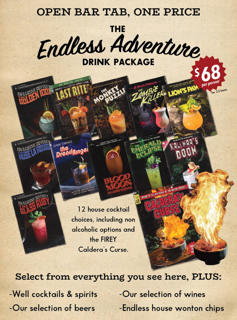
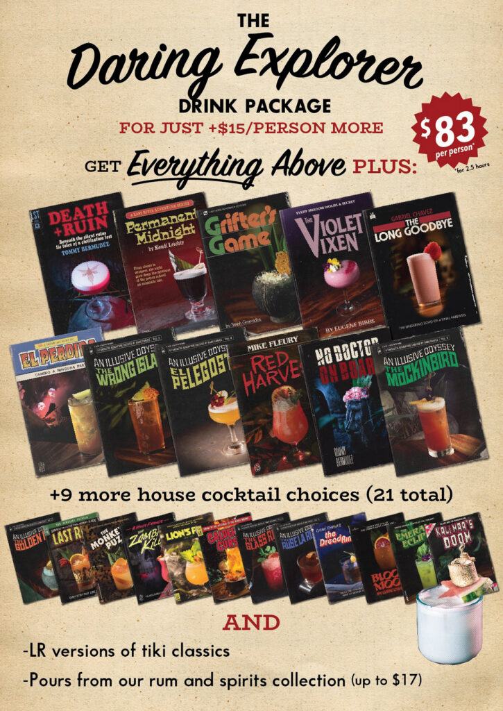
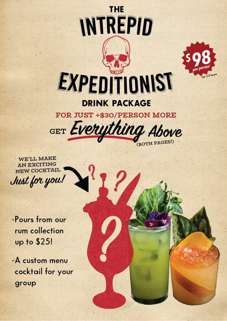
That covers concept and creative direction on the Adventure Menu system (each cocktail as a vintage pulp novel, 24 covers shot at the bar), all event marketing production for weekly activations and seasonal programming, the Events & Parties Book (a private dining sales document designed to feel like an artifact of the bar’s world rather than a floor plan), and the LR x False Idol co-branded shirt. Four years of production across print, digital, photography, and physical merchandise, all within a single consistent visual language.
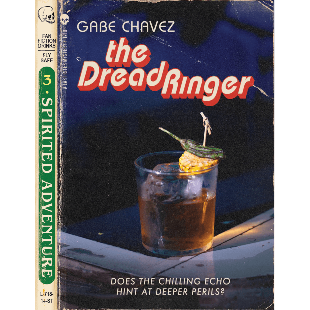
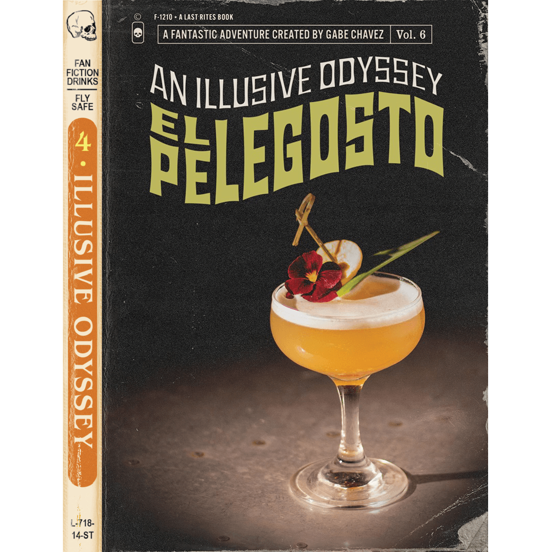
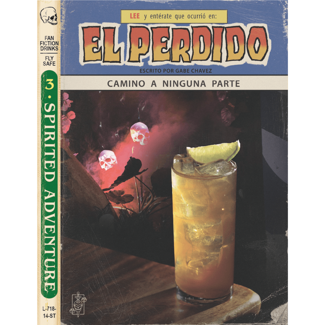
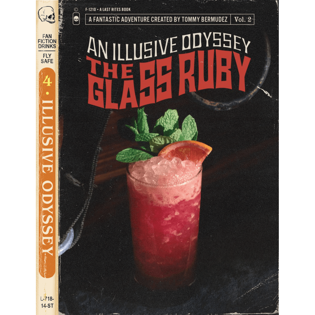
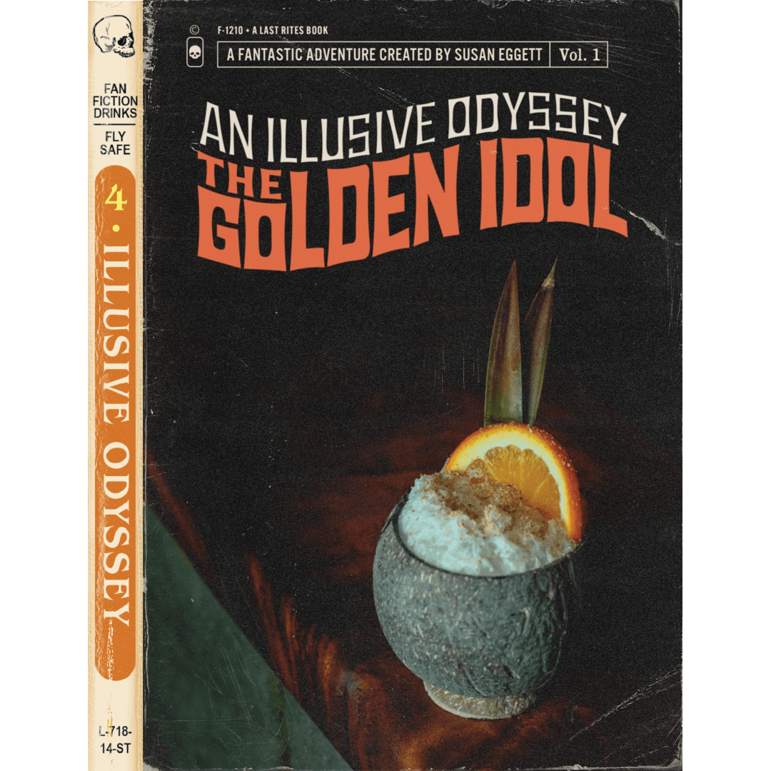
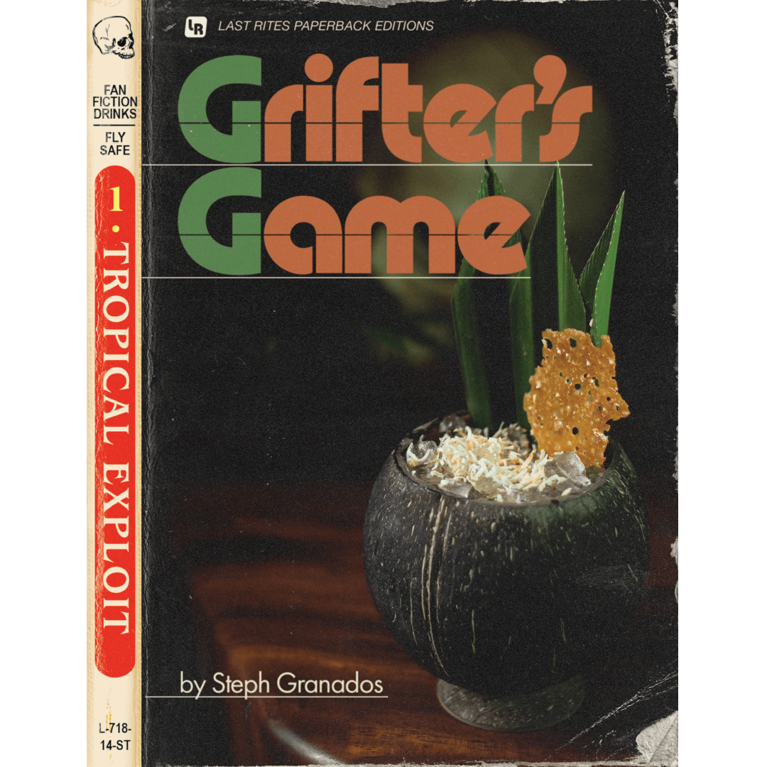
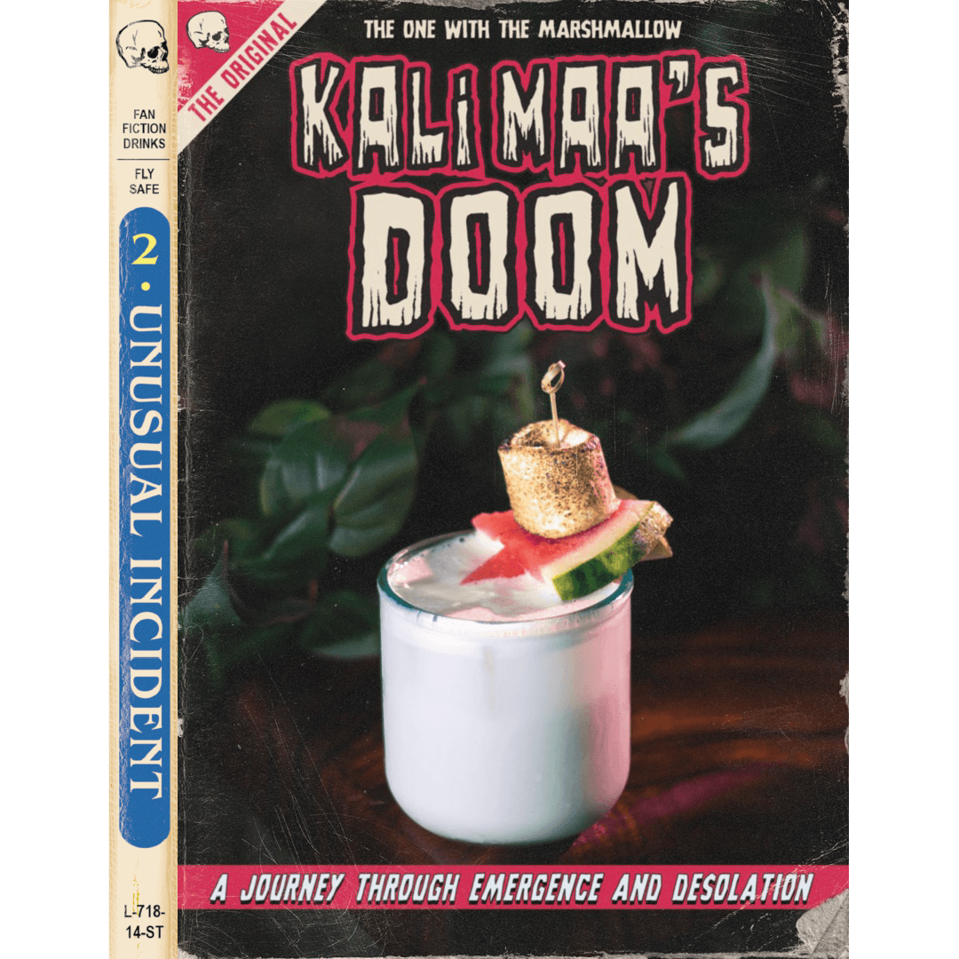
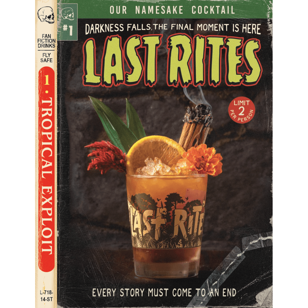
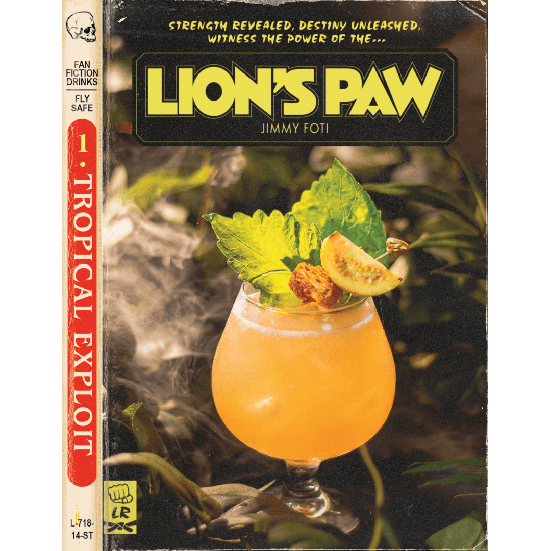
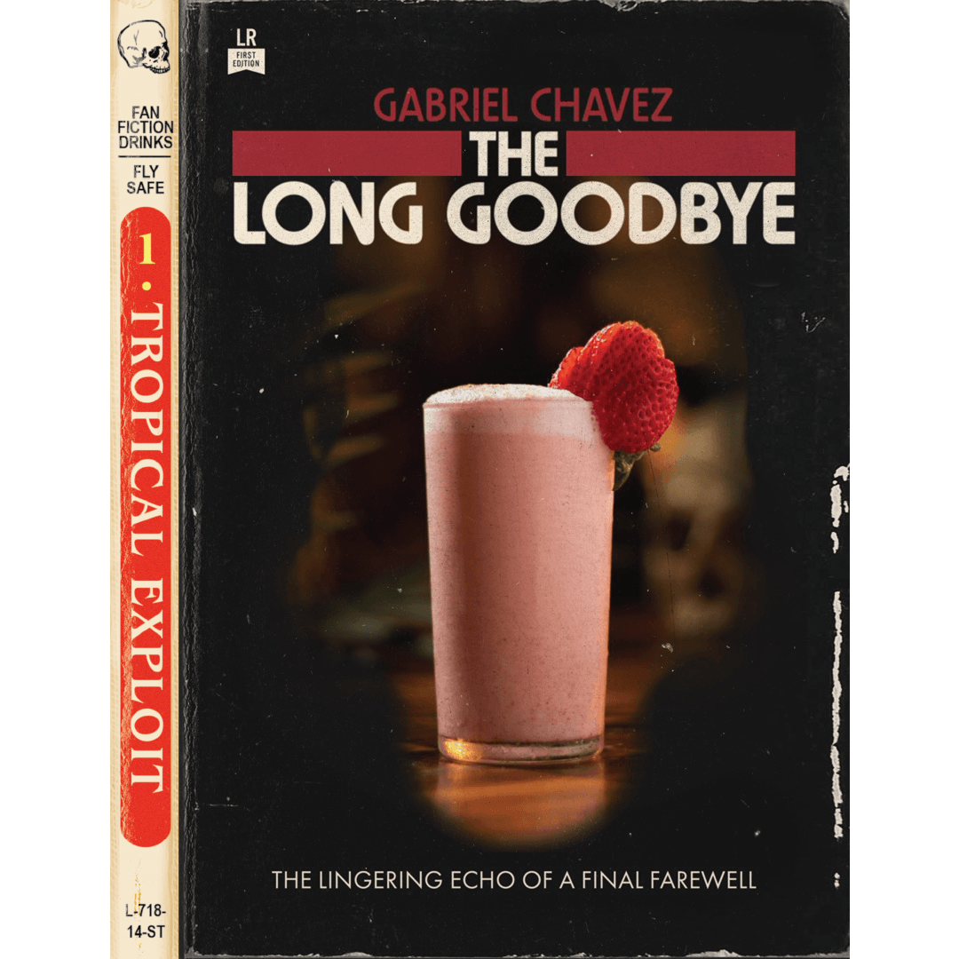
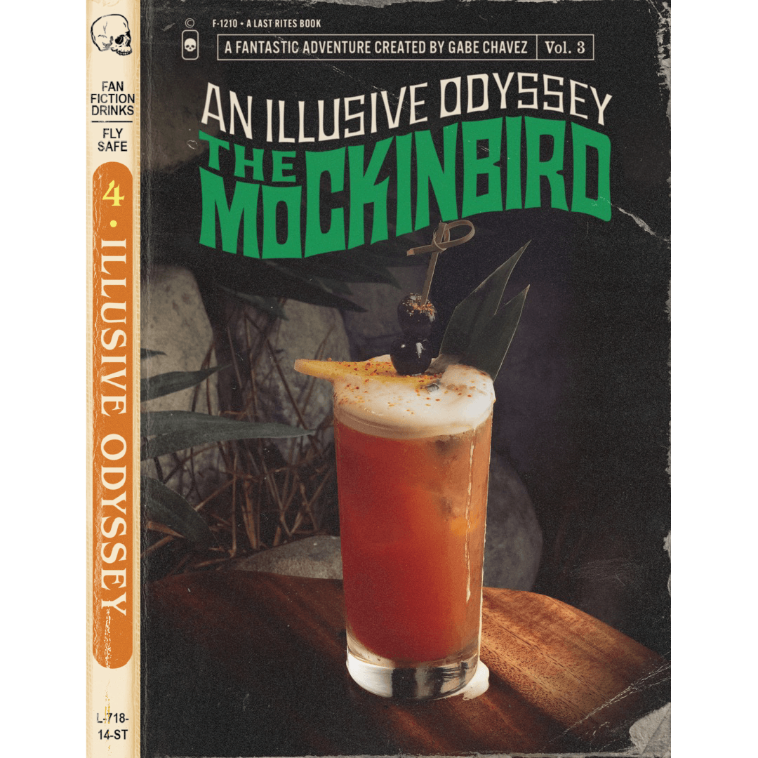
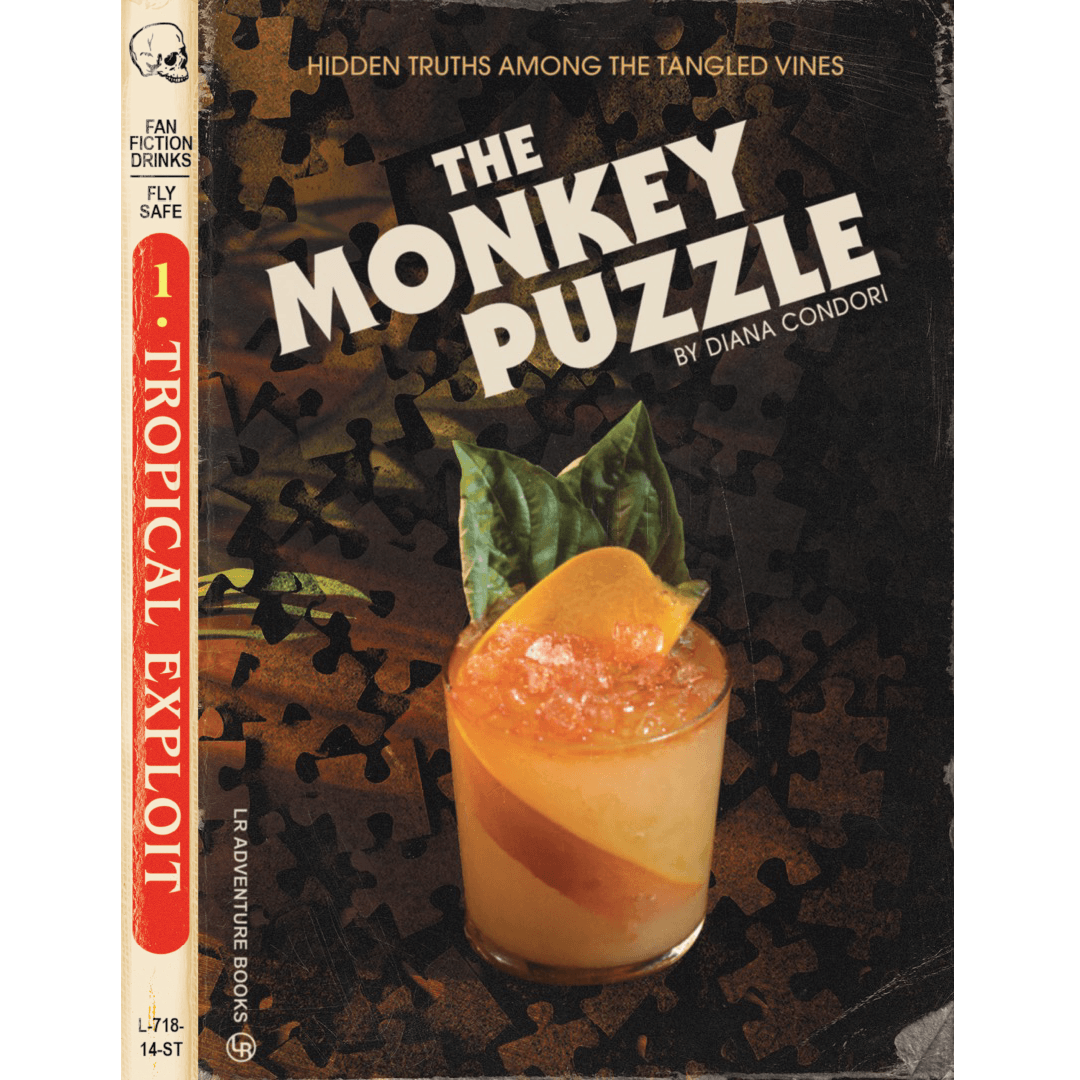
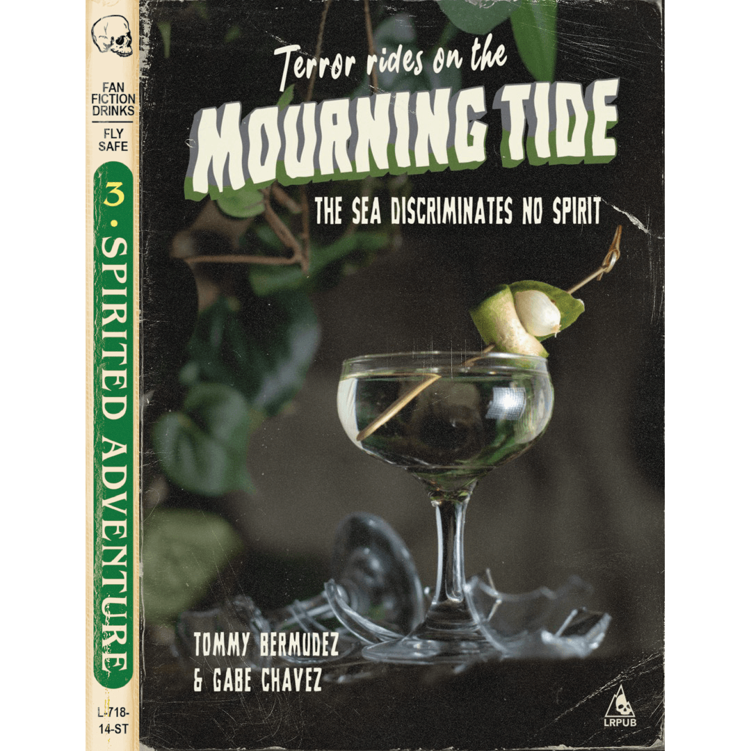
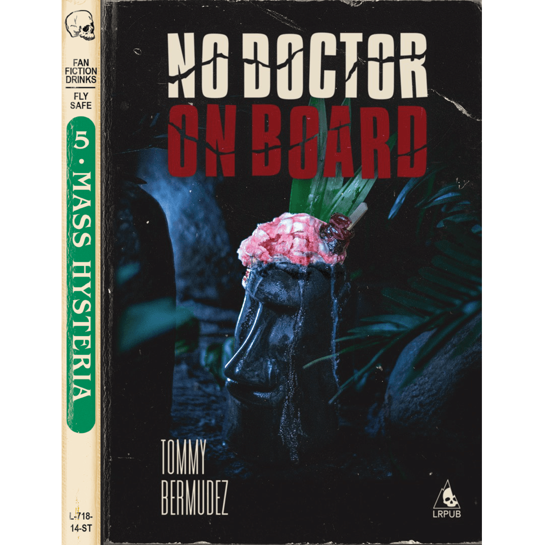
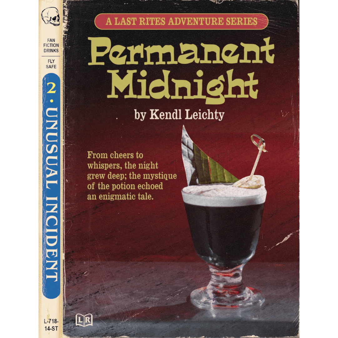
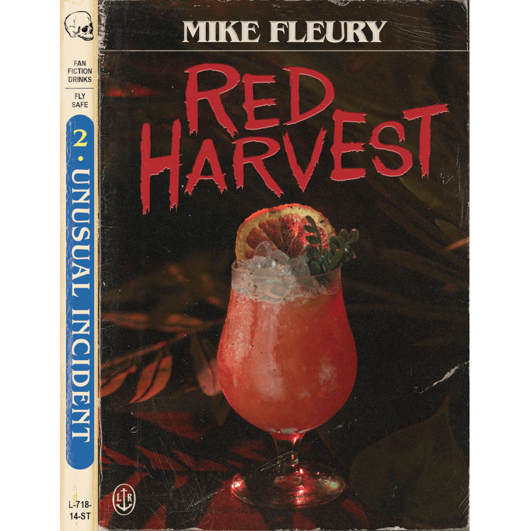
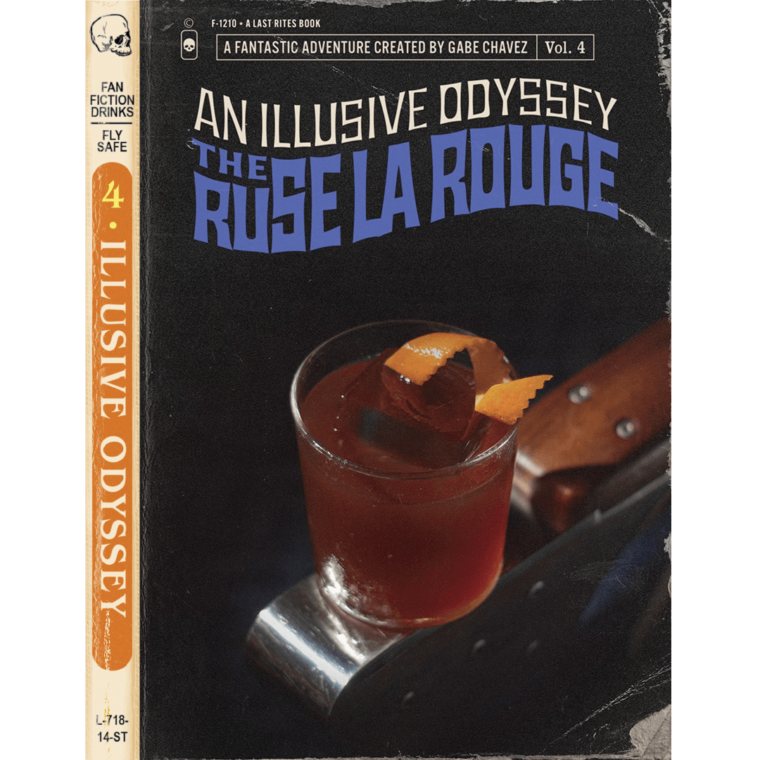
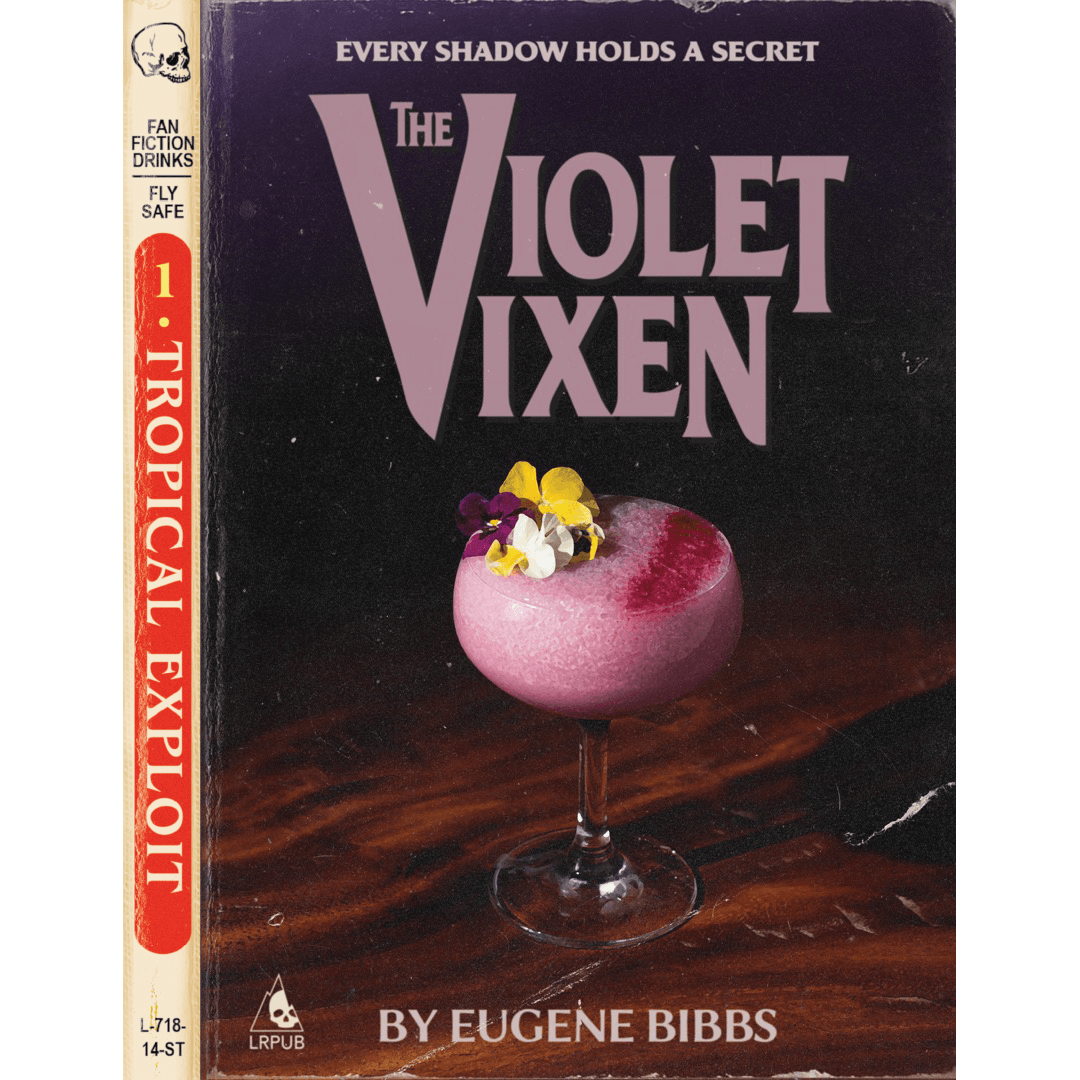
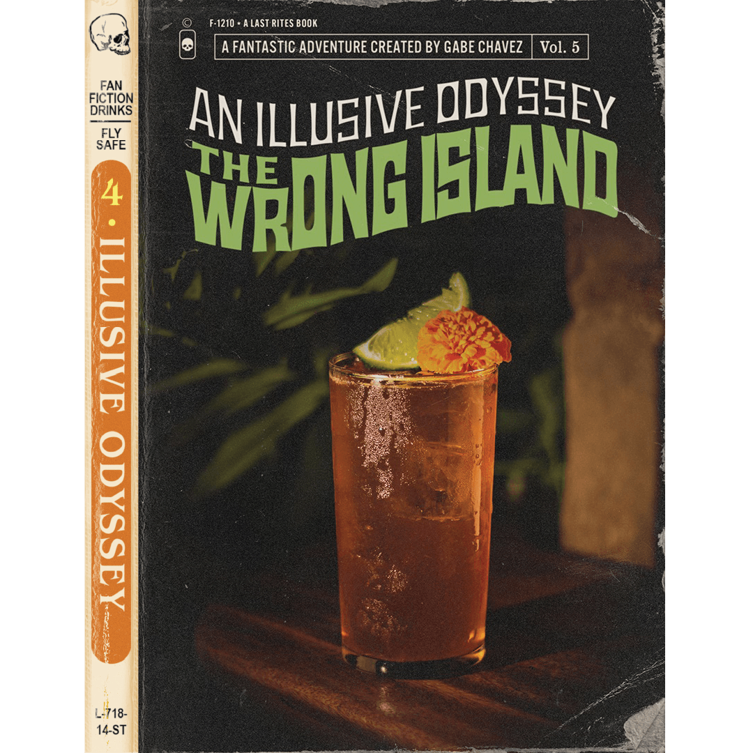
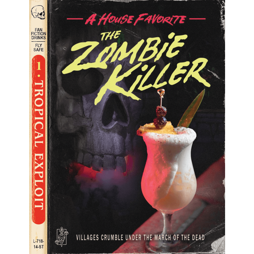
The Adventure Menu turns each cocktail into a vintage pulp novel: 24 drinks, each with its own genre treatment, tagline, and “by [bartender]” author credit. The concept was mine, iterative of the bar’s initial concept of pulp novels and dime store paperback adventure novels. The cocktail photography was mine. Design execution by Justin Lew.
The Pulp Approach
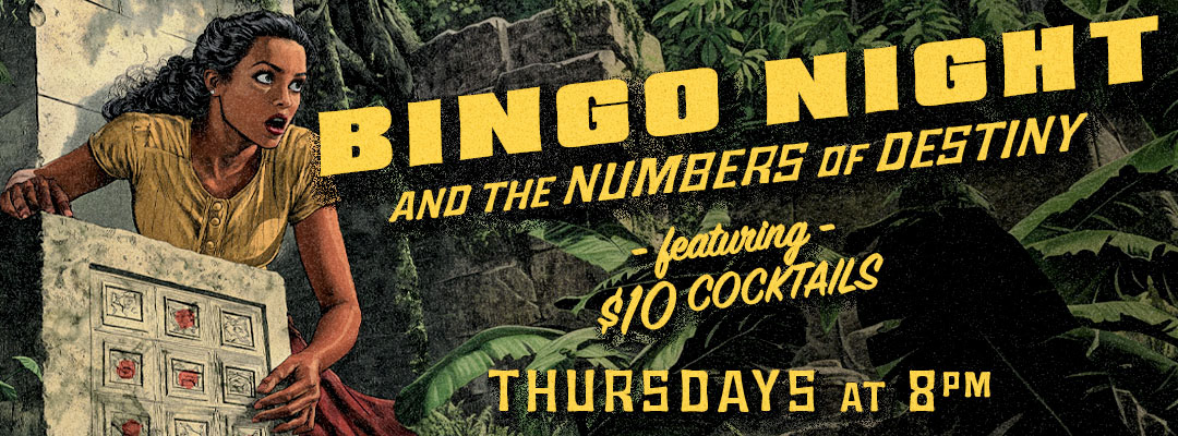
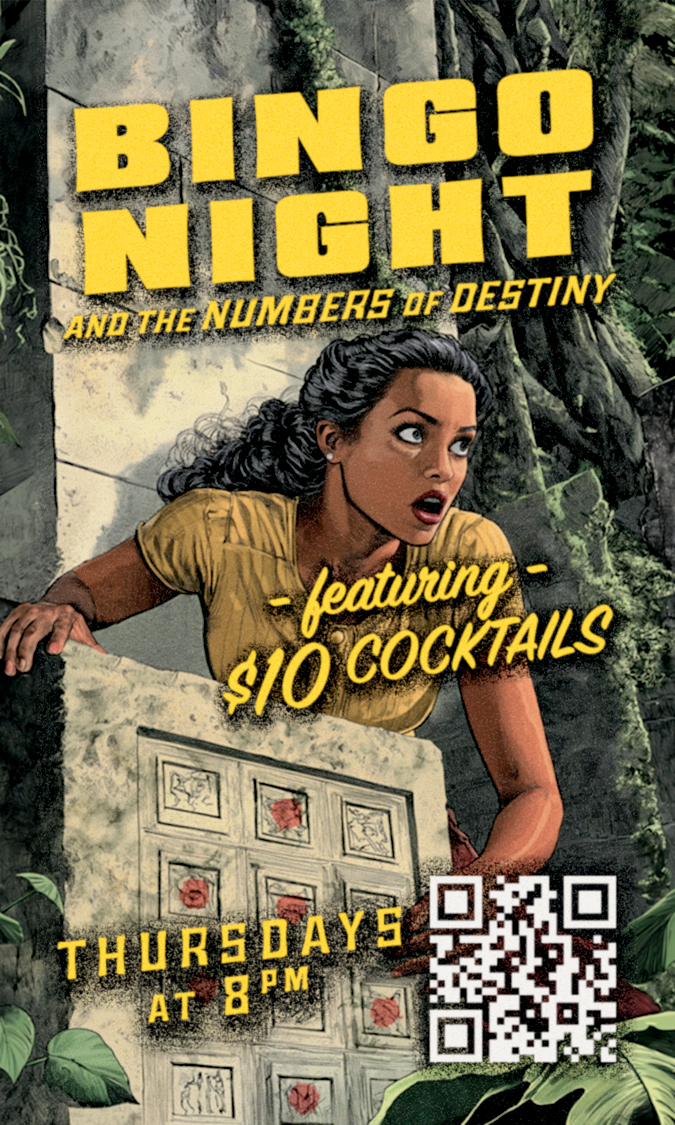
Last Rites’ brand already lived in pulp adventure territory. The event marketing needed to extend that — not just match the palette, but commit to the conceit. Every recurring event became a story. The poster looked like its cover.
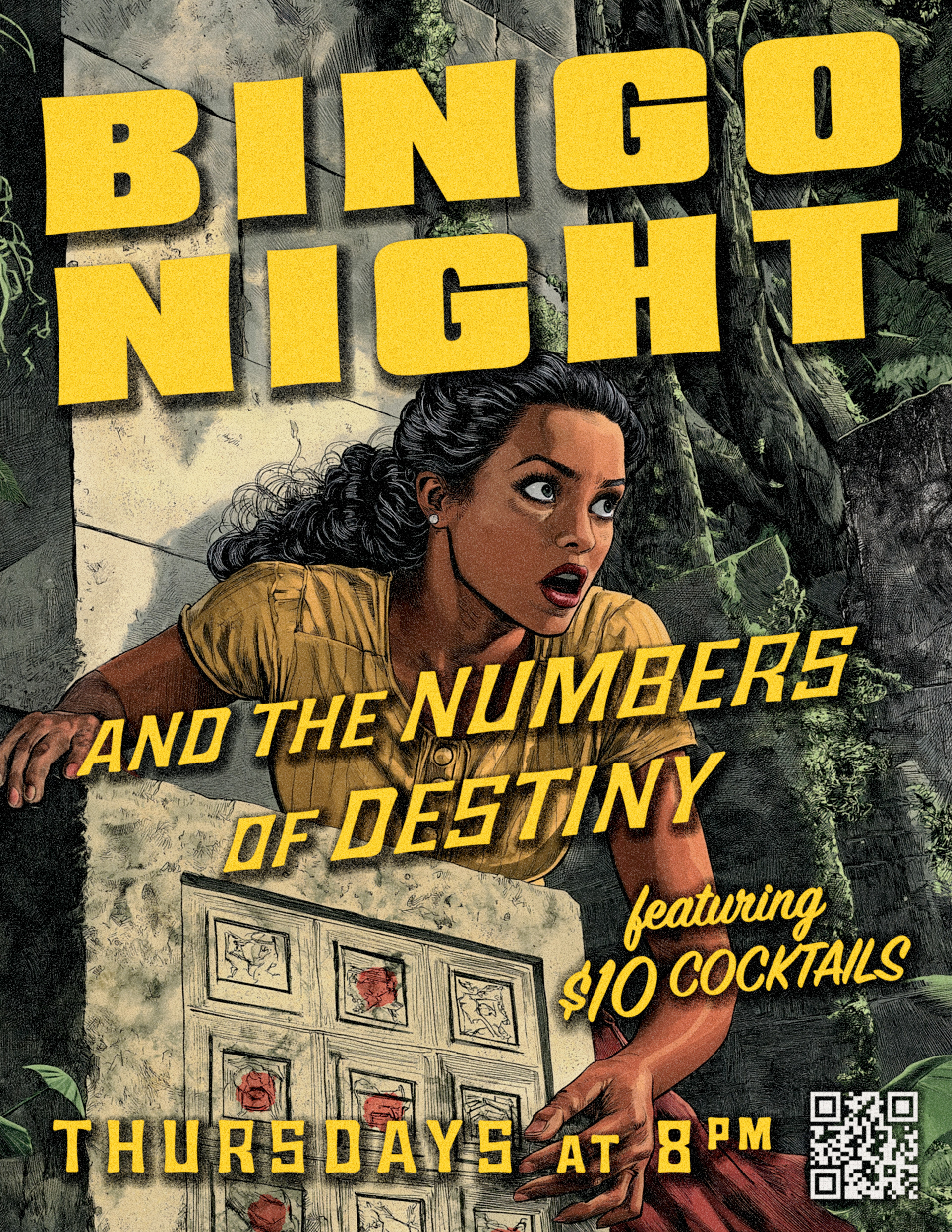
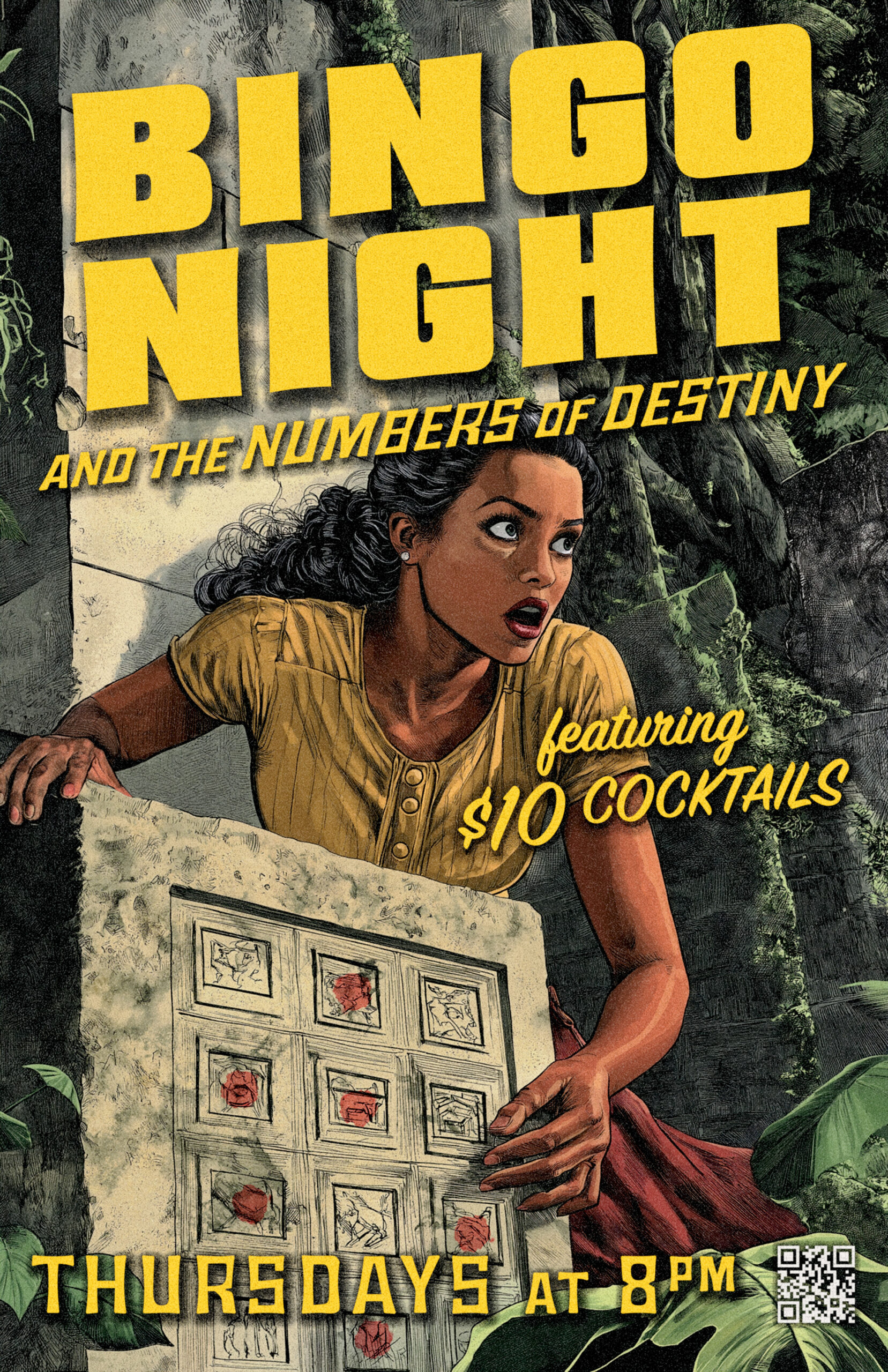
“Bingo Night and the Numbers of Destiny.” Each event title was written as a pulp novel title first. The illustration treated the premise seriously: a character in jeopardy, dramatic lighting, something at stake. The type matched — distressed letterforms, period-appropriate styling, the kind of lettering that belongs on a drugstore paperback rack in 1955.
Midjourney made it possible to generate illustration that actually looked like vintage paperback art rather than a graphic approximation of it. The work was in the prompting — directing the model toward a specific era, a specific tension, a specific color temperature — and then building the typography around what came out.
The goal was to make someone look twice before they realized it was a Thursday night bingo promotion.
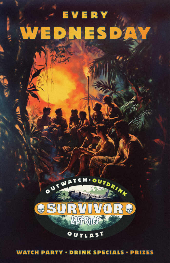
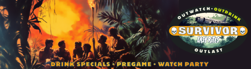
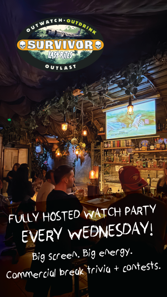
Special Events & Weekly Activations
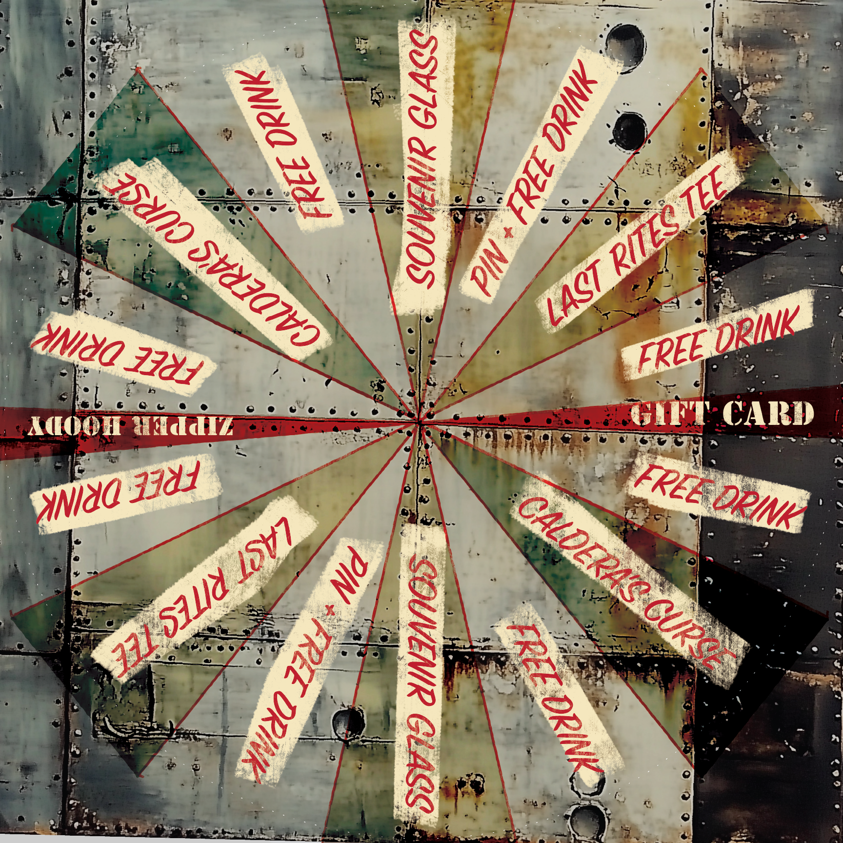
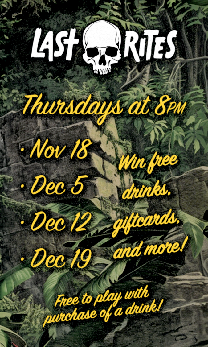
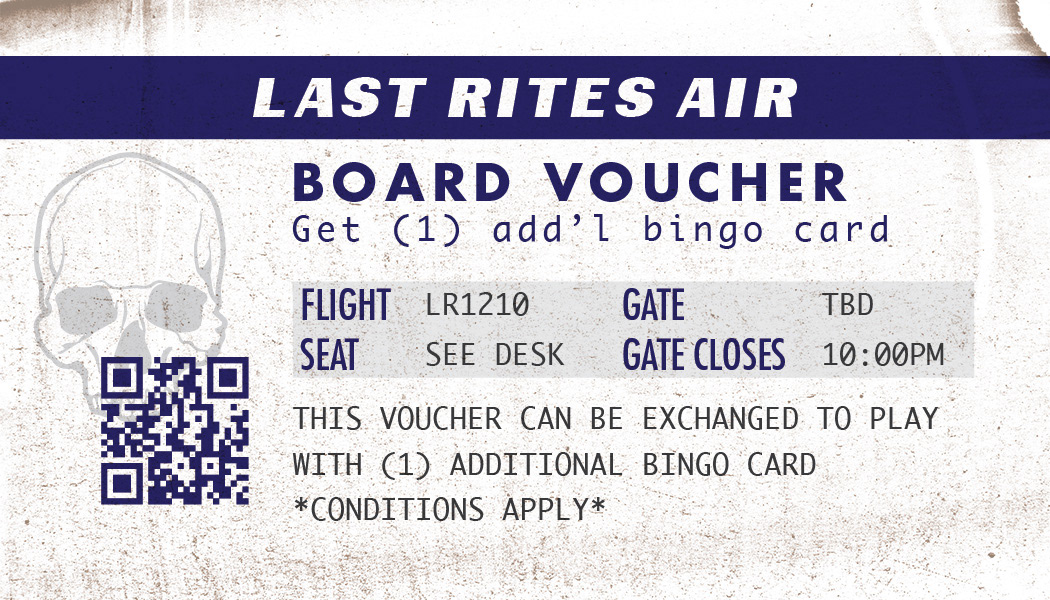
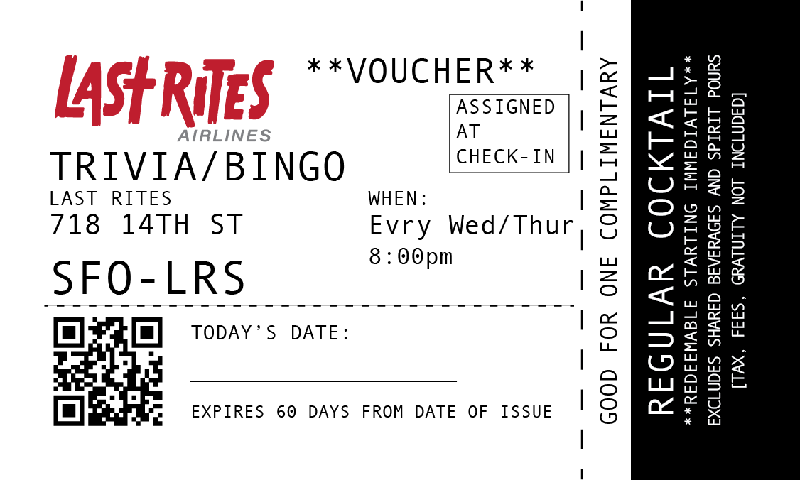
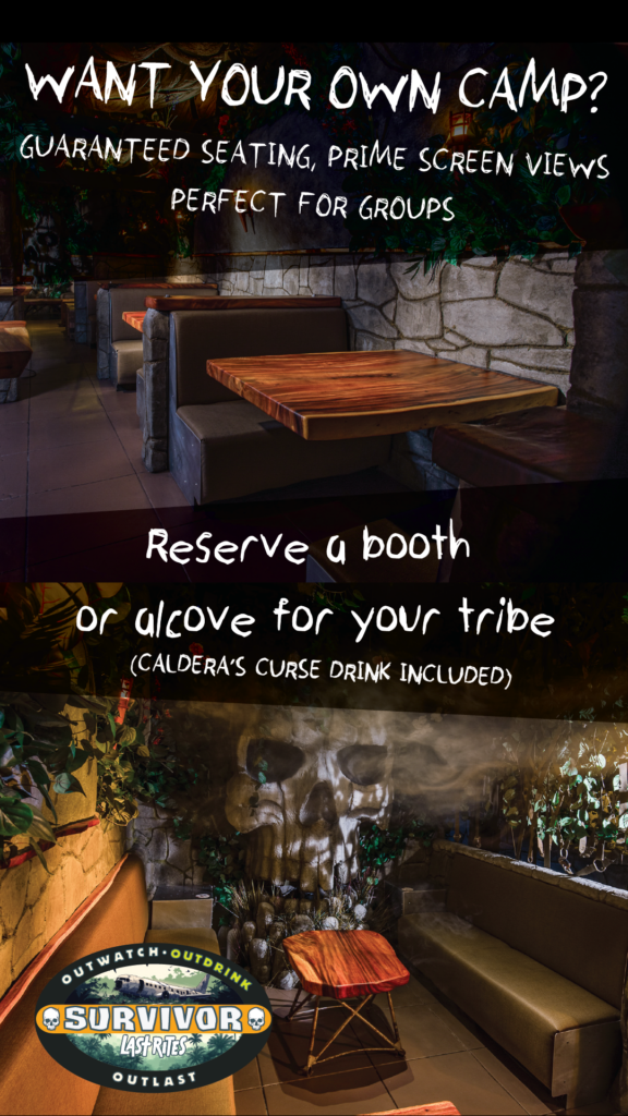
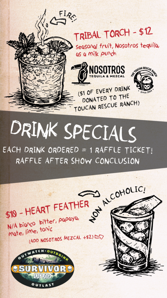
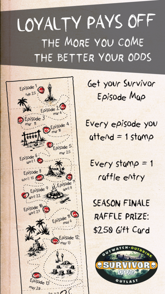
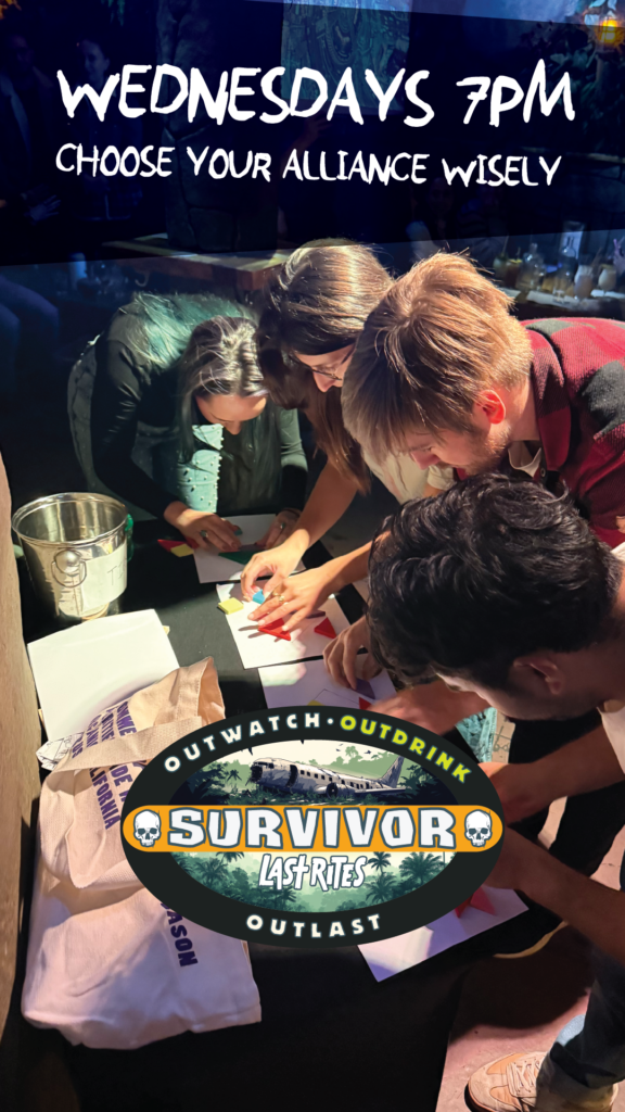
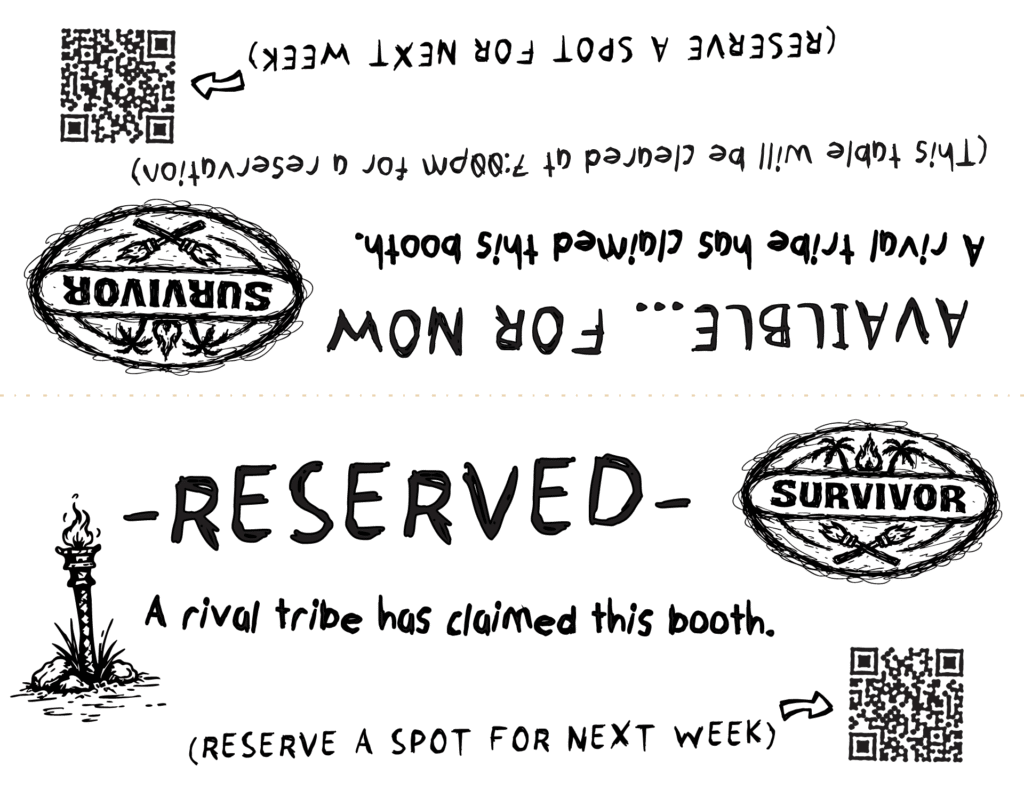
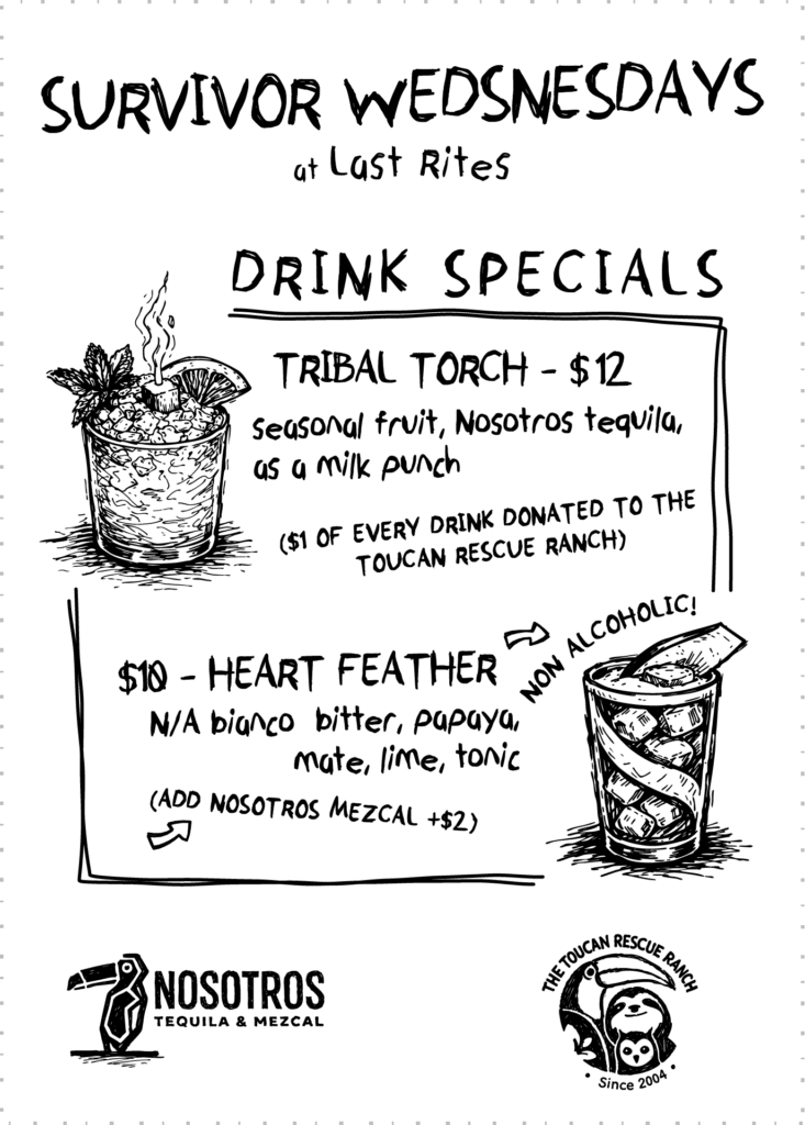
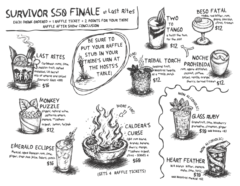
Recurring weekly programming each got a full design system, not just a poster. Bingo Night and Survivor Night are good examples: a poster series in two print formats, a customized prize wheel for winners to spin, and two distinct voucher card variants — one for drink prizes, one for an in-game mechanic. The same treatment extended to Trivia Night, Survivor Night, and others.
Typography and layout in Illustrator. All illustrations art-directed and generated in Midjourney.
BINGO NIGHT
SURVIVOR NIGHT
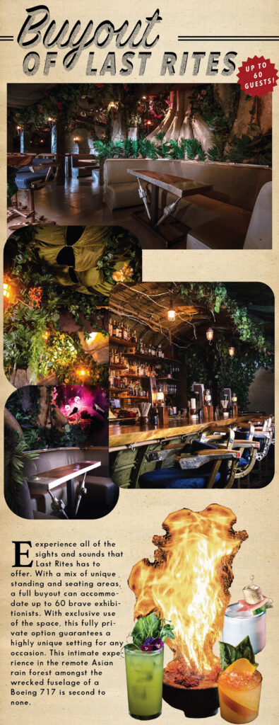
Events & Parties Book
A private events and buyouts sales document designed to feel like the bar itself. Each seating area treated as a destination, not a floor plan. Cover art, interior layout, and copy all mine.
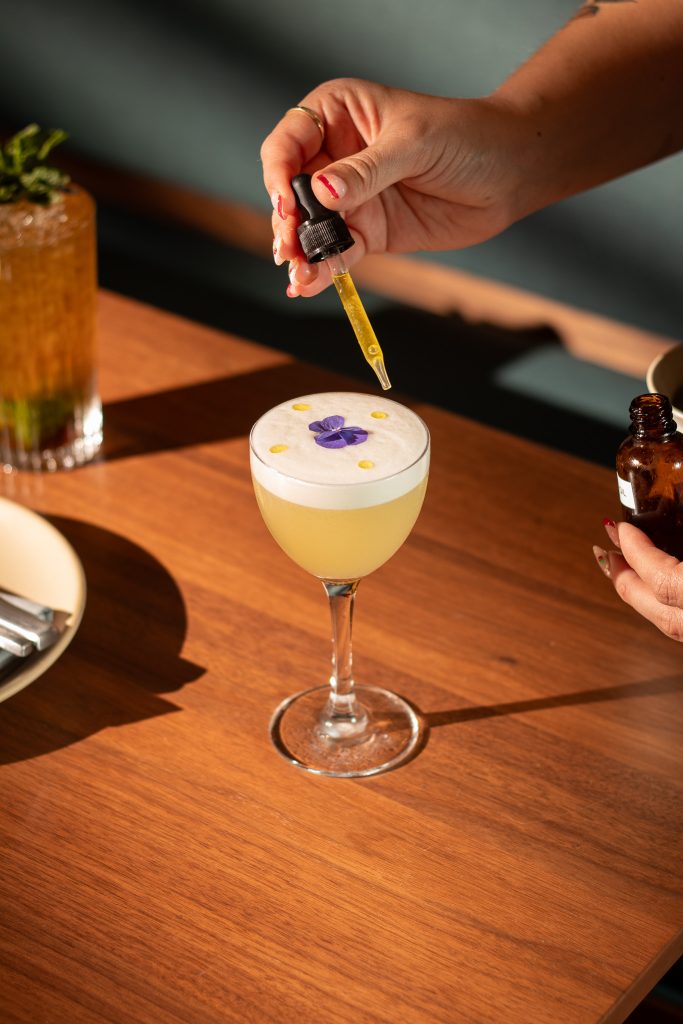
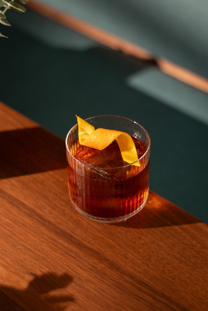
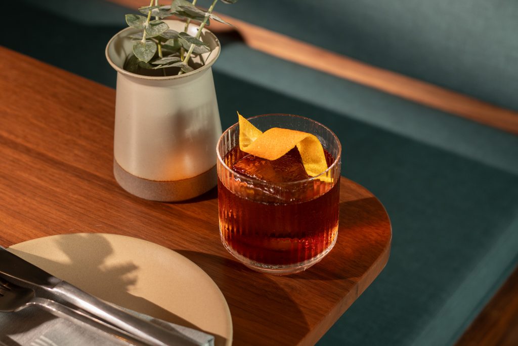
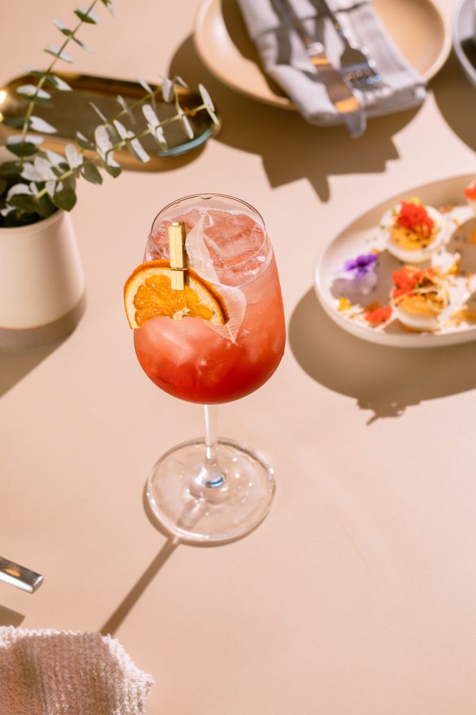
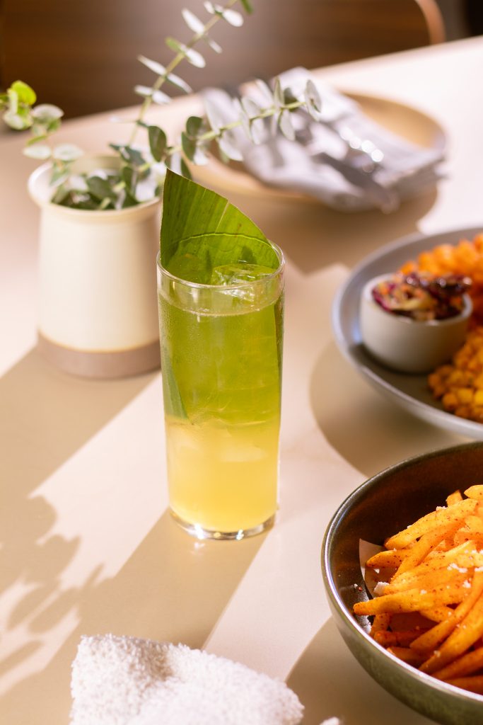
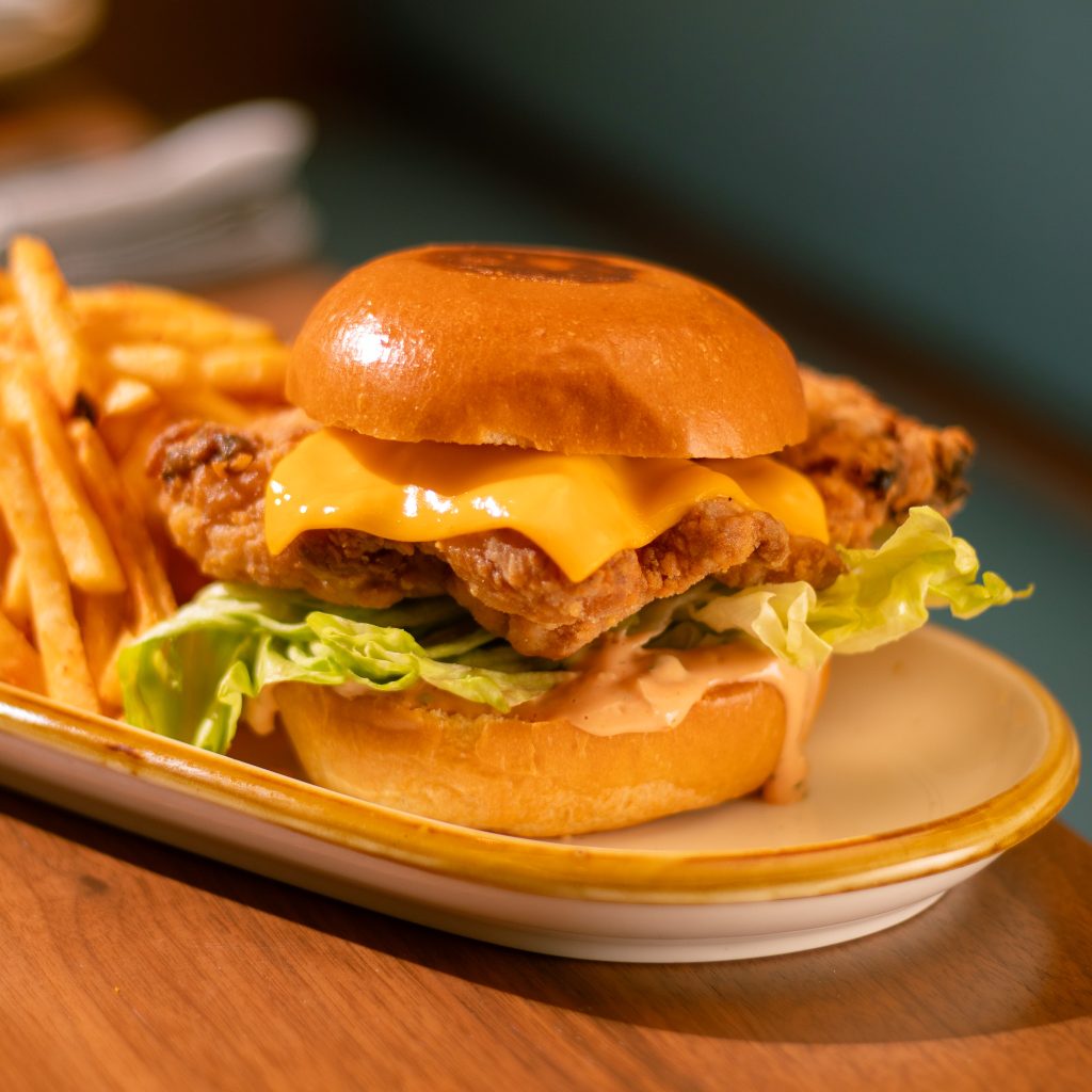
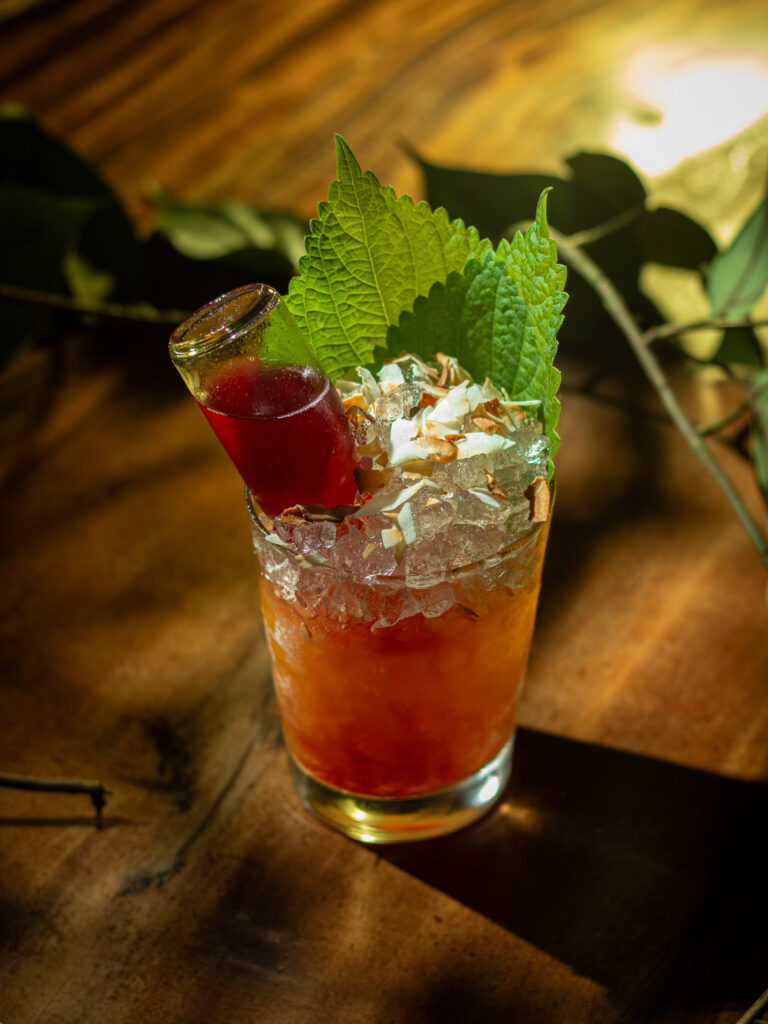
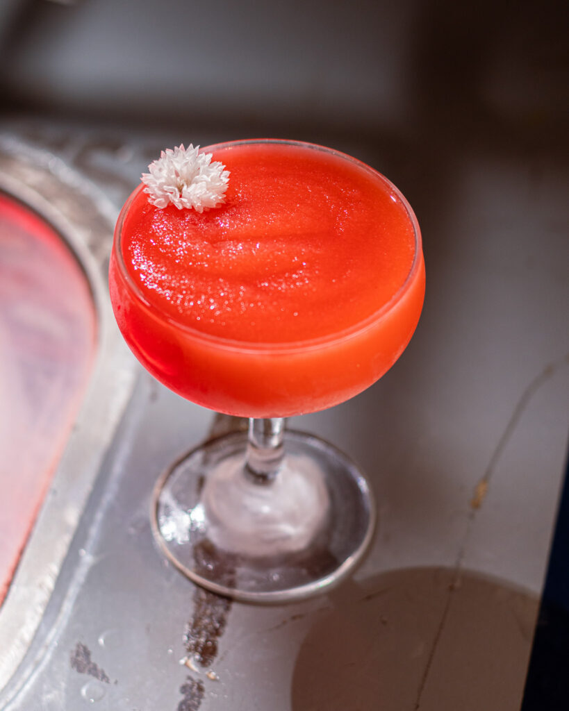
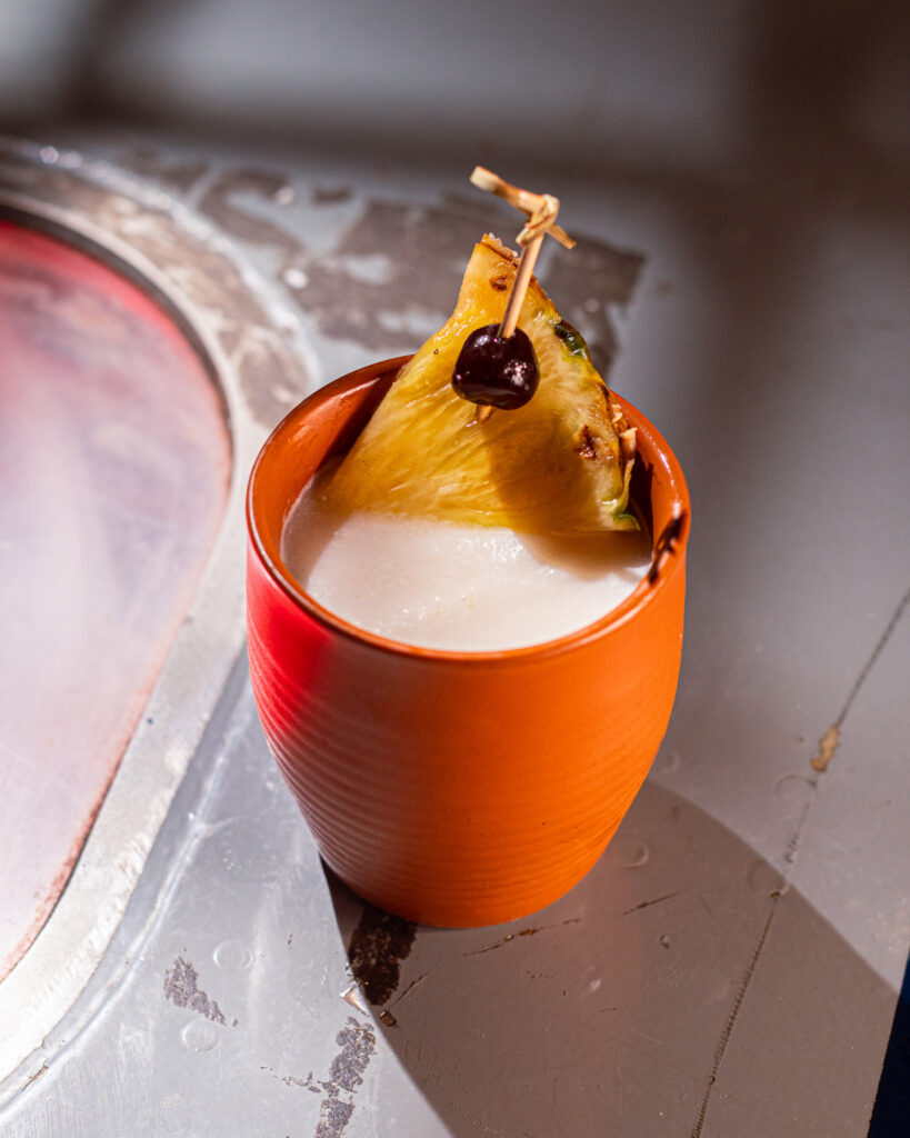
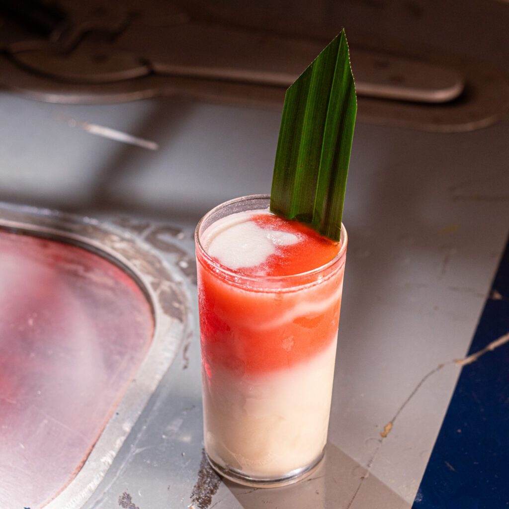
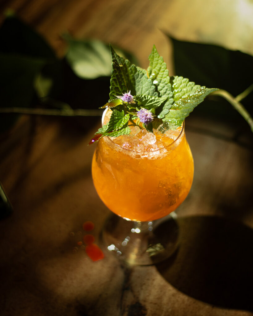
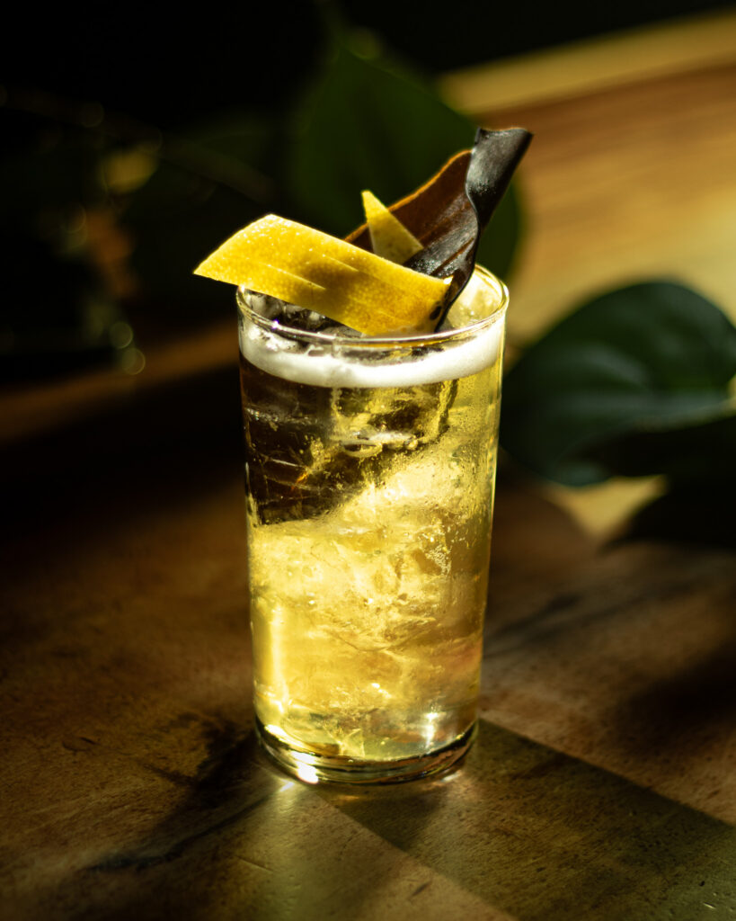
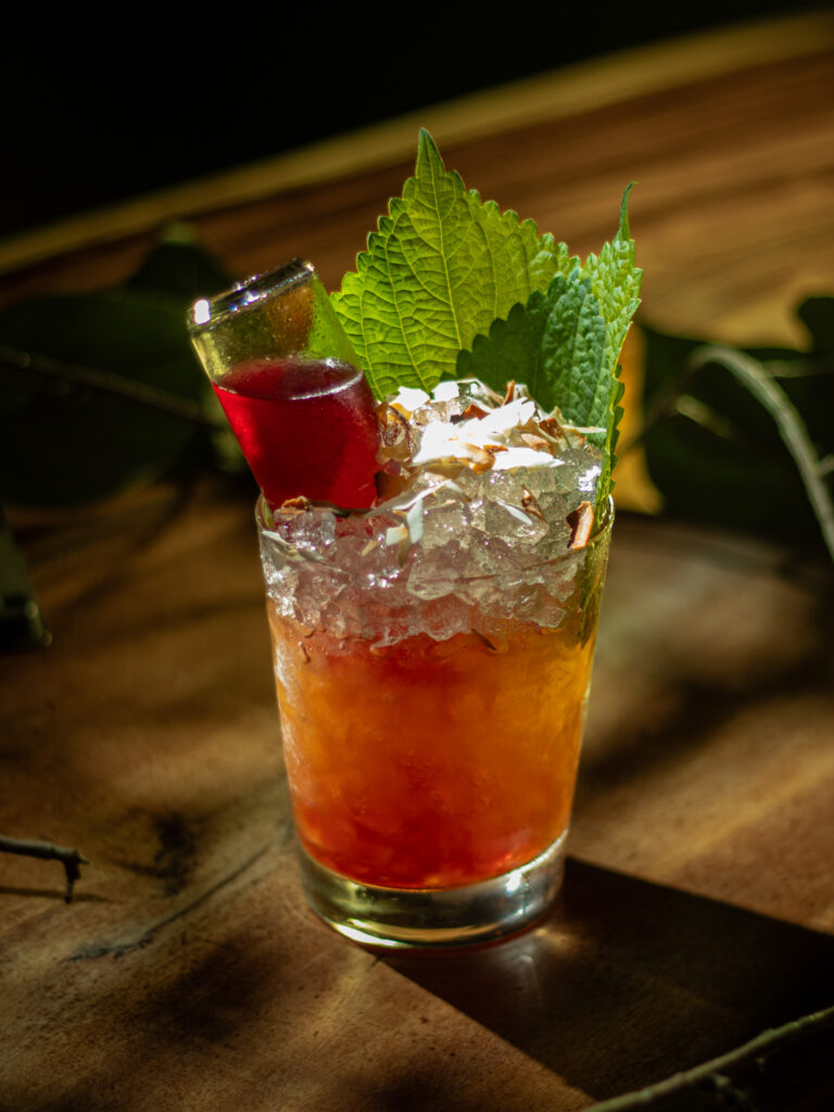
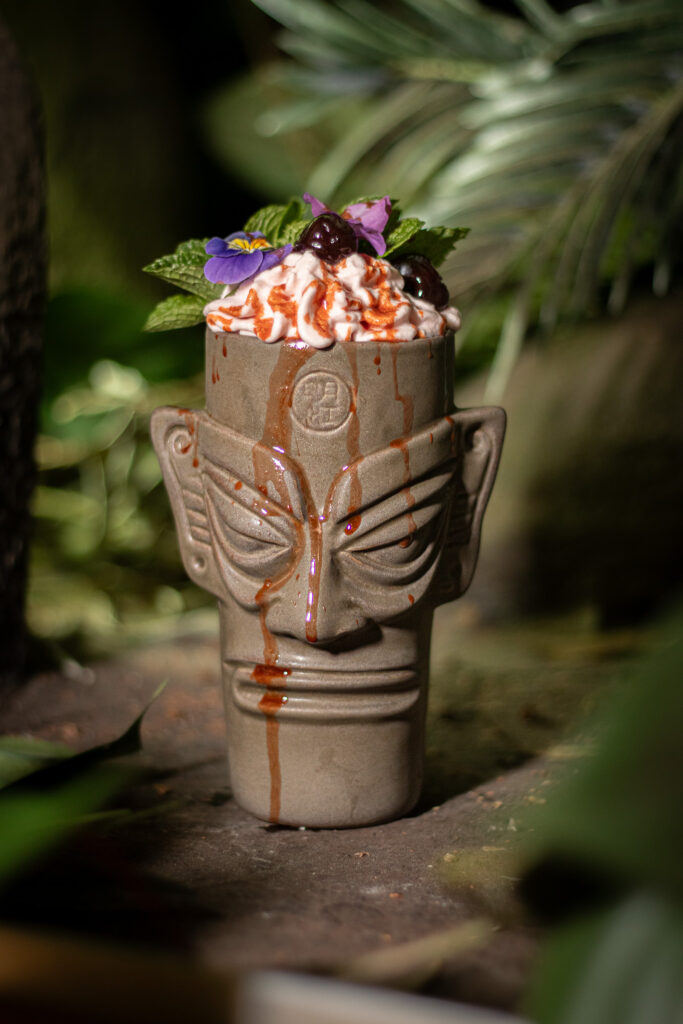
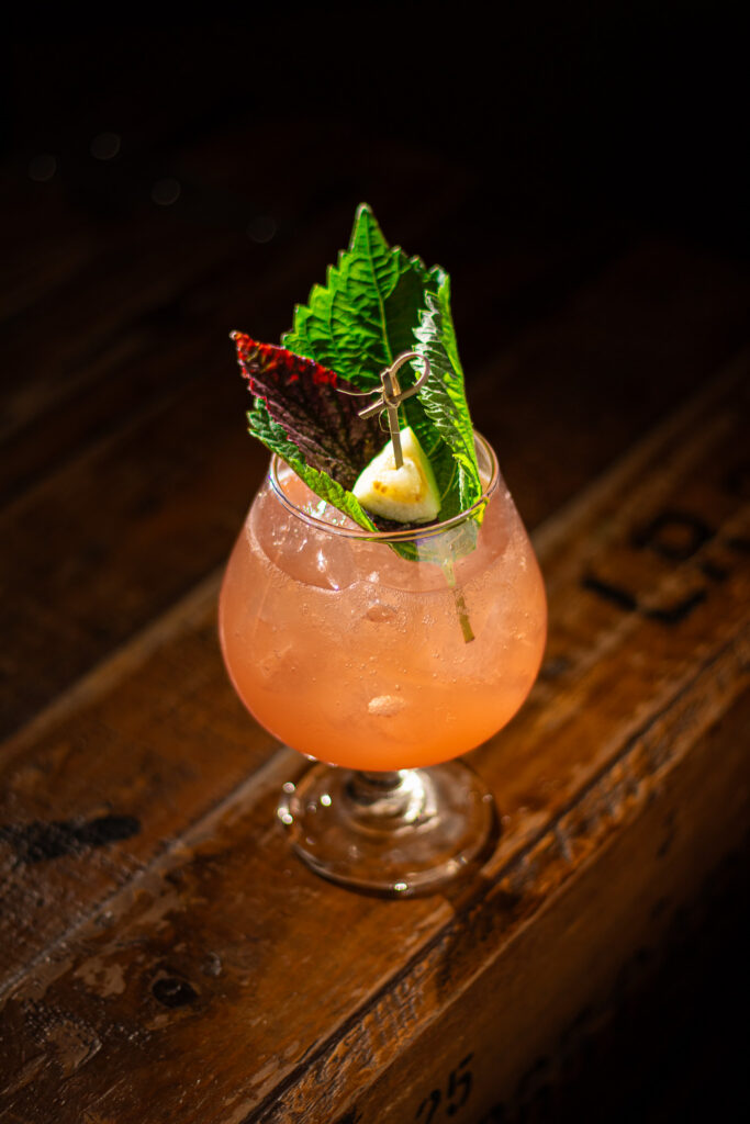
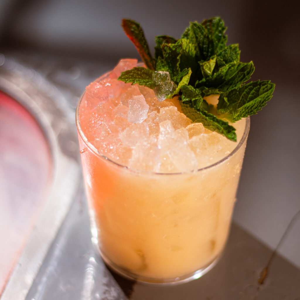
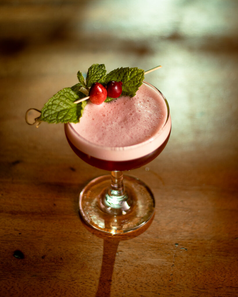
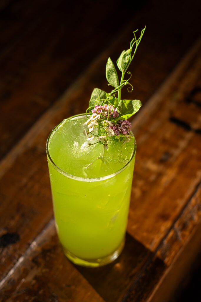
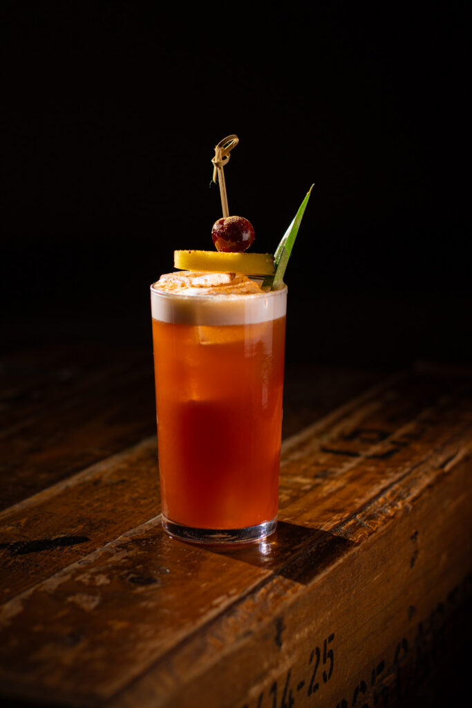
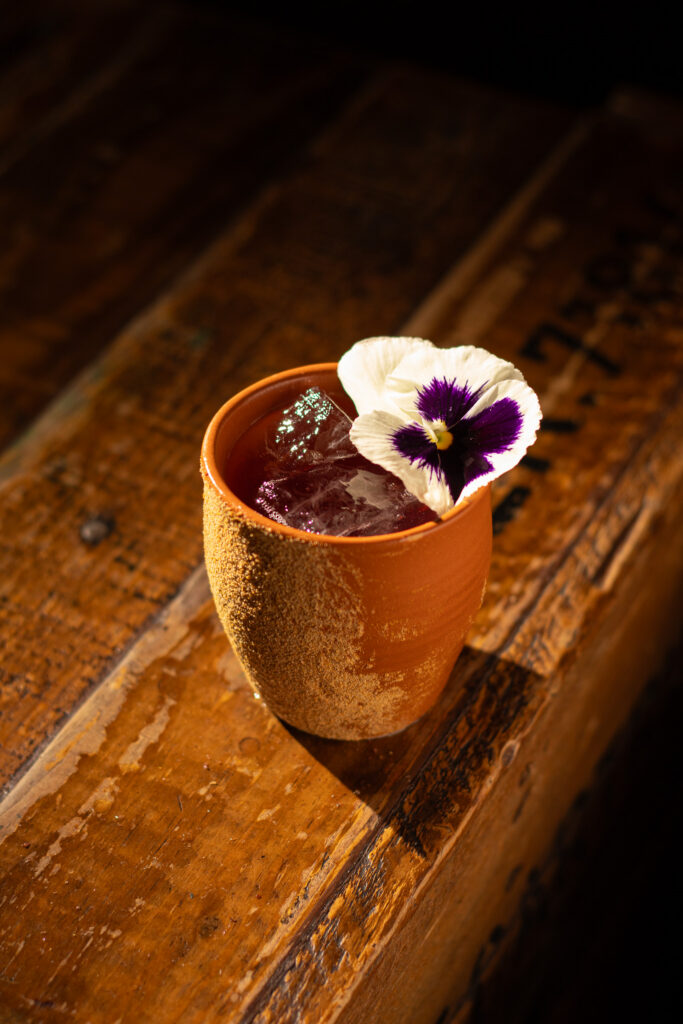
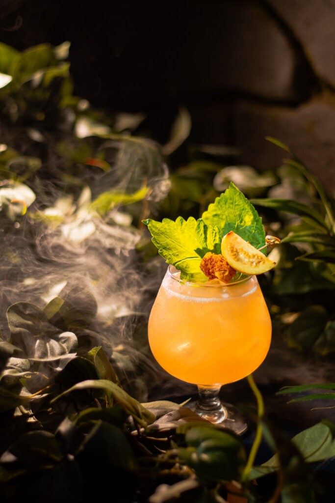
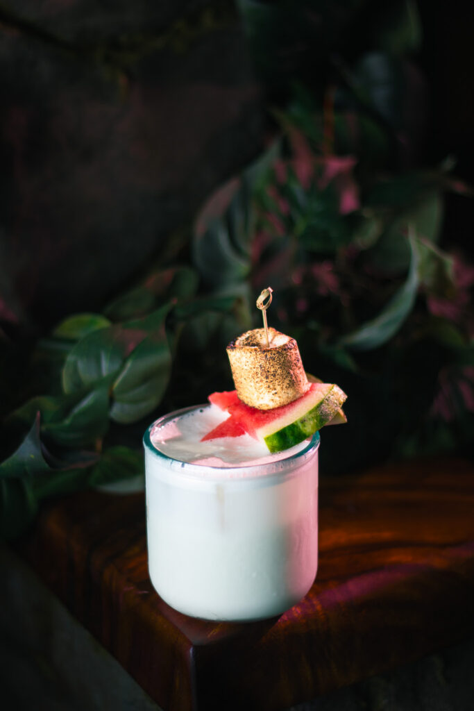
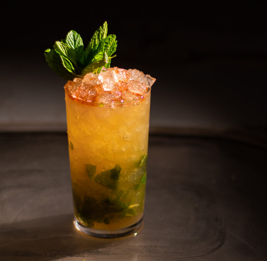
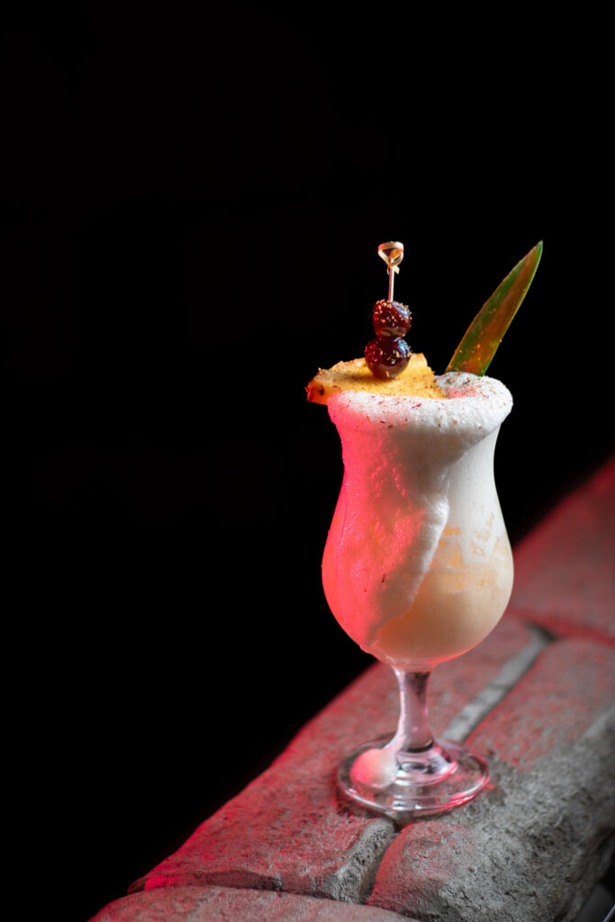
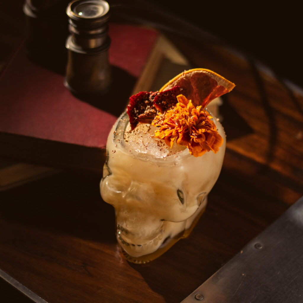
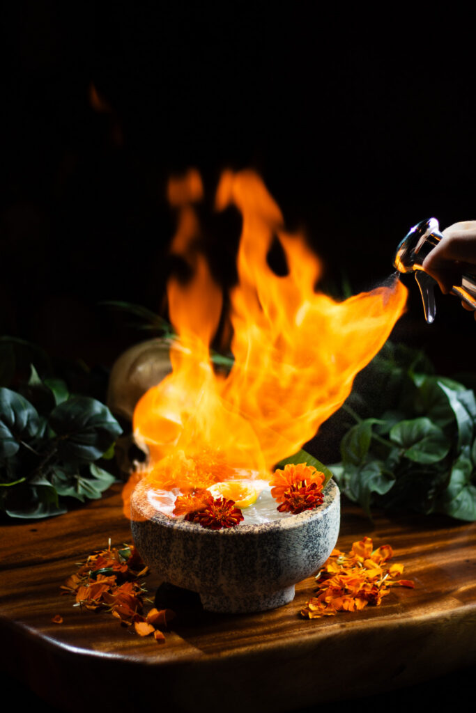
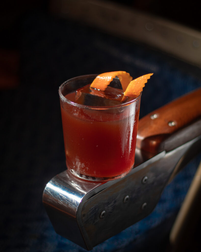
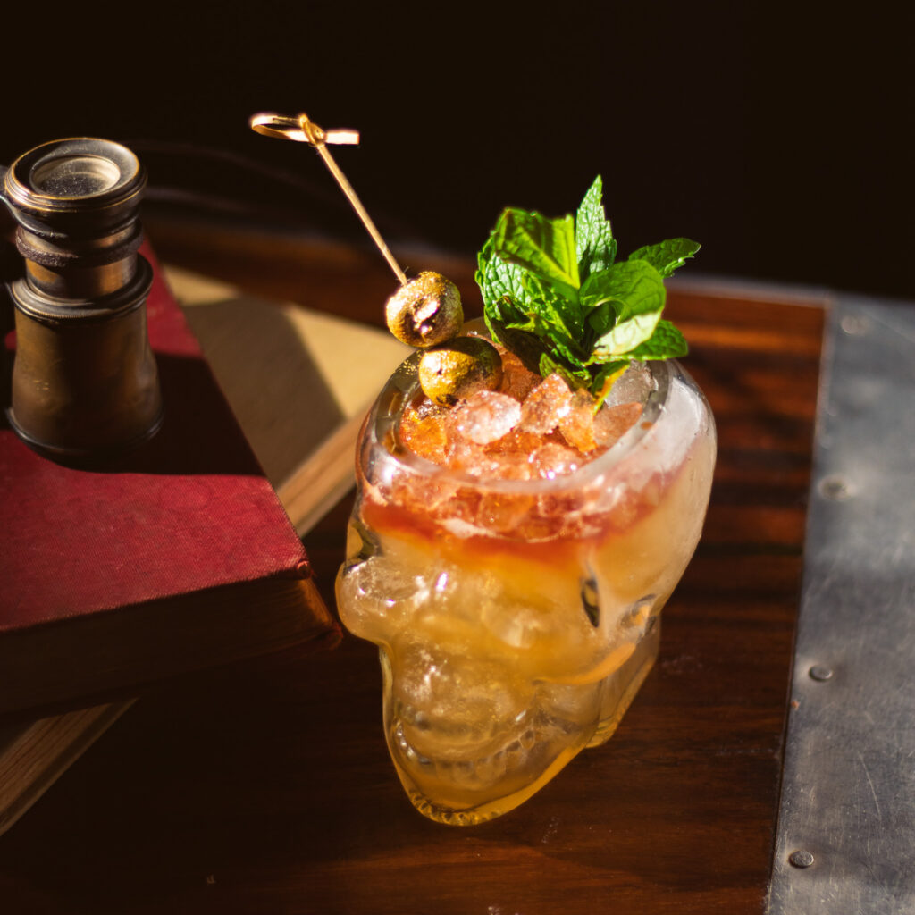
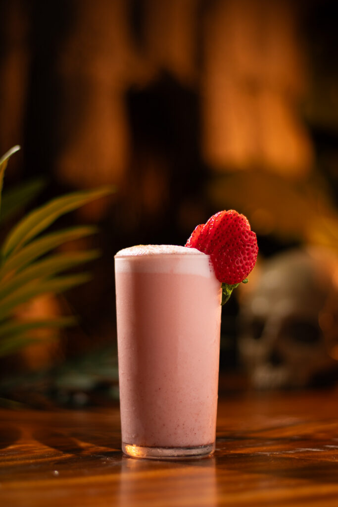
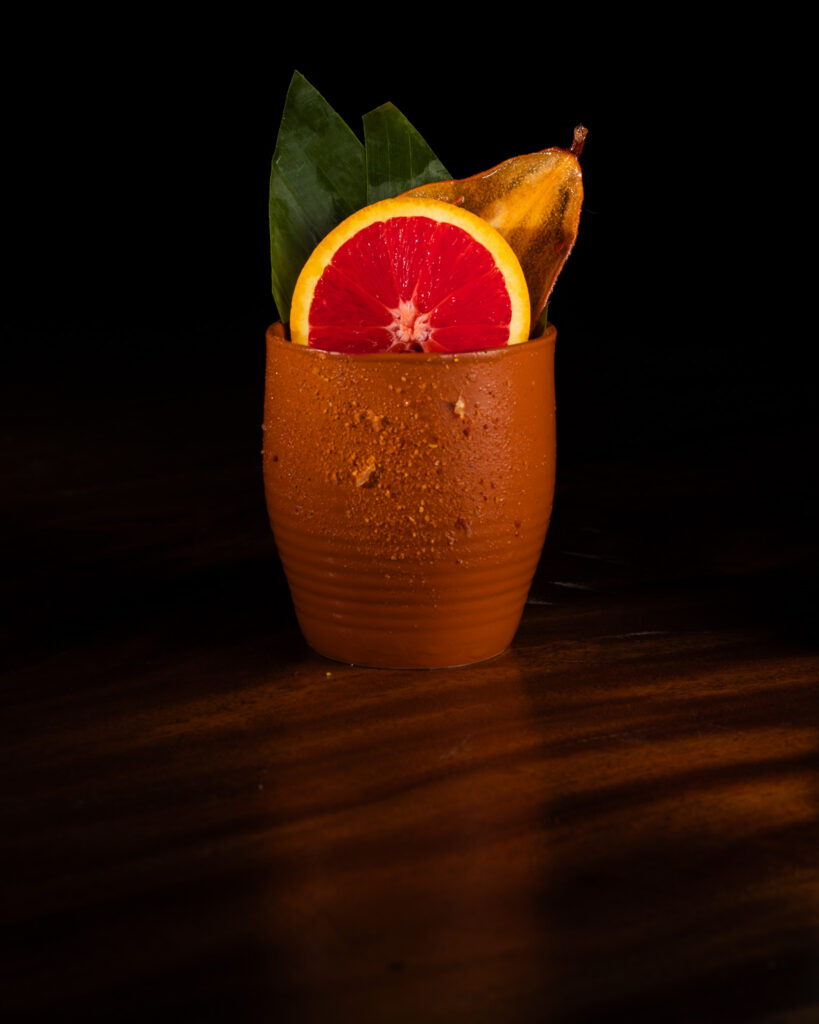
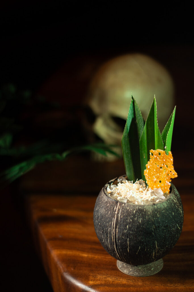
Cocktail Photography
Last Rites photography has a specific look: dark, dramatic, directional lighting against warm wood and stone — intentionally different from the brighter product work I do for Horsefeather. Four years of ongoing beverage photography used across menus, social, and the Adventure Menu system.
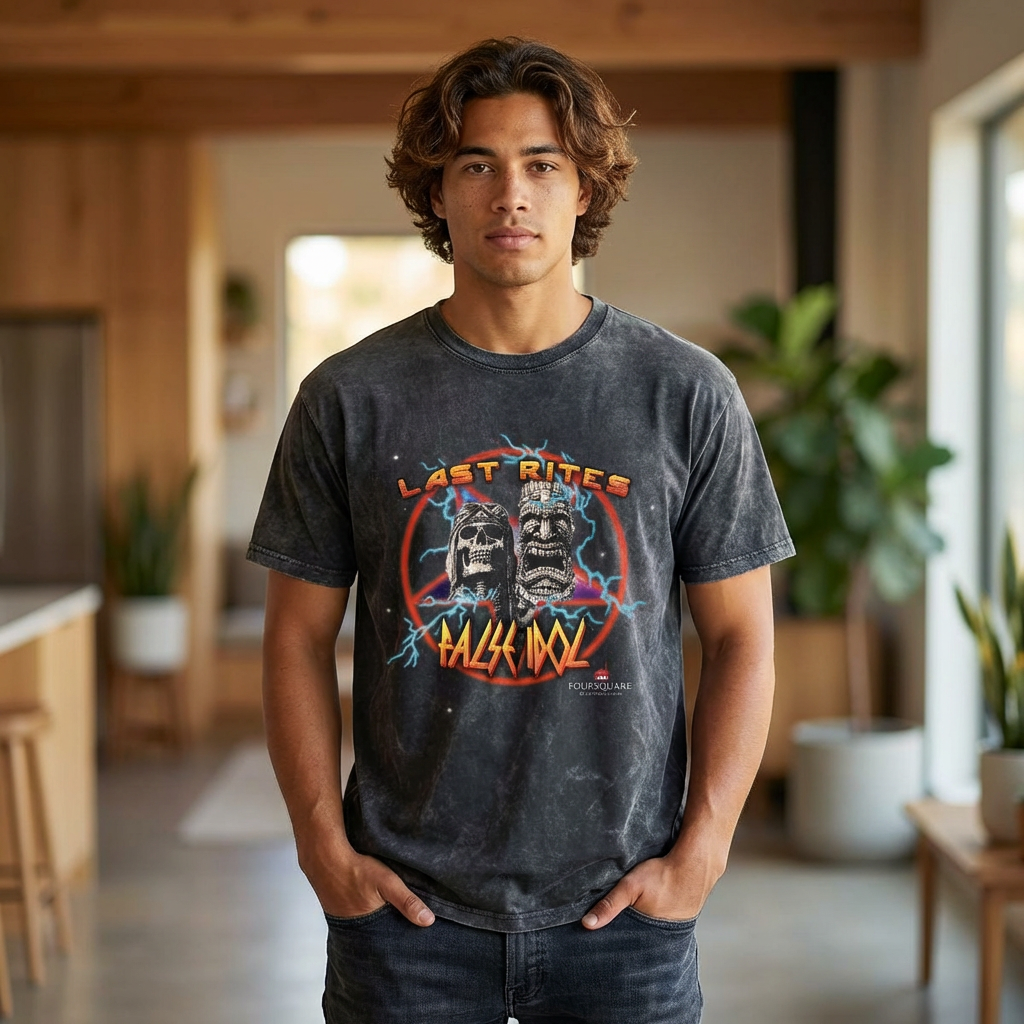
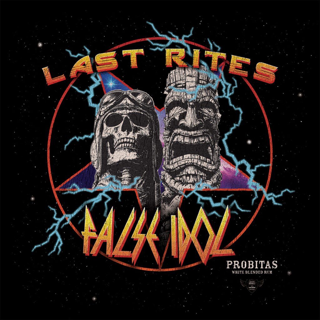
Last Rites and False Idol (San Diego) co-hosted an event with Foursquare Rum Distillery. The shirt needed to represent both bars without defaulting to either one’s usual aesthetic. Heavy metal was the answer. Lettering, composition, and illustration direction all mine.